- Styles (1)
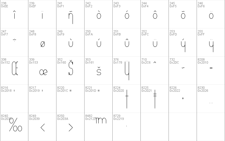
- Character Maps
- License


- Free for Personal Use
- Free for Commercial Use
- Modification Allowed
- Redistribution Allowed
Read more
+=+=+=+=+=+=+=+=+=+=+=+=+=+=+=+=+=+=+=+=+=+=+=+=+=+=+=+=+=+=+=+=+=+=+=+
+=+=+=+=+=+=+=+=+ DarkSide Productions = Free Fonts ! +=+=+=+=+=+=+=+=+
+=+=+=+=+=+=+=+=+=+=+=+=+=+=+=+=+=+=+=+=+=+=+=+=+=+=+=+=+=+=+=+=+=+=+=+
+=+=+=+=+=+=+ "Verticalization" Copyright� 1998 R. Gast +=+=+=+=+=+=+=+
+=+=+=+=+=+=+=+=+=+=+=+=+=+=+=+=+=+=+=+=+=+=+=+=+=+=+=+=+=+=+=+=+=+=+=+
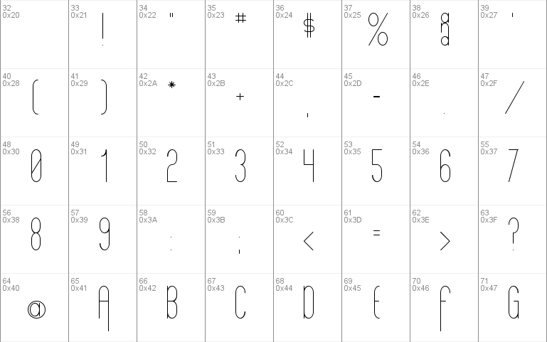
"Verticalization" is the 24th new free font from DarkSide Productions.
It was completed on 11/27/98 and is a conditionally* FREE font!
*Conditionally free means free for everyone, for either personal or
commercial use. The only stipulation: If you plan to include this font
on a disk or CD, as part of any software, collection or library,
whether on diskette medium or digitally on the web, for distribution
to the public on either a "for profit" or "not for profit" basis,
permission must be obtained in writing from the author and copyright
holder, who is specifically identified as:
R. Gast
5818 Prophet's Rock Rd.
W. Lafayette, IN 47906
e-mail: [email protected]
URL: http://home.earthlink.net/~darkside7/index.html
It may be distributed as a free font as long as this text file
(Verticalization.txt) is included with it. "If it's free," you ask,
"why keep this file with the font?"
Here's the reason: Maybe, just maybe, you'll make a fortune using this
font in some manner. And if you do, all I ask is that you remember me
with a token of your appreciation. Any modest amount (at least $1 and
not to exceed $1,000,000) would be an appropriate gesture for my
contribution to your monumental financial success. Hey! I can dream!
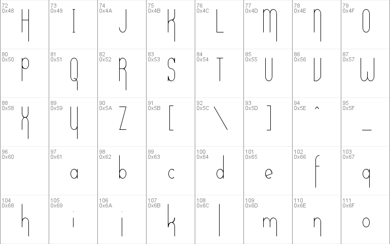
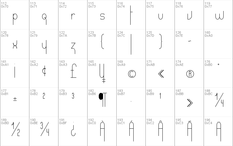
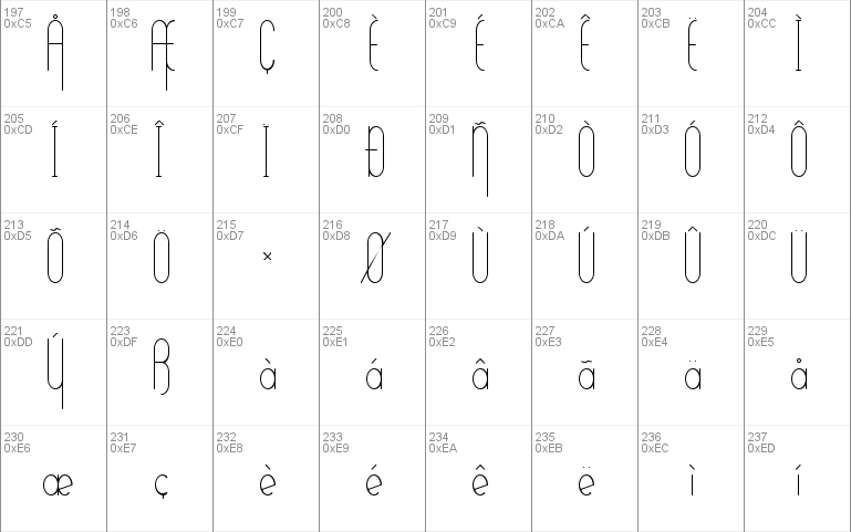
The character set includes:
All Upper and Lower case letters and numbers.
The vast majority of punctuation and international characters.
Note: The keystroke ` (grave) is a special spacing element to be
used between character combinations such as "Th, fl, Pl, etc" to
obtain whatever desired spacing you want to achieve.
The name "Verticalization" comes from the disproportionate height of
the vertical strokes in the characters as compared to the character
widths. And, having to stretch the truth my whole life just to claim
to be 5'9" tall, I see nothing wrong with making a font that is taller
than I am!
Oh, yeah....I almost forgot. If (for some unknown reason) you really
do want to make a donation to encourage me to continue my creative
efforts, send it to the address above. (Yeah....As If!) Thanks & Enjoy!
+=+=+=+=+=+=+=+=+=+=+=+=+=+=+=+=+=+=+=+=+=+=+=+=+=+=+=+=+=+=+=+=+=+=+=+
=+=+=++=+=+=+=+=+ Watch for more Free Fonts to come @ +=+=+=+=+=+=+=+=+
+=+=+=+=+=+=+=+=+=+=+=+=+=+=+=+=+=+=+=+=+=+=+=+=+=+=+=+=+=+=+=+=+=+=+=+
+=+=+=+=+=+ http://home.earthlink.net/~darkside7/index.html +=+=+=+=+=+
+=+=+=+=+=+=+=+=+=+=+=+=+=+=+=+=+=+=+=+=+=+=+=+=+=+=+=+=+=+=+=+=+=+=+=+


Comments