
Download (zip 7.1 Kb)Add to favouritesReport this font
- Styles (1)
- Character Maps
- License
1 styles for

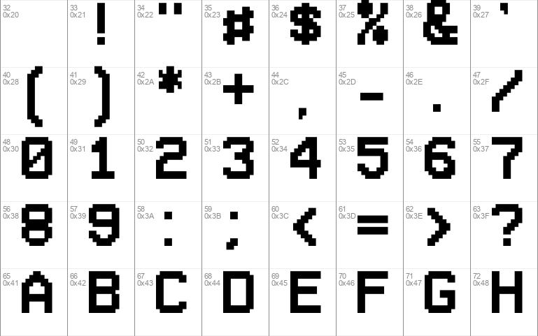
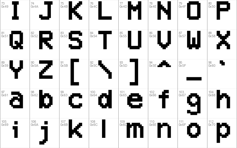
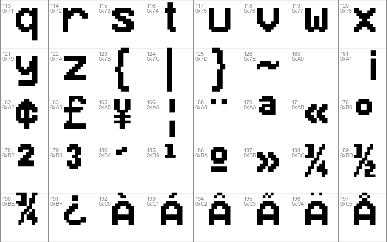
202 characters

- Free for Personal Use
- Free for Commercial Use
- Modification Allowed
- Redistribution Allowed
Extended information
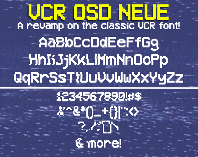
VCR OSD NEUE is a font i made after I started to get annoyed with the kerning (the spacing between letters or characters.) of the letter "i". and while looking at the characters I notice that that the lowercase g, p, q, y, i, and t were hard to work with due to the strange height and kerning problems. (i kept the lowercase a because it has a certain charm to it.)
So I thought "what if someone made a revamped version with differences in the letters?" Then I got the inspiration to make VCR OSD NEUE
If used please credit.
Comments