

- Styles (1)
- Character Maps
- License


- Free for Personal Use
- Free for Commercial Use
- Modification Allowed
- Redistribution Allowed
Extended information
Discovered in the ruins of a Syrian temple in Ras Shamara, this
alphabet dates from 1,400 BC; it's use ended around 1,200 BC with
the destruction of the city of Ugarit. Derived from both syllabic
(symbols representing spoken syllables) cuneiform and contemporary
Phoenician alphabets, it is the first cuneiform alphabet; the
letters were scratched onto wet clay tablets with a stylus. The
order of the letters closely follows the arrangement of the
Phoenician and Hebrew letters. Unlike these neighboring alphabets,
it is consistently written from left to right.
The alphabet consists of thirty letters and a word divider symbol;
only administrative texts included the full alphabet, since they
needed the final three letters to represent sounds in the
neighboring Hurrian language. The literary texts in the local
language include a mythological cycle concerning Ba'al Hadad --
the Lord of Thunder, as well as stories of legendary heros. The
fragments that have survived give a taste of the treasures of the
lost Canaanite culture.
Read more
http://davidmyriad.tripod.com/myriads.font.page.html
Ugaritic 3.0.1 Font Documentation
I designed this font to be both legible and true to the
proportions of the original letters. Created and (c) by David
Myriad Rosenbaum, 2002/5762. It includes every major letter
variant of the Ugaritic alphabet that I could find. If you need a
letter that's not on this font, E-mail me and I will add it.
Custom font design also available.
This is shareware; payment is FREE for students. Professors and
others not on a budget: twenty-five dollars, to the address below.
Permission is granted to freely copy and distribute this font
packet, if the entire folder, including this documentation, is
included. Academic use is granted, if the appropriate citation is
given.
Your letters of comment will be greatly appreciated. Contact me
at:
David Myriad Rosenbaum
P.O. Box 21701
El Sobrante CA 94820-1701
E-mail: [email protected]
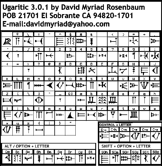
Keyboard Notes:
The are some challenges in fitting all the letters on the standard
keyboard, and in communicating their locations over cyberspace.
The easiest way is to visit my webpage, noted at the top of the
page. Here you will find a key map, as well as the latest version
of this and my other Ancient Near East fonts. A sample gif and key
map gif is also included in this package. You may also use the Key
Character viewing program on your PC. Be sure to check Shift,
Option, Control, and Shift-Option on your keyboard to see all the
characters.
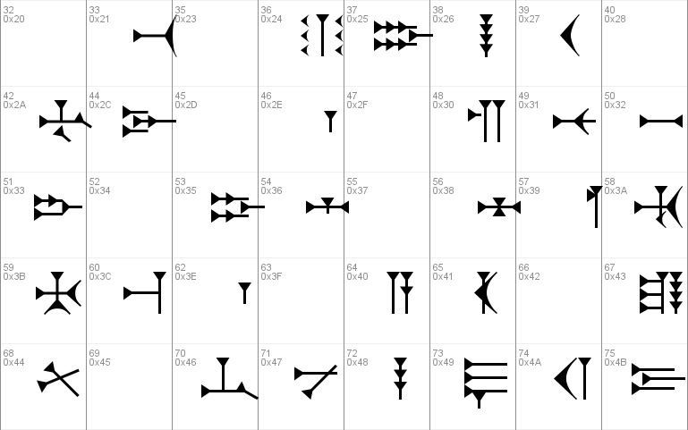
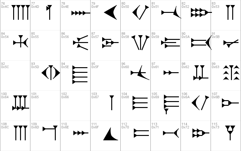
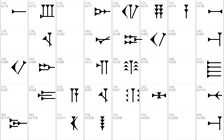
This font includes every major alternate form of each letter, but
some of them I've had to tuck away in odd places. The most common
form of the alphabet is found on the lower case keys, with a few
letters on the upper case keys. They are logically arranged, by
the sound transliterated into North American English. As I ran
out of room, I placed additional letters on the non-alphabetic
keys [numbers and symbols]. Most of the alternate letter shapes
also appear on the Alt plus Letter, Control plus Letter, and Shift
plus Option plus Letter key combinations, arranged by sound.
The word divider symbol is at the [.] or [>] keys.
UGARITIC WRITING
Discovered in the ruins of a Syrian temple in Ras Shamara, this
alphabet dates from 1,400 BC; it's use ended around 1,200 BC with
the destruction of the city of Ugarit. Derived from both syllabic
(symbols representing spoken syllables) cuneiform and contemporary
Phoenician alphabets, it is the first cuneiform alphabet; the
letters were scratched onto wet clay tablets with a stylus. The
order of the letters closely follows the arrangement of the
Phoenician and Hebrew letters. Unlike these neighboring alphabets,
it is consistently written from left to right.
The alphabet consists of thirty letters and a word divider symbol;
only administrative texts included the full alphabet, since they
needed the final three letters to represent sounds in the
neighboring Hurrian language. The literary texts in the local
language include a mythological cycle concerning Ba'al Hadad --
the Lord of Thunder, as well as stories of legendary heros. The
fragments that have survived give a taste of the treasures of the
lost Canaanite culture.
REFERENCES:
DRUCKER, JOHANNA. The Alphabetic Labyrinth. Thames and Hudson,
Inc. New York, 1995.
GIBSON, JOHN. Canaanite Myths and Legends. T. & T. Clark Ltd..
Endinburgh 1978.
C. B. F. WALKER. Cuneiform. Reading the Past Volume 3. University
of California Press/British Museum, 1987.
HOW IT'S DONE:
This font is a labor of love, as it takes about one hundred hours
to make; at least that's when I stop counting. I've decided to
focus upon creating primarily alphabets from the ancient Near
East, out of personal interest in my ancestors culture. I strive
for academic accuracy, studying as many scholarly sources as I can
find for each text.
Photographs or careful tracings of the individual letters are then
scanned and outlined by Fontographer 4.1.3 - a magnificent font
creation program, on an Apple Macintosh. Then comes many "happy"
hours as I smooth the rough lines of a handwritten text into an
idealized version of each letter. Or letters are drawn from
scratch. Pieces of letters are used to construct more complex
letters, creating a consistent look to the font. This is done on a
grid of one thousand points by one thousand points, and to one
thousandth of a point accuracy. This results in a font that is
true to the proportions of the original alphabet and is highly
readable, both on screen and in print.
WHAT'S NEW:
IN VERSION 3.0.1:
(10 JANUARY 2002/5762)
Every letter has been adjusted to improve legibility on screen --
the most obvious difference is that I've doubled the size of the
triangles. Many alternate shapes for most of the letters have been
added.
Alternate shapes for many letters have been added, and may be
found by pressing the letter plus the option key, or control key,
or shift and option keys simultaneously.
IN VERSION 2.0:
(6 JUNE 5758/1998)
Where possible, Upper Case keys have been added. Many of the
letters have been tweeked to increase their balance and visual
appeal. Since these differences involve changes in drawing the
letters differing from the microscopic .01 to 10 points, you may
not notice a difference in the letters.
==================================================================
Documentation 3.0.1 18 January 2002


Comments