- Styles (2)
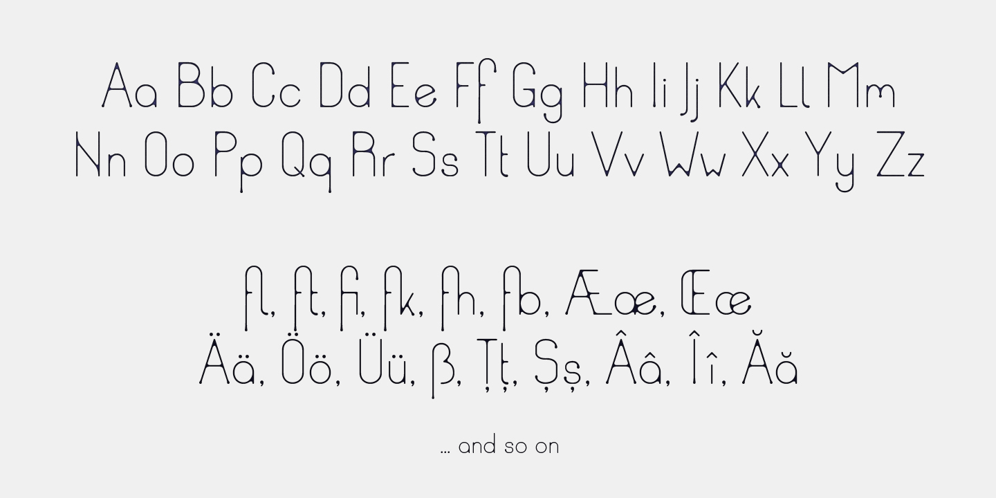
- Character Maps
- License


- Free for Personal Use
- Free for Commercial Use
- Modification Allowed
- Redistribution Allowed
Extended information
Designers Note
A thin, sans serif with a few ‘inconsistencies’ in the difference between the stems and x-height, for the purpose of making it a bit more informal. The concept is, to portray a rounded, friendly looking, simple font, and then create a visual effect to suggest it has been written with too much ink. All the places where two lines should cross and ought to create a sharp corner, this font is rounded off, to give it that bleed effect.
Some of the descenders and shapes have a bubble serif ‘symptom’, to suggest, the excess ink has started dripping downwards.
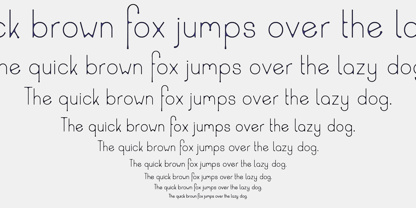
The font is easy to read in both very small text size, and just as useful in big. But of course, for the smaller versions, the rounded corners and “dripping” serifs are not as noticeable.
It works for a big variety of tonalities, from a bloody look all the way to a jelly/candy look.
More link: https://www.fontspring.com/fonts/tudy1311/ud?refby=tudy1311
Read more
Font Name:
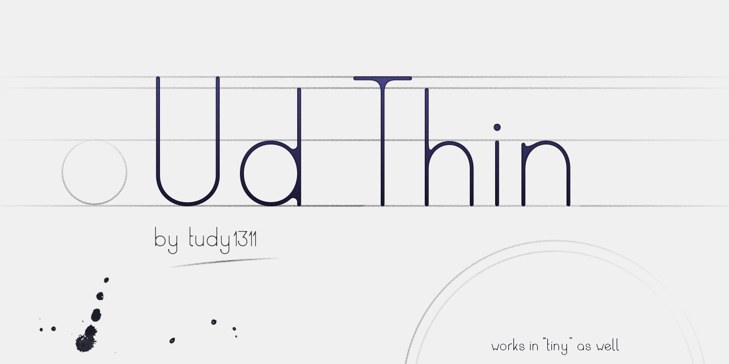
Ud Thin
*********************
Price:
5.00 $
*********************
Release Date:
18.03.2016
*********************
Designer Information:
tudy1311 (Tudor Banciu)
Website: tudy1311.com
*********************
Description:
A thin, sans serif with a few 'inconsistencies' in the difference between the stems and x-height, for the purpose of making it a bit more informal. The concept is, to portray a rounded, friendly looking, simple font, and then create a visual effect to suggest it has been written with too much ink. All the places where two lines should cross and ought to create a sharp corner, this font is rounded off, to give it that bleed effect.
Some of the descenders and shapes have a bubble serif 'symptom', to suggest, the excess ink has started dripping downwards.
The font is easy to read in both very small text size, and just useful in big. But of course, for the smaller versions, the rounded corners and "dripping" serifs are not as noticeable.
It works for a big variety of tonalities, from a bloody look all the way to a jelly/candy look.
*********************
Tags:
Display, Display Sans, Novelty, Geometric Sans, Rounded Sans, Circular, Uneven, Light, Bouncy, Ball terminals, Low Contrast, Ink, Soft
Comments