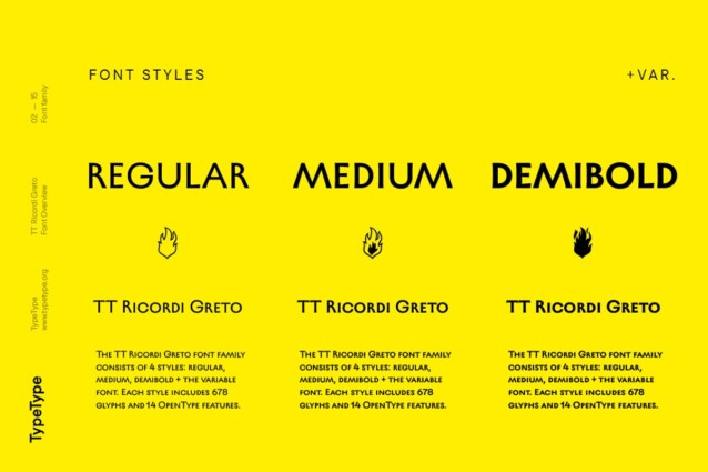
- Styles (4)
- Character Maps
- License


- Free for Personal Use
- Free for Commercial Use
- Modification Allowed
- Redistribution Allowed
Extended information
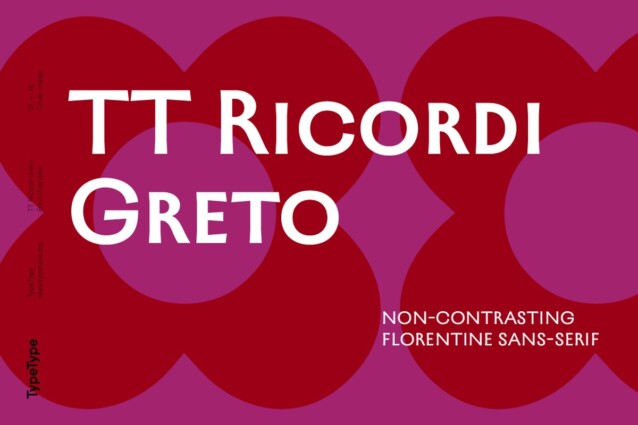
TT Ricordi Greto Font is the fifth typeface developed as part of the special project TT Ricordi. The essence of this unique series is to find hidden gems in inscriptions carved into old plaques and stones and bring them back to life in the form of modern typefaces.
TT Ricordi Greto is an original experimental project by Kseniya Karataeva. Her main source of inspiration was a floor plaque dating to 1423, found within the Basilica di Santa Croce, Florence. While working on this typeface, we aimed to make it trendy and modern and, at the same time, keep and accentuate the authentic details. As a result, historical forms of this font go hand in hand with contemporary visual design approaches.
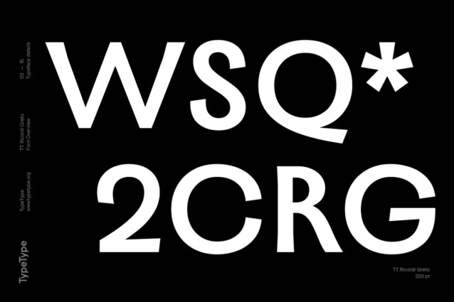
TT Ricordi Greto is a low-contrast Florentine sans serif with dynamic proportions. This is the only sans serif in the TT Ricordi collection; however, it kept slightly visible serifs resonating with its prototype. Other visual characteristics of the typeface include a closed aperture, varying glyph widths, and fluid terminals with curling and flaring stroke ends.
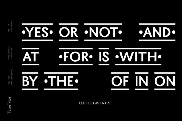
The typeface features a large set of graphic icons (characters and objects), dingbats (flowers, stars, and teardrops), and thirteen catchwords. All icons and dingbats are carefully selected and crafted to complement and interact with the font’s visual aesthetics in the best possible way.
A robust and expressive typeface, TT Ricordi Greto is sure to attract attention. This typeface is well-suited for designing magazine covers, packaging, signs, and posters, as well as for branding and web design.


Comments