- Styles (3)
- Character Maps
- License


- Free for Personal Use
- Free for Commercial Use
- Modification Allowed
- Redistribution Allowed
Extended information
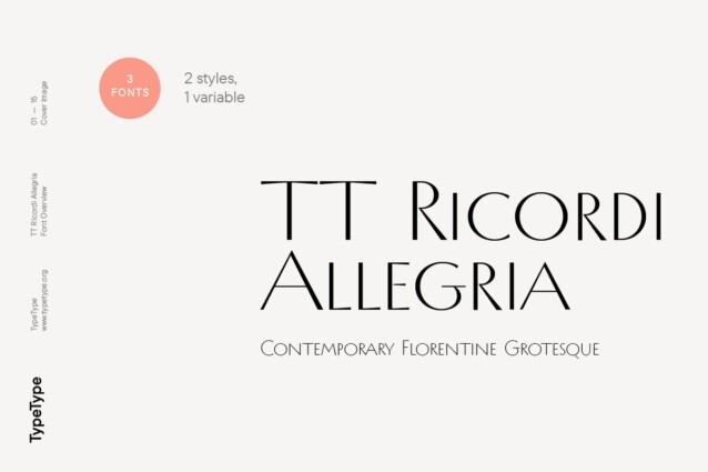
TT Ricordi Allegria Font Family is a modern high-contrast sans designed by Antonina Zhulkova for the special project TT Ricordi. The essence of this unique series is to find hidden gems in inscriptions carved into old plaques and stones and bring them back to life in the form of modern typefaces.
The primary source of inspiration for TT Ricordi Allegria was the inscription remains found within the Basilica di Santa Croce, Florence. The typeface’s graphics reflect the transitional stage between the classic Antiqua and Florentine Grotesque. TT Ricordi Allegria stands out for its hyperbolically dynamic proportions, pronounced contrast, wedge-shaped stroke ends, and the absence of traditional serifs.
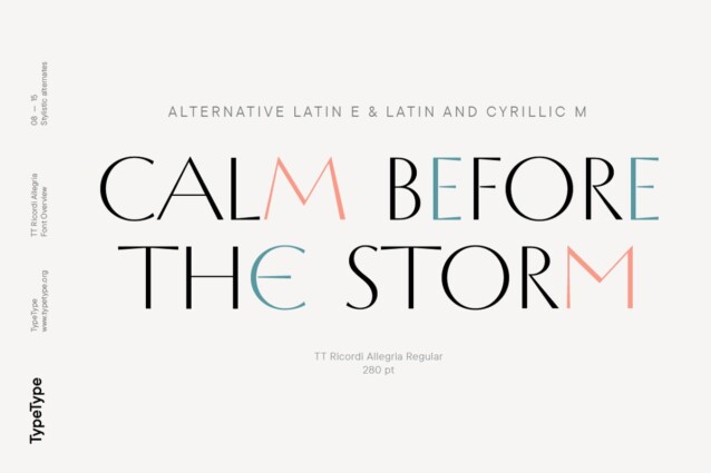
The typeface’s main visual feature is its versatility: by using the stylistic sets, you can transform the entire mood of TT Ricordi Allegria and the way it is perceived. The characters in the core set have a minimalist design, giving the typeface a disciplined feel as if the text typed in this font is really carved in stone. In turn, the alternate set adds roundness to the characters due to some glyphs having noticeable curls and fluid legs. Besides, the typeface includes a set of elegant ligatures for working with expressive text in large headlines, for example.
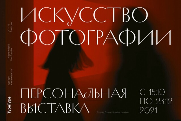
A noteworthy stage of designing TT Ricordi Allegria was developing the Cyrillic character set. The Cyrillic writing system doesn’t align seamlessly with the concept of the Florentine Grotesque and high-contrast sans. The two most challenging tasks were to create a proportion variation system for characters, similar to that of the Latin alphabet, and to maintain the visual appeal of the text when using the Cyrillic alphabet for typing. This is why the typeface features letters Д, Л, У, Ы that may look less familiar to the eye, and the proportions of other Cyrillic alphabet characters are not quite classic either. In general, the Cyrillic set looks more expressive than its Latin prototype. The important thing is that it doesn’t have a historical feel that often appears while working on the Cyrillic character design for the serifs of this type.


Comments