
- Styles (22)
- Character Maps
- License


- Free for Personal Use
- Free for Commercial Use
- Modification Allowed
- Redistribution Allowed
Extended information
TT Rationalist Font – For those familiar with the bestsellers TT Norms® Pro and TT Commons™ Pro, the new font will feel effortlessly navigable. It has similar proportions, characteristics, and functionality, yet it’s an independent and unique typeface.
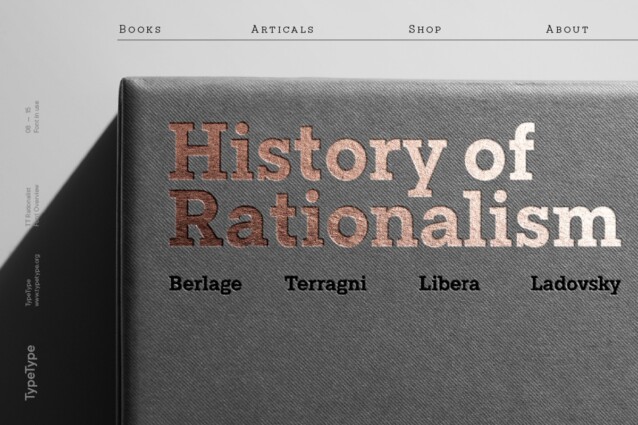
Unlike the geometric sans serifs TT Norms® Pro and TT Commons™ Pro, TT Rationalist is a slab serif typeface. It’s functional and original. Slabs are characterized by heavy-looking rectangular serifs, but in TT Rationalist, they have a trapezoidal shape that gives the font a modern look.
Speaking about modern visual features, we aimed to avoid an overly historical aesthetic found in numerous slab serif typefaces. We gave particular attention to perfecting the Black font style, which initially echoed the aesthetics of Wild West posters. When we balanced excessive contrast that appeared because of visual compensation, the font ceased to evoke retro associations. Now, TT Rationalist Black is an excellent tool for headlines that looks especially great on posters and perfectly matches the Light font styles of TT Norms® Pro and TT Commons™ Pro.
The new font is well-suited for both headlines and large text blocks. It’s particularly aesthetic when used for printed material design (books, magazines, or leaflets).
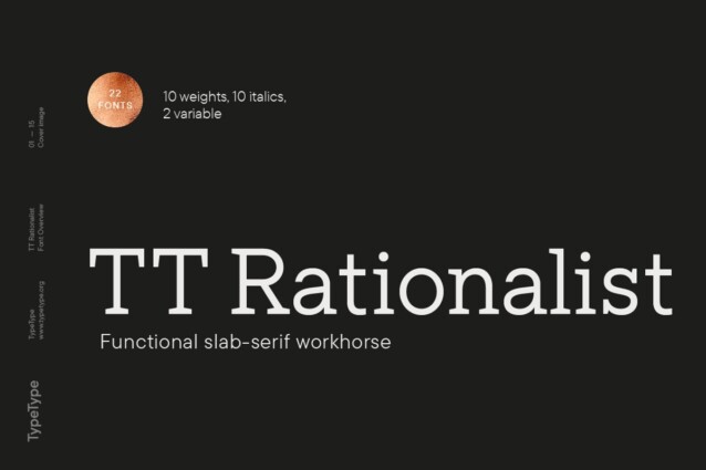
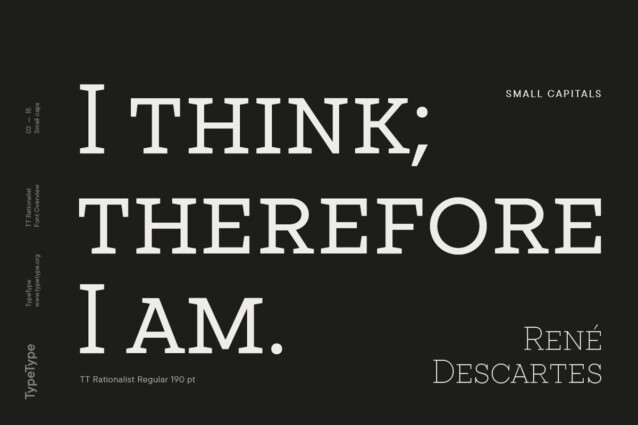
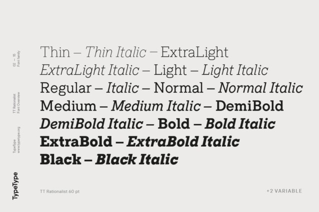
The TT Rationalist typeface consists of 22 font styles: 10 roman, 10 true Italics, and 2 variable fonts. Each font style includes an extensive character set of over 950 glyphs. The font supports over 200 languages and contains 27 OpenType features. In addition to the standard ones, there are small caps for Latin and Cyrillic writing systems and alternative versions for the ampersand and the letter g. The italics feature two stylistic sets, allowing you to switch key characters (k, v, w, y, z) between sharper and smoother forms.


Comments