- Styles (30)
- Character Maps
- License


- Free for Personal Use
- Free for Commercial Use
- Modification Allowed
- Redistribution Allowed
Extended information
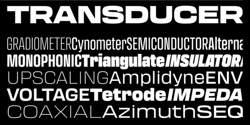
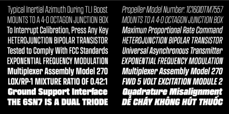
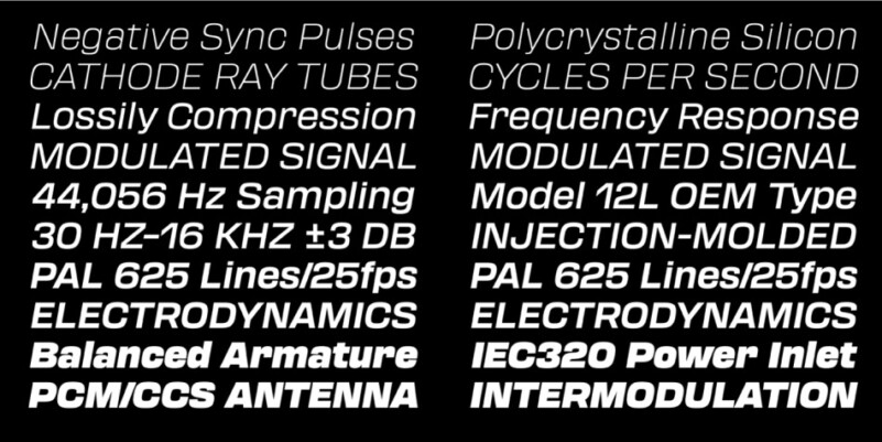
Transducer Font is a modern sans serif typeface that is characterized by its clean lines, bold strokes, and geometric shapes. This typeface was designed with the intention of creating a strong visual impact and capturing attention. Some of the quirks typically associated with this style have been changed to aid legibility. The traditional modernist approach of attempting to make every letter as similar as possible to every other letter has been lessened here (compare the lowercase t in Transducer with the t in Microgramma). A high x-height helps make it easier to read at a glance—a necessity when designing for interfaces and diagrams. It also comes in a large array of weights and widths. In its attempt to be more humanist and incorporate the pops and hums of analog equipment, also eschews perfectly straight vertical lines. The vertical strokes feature a nearly imperceptible tapering towards the middle—a nod back to imperfections found in and on the equipment which inspired the typeface. Finding the balance here was critical to the whole typeface; too much taper and it would lose its mechanical roots, too little and it would feel to sterile. I should have kept track of the hours spent pivoting from one side to the other (and the subsequent corrections that needed to take place across the whole typeface after an adjustment was made). This gives a slight warmth to the typeface, something lacking from most of its brethren.
Thanks very much to James Todd. Transducer Font just personal use only, if you need for commercial use and full version please download in here.


Comments