


- Styles (1)
- Character Maps
- License
Tagettes Regular


- Free for Personal Use
- Free for Commercial Use
- Modification Allowed
- Redistribution Allowed
Extended information
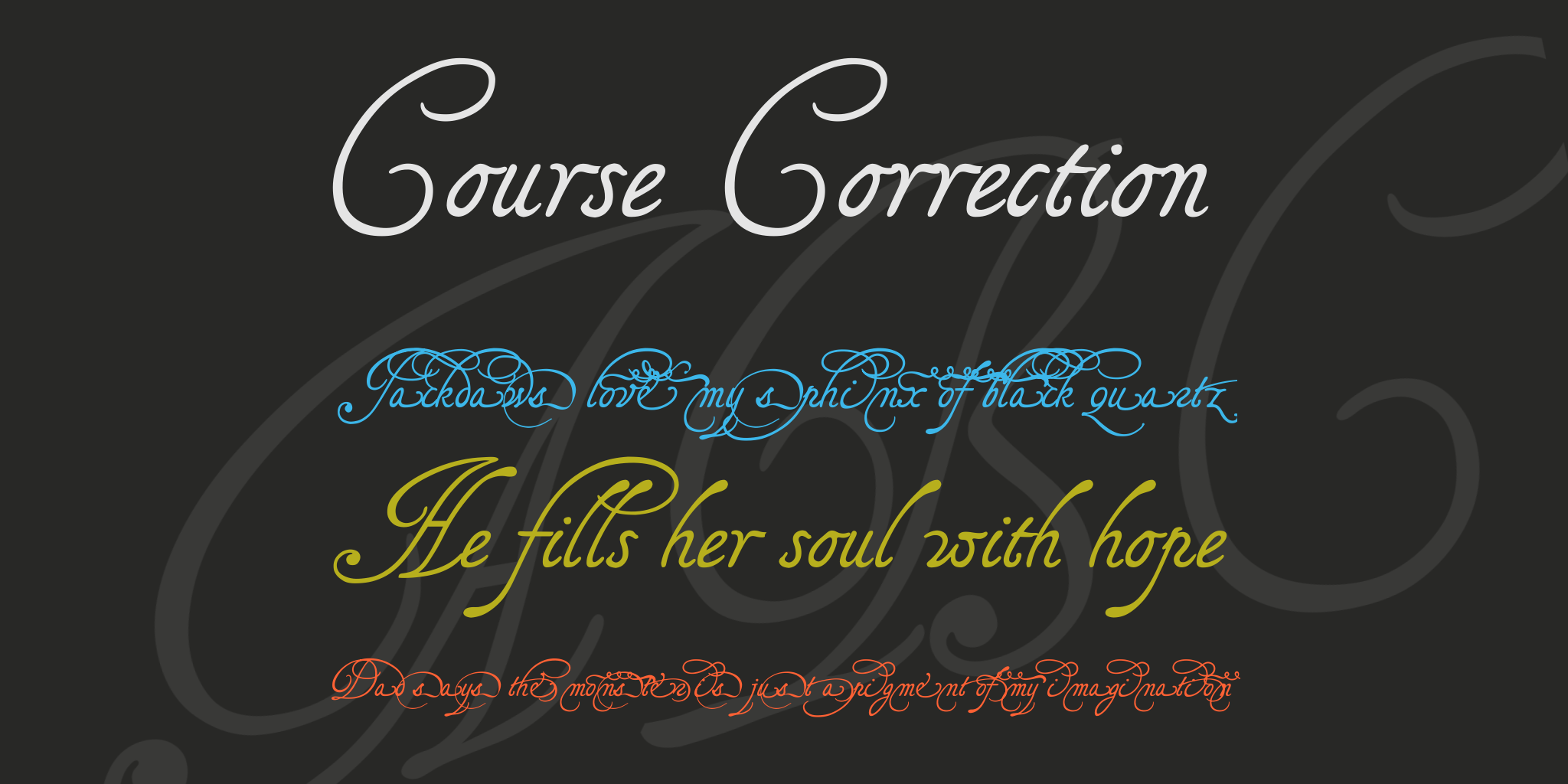
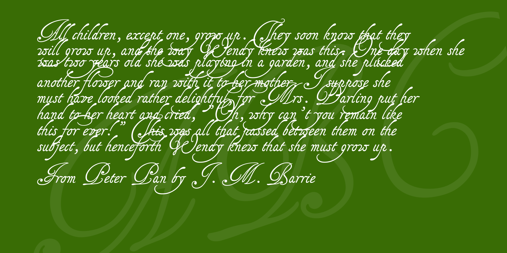
These fonts are dedicated to the lovers of swashes, and I shall feel vastly flattered if you use them to write your wedding invitations -- wishing you all sorts of good luck and happiness into the bargain!
Tagettes & TagettesPlus are the type of Italian chancery cursive of the 16th and 17th century that is mostly called Cancellaresca. They were developped out of a page of samples created by the French writing master Louis Barbedor around 1650 (unfortunately, the man's name is already taken by another font, so I had to invent a fancy name). Monsieur Barbedor provided such a variety of _p_s and _f_s and _g_s etc. that for a while I got quite lost in that jungle. At long last, I realized, moreover, that swashing too many of the lower case glyphs would make the font look crammed. So, I finally settled on the swashed g -- since that is of my own invention --, as well as a swashed f, and y, sending the swashed b, d, h, k, p, and l off to the alternate font called TagettesPlus.
Both fonts are matching -- on my computer at least --, and you should therefore have no difficulties in making your texts more swashed by selecting some letters and having them displayed as the alternate glyphs.
As usual, there is no number sign in this font, and you'll find a long s in its place. Despite the alternate font, there are still extras in the main font, e.g.
a double l on the left bracket
a double f on the right bracket
a less swashed simple g on the bar sign
an alternate r on the masculine ordinator, the 'less than or equal to', and the the 'fi' sign
an alternate s on the feminine ordinator, the 'greater than or equal to', and the the 'fl' sign
a swash on the underscore
a swash on the ASCII tilde
and yet another swash on the broken bar sign
TagettesPlus contains neither figures nor punctuation marks, and its set of upper case glyphs is identical with that of the main font. Its lower case letters are the alternate ones. They are mostly swashed, but you'll find a simple f and g there, too, as well as two less space-taking _y_s.
Update 2007 has somewhat altered the TagettesPlus font, adding a swash to the c, s and v, changing the e and t, and redistributing some of the keys. Here's the actual list:
a swashed long s on the number sign
a new ending swash for middle zone characters on the period sign
a swash on the hyphen
another swash on the underscore
the font's former e, s, and t on the numbers 1 to 3
a second simple y on the number 4
and an alternate German sharp s on the sharp s sign.
As to the dragon, you'll find it now, not only on the @, but on the µ (micro sign), too.
For the Tagettes main font, update 2007 has added two kerning pairs, Ll and Ldotl, and has corrected the Ldot and and ldot.
Update 2010 has not changed the TagettesPlus font. However, for the main font, it has not only enlarged the dashes, and corrected the dcaron, Lcaron/lcaron, and tcaron, it has also redesigned the composite glyphs, and has done this two times over. There is now a difference between the UNICODE version on this page, and the ASCII version you'll find in the collection on the home page. The UNICODE version has been provided with every accented Western character I found in Arial, including U/uhorn, Ohorn/ohorn, as well as their derivatives, and the Schwa/schwa. On top of that, fhe accented glyphs have been treated with more consideration than in the ASCII font. In the ASCII version, the capitals have mostly been downsized to make room for the accents above, whereas in the UNICODE font, the gap between the lines has been enlarged, to keep the capitals as intact as possible. If you need to use accented characters, the Unicode version should be your choice.
Licensing
Commercial licensing is available at http://www.pia-frauss.de/imp/cu.htm
Read more
Tagettes & TagettesPlus
__________________________________________
... are UNICODE fonts created by Pia Frauss in 2005, with High-Logic's FontCreator program, updated in 2007 and 2010. You have downloaded version 2.00 of both fonts (completed in 2010).
You're welcome to enjoy these fonts.
Tagettes & TagettesPlus are free for private use. For commercial use, please visit my "Conditions of Use" page at
http://www.pia-frauss.de/imp/cu.htm
The Tagettes fonts are the type of Italian chancery writing of the 16th and 17th century that is mostly called Cancellaresca, and were developped out of a page of samples created by the French writing master Louis Barbedor around 1650.
Both fonts are matching -- on my computer at least --, and you should therefore have no difficulties in getting your texts to look more swashed by selecting some letters and having them displayed as the alternate glyphs.
As usual, there is no number sign in these fonts, and you'll find a *long s* in its place.
Despite the alternate font, there are still extras in the Tagettes main font, i.e.,
- a double *l* on the left bracket
- a double *f* on the right bracket
- a less swashed simple *g* on the bar sign
- an alternate *r* on the masculine ordinator, the 'less than or equal to', and the the 'fi' sign
- an alternate *s* on the feminine ordinator, the 'greater than or equal to', and the the 'fl' sign
- a swash on the underscore
- a swash on the ASCII tilde
- and yet another swash on the broken bar sign
TagettesPlus
contains neither figures nor punctuation marks, nor composite charcters, and its set of upper case glyphs is identical with that of the main font. Its lower case letters are the alternate ones. They are mostly swashed, but you'll find a simple f and g there, too, as well as two less space-taking ys.
UPDATE 2007
has somwhat altered the TagettesPlus font, adding a swash to the c, s and v, changing the e and t, and redistributing some of the keys. Here's the actual list:
- a swashed long *s* on the number sign
- a new ending swash for middle zone characters on the period sign
- a swash on the hyphen
- another swash on the underscore
- the font's former *e*, *s*, and *t* on the numbers 1 to 3
- a second simple *y* on the number 4
- and an alternate German *sharp s* on the sharp s sign.
- As to the dragon, you'll find it now, not only on the @ sign, but on the � (micro sign), too.
For the Tagettes main font, there have been a two UPDATEs in 2010.
The first had some glitches eliminated, which affected the boundaries of composite glyphs (for example the *yacute*).
The second UPDATE 2010 has not changed the TagettesPlus font. However, for the main font, it has not only enlarged the dashes, and corrected the *dcaron*, *L/lcaron*, and *tcaron*, it has also redesigned all of the composite glyphs, and has done this two times over. There is now a difference between the UNICODE version on this page, and the ASCII version in the collection you'll find on the home page. The UNICODE version (the one you have downloaded) has been provided with every accented Western character I found in Arial, including *U/uhorn*, *O/ohorn*, as well as their derivatives, and the *Schwa/schwa*. On top of that, the accented glyphs have been treated with more consideration than those of the ASCII font. In the ASCII font, the capitals have mostly been downsized to make room for the accents above, whereas in the UNICODE version, the gap between the lines has been enlarged, to keep the capitals as intact as possible. If you need to use accented characters, the UNICODE version should be your choice.
_________________________________
Disclaimer:
1. The designer as well as owner of this font is Pia Frauss.
2. This is a free font, but it is restricted to personal use only. Commercial use may be obtained by paying a licensing fee.
3. This font may not be included in any commercial compilation of fonts, be it on CD, disks or other products, without the owner's permission.
4. Altogether, this font may not be used for commercial ends and financial gain without the owner's permission.
5. This font may be freely distributed, as long as the zipfile, including this text, remains unaltered.
6. This font comes as it is. There is no warranty -- express or implied -- offered by the owner, or supplier. The risk of any losses or damages resulting from the use of this font remains wth the user.
If you need any information not supplied by this or by the http://www.pia-frauss.de/ website, please write to fonts @ pia-frauss.de (please remove the spaces around the *@* before copying the address into your mail form).
(However, please note that no enquiries such as "how do I download/install/get such and such program to work with your fonts" will be answered in the future.)
Comments