- Styles (11)
- Character Maps
- License


- Free for Personal Use
- Free for Commercial Use
- Modification Allowed
- Redistribution Allowed
Extended information
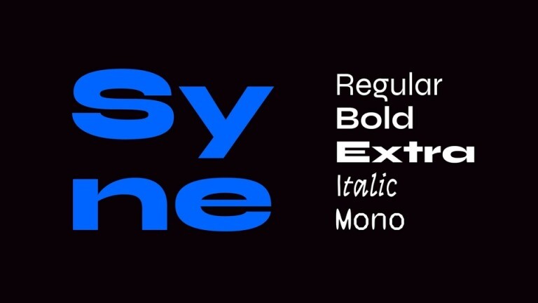
Syne Font is a free sans-serif font family, designed to capture the essence of modern style and sophistication with exquisite minimalism. Closely based on the art center’s team’s will to gather diverse artistic personalities to create fresh and enriching situations, the type family is an exploration into atypical associations in weights and styles.
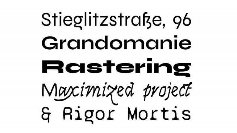
Syne Regular is a geometric sans, inspired by many standards of the genre but presenting quite condensed vertical proportions — short ascenders, descenders and uppercases — for a study yet pleasant feeling in longer texts. It also features minimalistic diacritic marks, reduced to the simplest form to only signify a presence.
The weight system in Syne is thought as a take on synaesthesia in the type design field as well as a kind mockery regarding the more and more complex design spaces and the seemingly infinite possibilities offered by the recent Variable Fonts format.
When getting bolder, all the way to the dramatic and Eurostile-inspired Extra style, the type gains in width, drastically limiting the spectrum with this abnormal association and forcing radical graphic design choices. It is after all one of the strengths of custom-made type that, because it has been created knowing how it would be used, it does not have to care about pleasing everyone or fitting each and every situation, but can focus on conveying a strong identity without compromising.
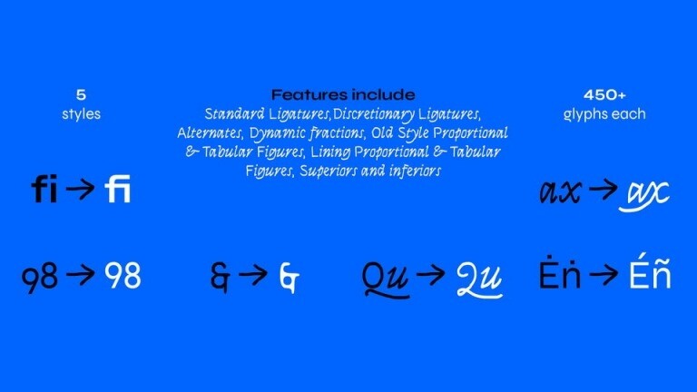
Italic & Mono, two vector-twisted companions, side-kicks to a central Roman, carry deep scars of the tools that produced them, as to point out their inherent Bezier substance. The Italic shares its x-height and optical weight with the Regular, but draws its structures in flourished Renaissance types such as Robert Granjon’s and its peculiar flavour in the made-up exercise of trackpad-calligraphy. It is an hommage to yesterday’s masters using one of the most common gesture-based interfaces of today.
The Mono cut is built upon the Regular but has been strongly distorted with DataFace, a little program we made based on the classic FontTools library, that allowed us to automatically switch all on-curve points into off-curve ones and vice-versa. It gives the type’s contours a unique treatment, mixing arcs and straight lines in a completely unorthodox and vivacious way.
Bringing together History and the technical essence of nowadays typography, these two styles both integrated a part of surprise in their design process, a desired lost of control, an acceptance of error to bring out shapes that pure drawing would fail to imagine.
Thanks Bonjour Monde for creating such a great font! Syne Font is free for personal & commercial use. Please download and enjoy, or can search more similar fonts on befonts.


Comments