

Download (zip 181.8 Kb)Add to favouritesReport this font
- Styles (1)
- Character Maps
- License
1 styles for
83 characters


- Free for Personal Use
- Free for Commercial Use
- Modification Allowed
- Redistribution Allowed
Read more
Strelsau
========
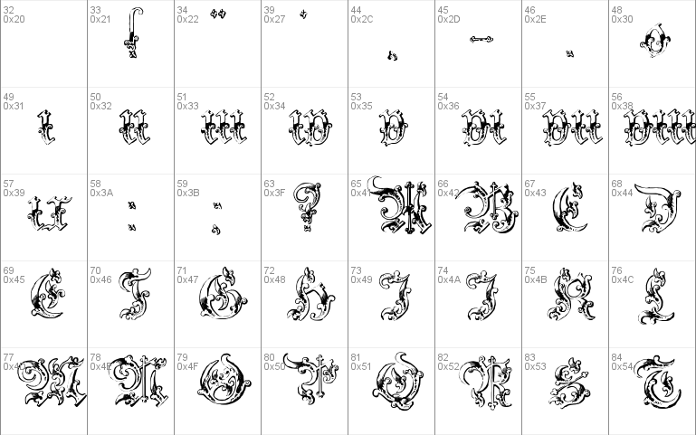
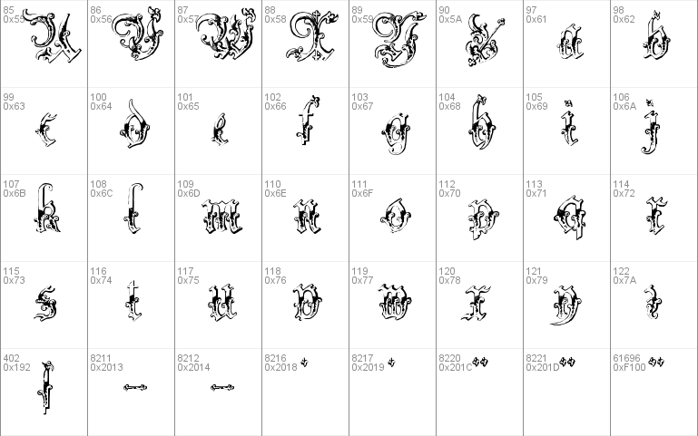
Black letter meets high Victorian, with interesting results I
think :) Yet another of my fonts named out of the novel "Prisoner of
Zenda - which of course itself is a piece of high Victorian folly.
Petra described this one as what a 16th century 'Circus' face would look like.
It certainly lives up to that impression. The truth is a little more prosaic...
a 19th vcentury printer's Fraktur revival, but in either case, a very very
impressive face to behold, and quite the thing for titles in the appropriate
document.
I can see this one on the title page of an historical novel published in
Victorian times.
Paul Lloyd
[email protected]
http://moorstation.org/typoasis/designers/lloyd/index.htm


Comments