- Styles (2)
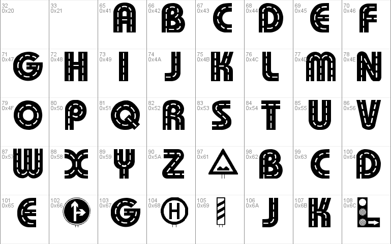
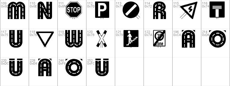
- Character Maps
- License

- Free for Personal Use
- Free for Commercial Use
- Modification Allowed
- Redistribution Allowed
Read more
Emailware f�r den privaten Gebrauch. Die Schrift darf in privaten Fontarchiven zum
Download angeboten werden. Kommerzielle Nutzung nur mit meiner Zustimmung.
[email protected]
Mehr eigene Fonts auf meiner Homepage: http://members.xoom.com/dingfontbats
Meine urspr�ngliche Idee war, eine Schrift zu gestalten, die den Schilderwald in
Deutschland ein wenig auf die Schippe nimmt.
Der erste Versuch war entt�uschend. Die Schrift wirkte unruhig und war teilweise
schwer lesbar. So entwarf ich eine zweite Version, in der ich die Verkehrszeichen
auf eine einheitliche Gr��e brachte und die Gro�buchstaben nur als Stra�e darstellte.
Mein Tipp:
Ein Wort normal schreiben, und wenn es zu viel Verkehrszeichen enth�lt, einfach ein
Verkehrszeichen (=Kleinbuchstabe) durch Stra�e (=Gro�buchstabe) ersetzen.
Ich habe die urspr�ngliche Version nun auch so �berarbeitet, dass die Gro�buchstaben
komplett Stra�e sind.
Probiert einfach etwas, ich hoffe, sie Schrift gef�llt auch trotzdem.
Viel Spa� mit der Schrift. Ich freue mich �ber eine Reaktion,
Susanne Fiedler
Emailware for private use only. The Font may be distributed in private Fontarchives for
download. Any commercial use is forbidden without my written permission.
[email protected]
More fonts on my homepage: http://members.xoom.com/dingfontbats
The font should be a little joke on the heaps of traffic signs we have her in Germany.
The first try was disappointing to me. The font was difficult to read and didn�t look
like I imagined. So I did a second Version, in which all traffic signs got the same
size. The capital letters were completely changed to roads.
My hint:
Type the word normally and if it has too many traffic signs, change a traffic sign
(=lower cap) into road (= upper cap).
I also updated the first Version. The upper caps are now roads, too.
I hope you like the font nevertheless. Juat try a little bit!
Greetings from Bavaria and please send me an email
Susanne Fiedler
Comments