

- Styles (4)
- Character Maps
- License


- Free for Personal Use
- Free for Commercial Use
- Modification Allowed
- Redistribution Allowed
Read more
ABOUT RESPESS CAPITALS. . .
Respess Capitals was designed, inked and digitized by moi,
l'Ab�c�darienne, in 2003.
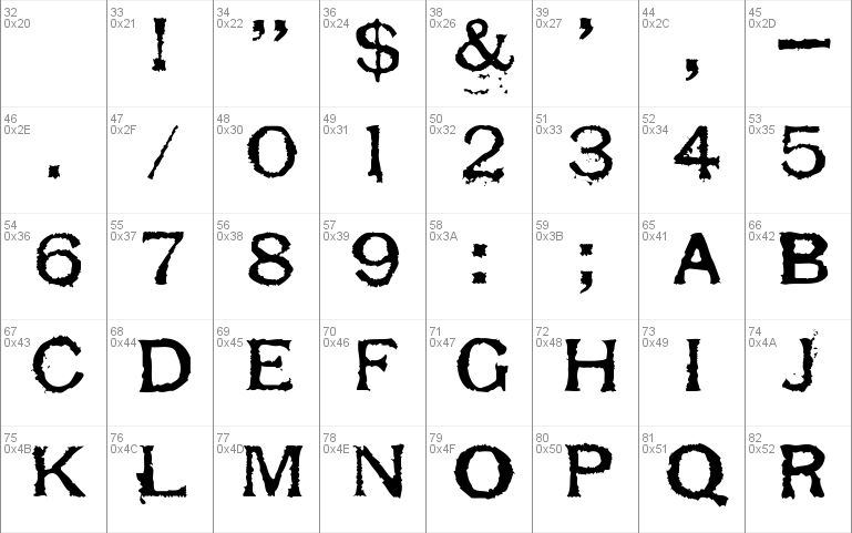
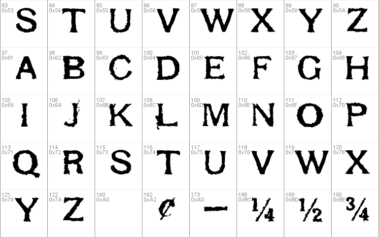
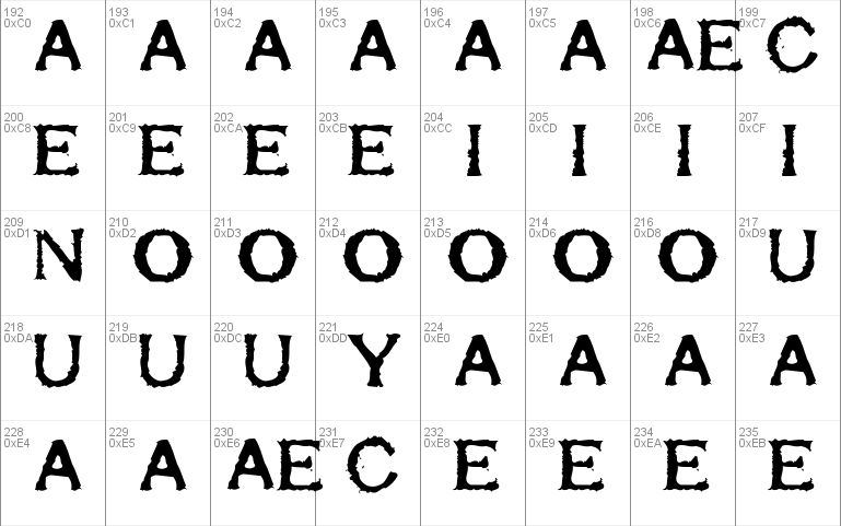
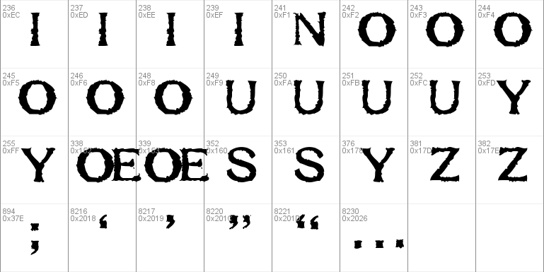
It contains a very limited number of characters:
0123456789ABCDEFGHIJKLMNOPQRSTUVWXYZ ! & $ � / - � � � � . , : ; �
That's it. Why? Because Respess Capitals was scanned
from rubber stamp impressions, and those are all the
characters that were in the stamp set.
Respess Capitals is named after the woman who sold me the
stamp set.
THE COOL PART . . .
Respess Capitals has four weights, all sharing their
character positions, kerning, and metrics: Light, Medium,
Heavy, Excessive.
You can swap letters from the four weights to add variety
and reality to your type, or easily overlap them to create
new letterforms and textures.
C'est cool, n'est-ce pas?
ABOUT DISTRIBUTION. . .
You may distribute this font shamelessly. You may translate
it to any platform, just don't change the name. You may
remix it, just give me credit and let me know.
V
{ }
{ . }
{ . . }
o o o o o o { . . . } o o o o o o
^ ^ ^ ^ ^ ^ ^ ^ { . . . . } ^ ^ ^ ^ ^ ^ ^ ^
| |
| [email protected] |
| |
| www.abecedarienne.com |
| |
o-----------------------------------------o


Comments