
- Styles (2)
- Character Maps
- License


- Free for Personal Use
- Free for Commercial Use
- Modification Allowed
- Redistribution Allowed
Extended information
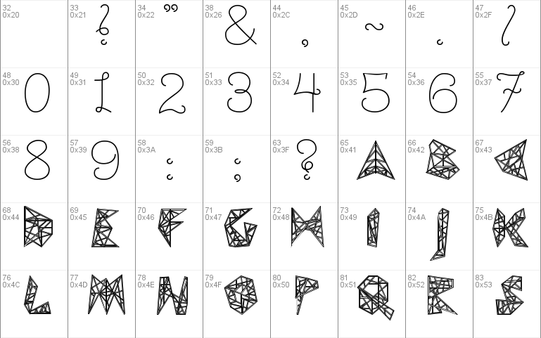
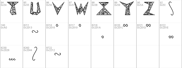
A typeface inspired by the electricity pylons crossing the countryside. Comes with a narrow and wide spaced version to mimic the effect of power pylon placement.
Read more
Pylon:
The Pylon typeface is a typeface based on the rhythm and lattice shapes of electricity pylons. For each letter a specific shape from a pylon was chosen and enlarged. This construction makes them interlockable, but also works with large spacing. Hopefully, with this typeface, people will be able to appreciate the shape and rhythm of pylons more, and will give pylon enthusiasts a new way to express themselves and their hobby.
-
Included is also the 'Pylon Wide' which mimics the pattern and rhythm of electricity pylons across the landscape.
Designed by Arthur Reinders Folmer
www.arthus.nl
Comments