- Styles (2)
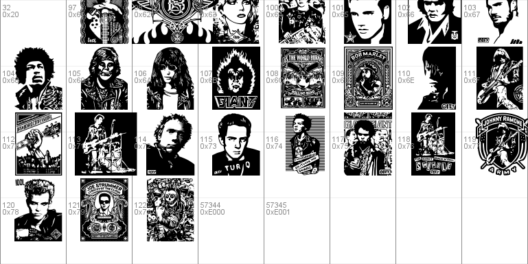
- Character Maps
- License


- Free for Personal Use
- Free for Commercial Use
- Modification Allowed
- Redistribution Allowed
Extended information
This is one of twenty-seven fonts in the Obey Series.
Read more
The Obey series of fonts are � 2009 by bobistheowl for Metaphase Brothel Graphics. Obey Giant concept and the Obey campaign are � by Shepard Fairey, 1989 - present. All rights reserved.
These fonts are freeware, but if you have any reason to use them commercially, you should get approval from Shepard Fairey at http://obeygiant.com
These fonts were made with MS Paint and ScanFont 3.13. All source graphics were hand drawn or manually traced from images found on the Internet. No pre-existing vectors or scanned images were used. For those who are interested, the original monochrome bitmaps used as source graphics for these fonts are available as a separate download on my homepage, hosted by Luc Devroye:
http://cg.scs.carleton.ca/~luc/bobistheowl.html
Open Type versions of some of these fonts exist. Both the .otf and .ttf versions, (which I consider to be superior to the .otfs), are available on my homepage, but only the .ttf versions will be circulated to other font download sites.
Each font in this series is available with both a lower case and a caps version. Some of my previous fonts were compatible with Windows Vista only when the character set was in capitals. I am hopeful that this new series will work with all operating systems, (they work fine with Windows XP, and my previous, more complex fonts generally worked fine with Mac, Unix, and Linux systems).
If you like these fonts, please let me know in a comment on the site where you downloaded them, or you can reach me by e-mail at [email protected]
Frank Shepard Fairey (born February 15, 1970) is a contemporary artist, graphic designer, and illustrator who emerged from the skateboarding scene. He first became known for his "Andr� the Giant Has a Posse" sticker campaign, in which he appropriated images from the comedic super market tabloid Weekly World News. His work became more widely known in the 2008 U.S. presidential election, specifically his Barack Obama "HOPE" poster. The Institute of Contemporary Art, Boston calls him one of today's best known and most influential street artists. His work is included in the collections at The Smithsonian, the Los Angeles County Museum of Art, the Museum of Modern Art in New York, and the Victoria and Albert Museum in London.
The genesis of the Obey campaign dates back to 1989, when a teenaged Shepard Fairey began to make vinyl skateboard stickers with the image of professional wrestler, Andr� the Giant, accompanied by the slogan "Andr� the Giant has a Posse", as an in-joke directed at hip hop and skater subculture, and then began clandestinely (and somewhat fanatically) propagating and posting them in Providence, Rhode Island and the rest of the Eastern United States.
Threat of a lawsuit from Titan Sports, Inc. in 1994 spurred Fairey to stop using the trademarked name Andr� the Giant, and to create a more iconic image of the wrestler's face, now most often with the equally iconic branding OBEY. The "OBEY" slogan was not only a parody of propaganda, but also a direct homage to the "OBEY" signs found in the 1988 cult classic film, They Live, starring Roddy Piper. About "Obey," San Diego Union-Tribune art critic Robert L. Pincus says Fairey's work, "was a reaction against earlier political art, since it delivered no clear message. Still, �Obey� was suggestively antiauthoritarian." "Following the example set by gallery art, some street art is more about the concept than the art," writes The Walrus (magazine) contributor Nick Mount. �'Fuck Bush' isn�t an aesthetic; it�s an ethic. Shepard Fairey�s Obey Giant stickers and Akay�s Akayism posters are clever children of Duchamp, ironic conceptual art."
sources: http://en.wikipedia.org/wiki/Shepard_Fairey
http://en.wikipedia.org/wiki/Obey_Giant
Fairey's artwork is, for the most part, derivative of other people's work, to the point of being considered plagiarism by many. Fairey himself claims to 'have have had an original idea', but his Obey campaign has proven to be diverse, prolific, and enduring. More recently, Fairey has published a book of his body of work, 'Supply and Demand - The Art of Shepard Fairey 1989 - 2009'.
This special series of fonts celebrates the twentieth anniversary of the Obey street art campaign, 1989-2009.
I had to completely rethink the way I make fonts to do this project. Previously, I had been creating source graphics 2� times as large as the finished glyphs, converting the images to 256 colour bitmaps, reducing the image to 40%, converting to monochrome, then filling in the 'islands' of black and white. This made for fonts with very large file sizes, and images that degraded significantly above 72 point size. The 256 colour transitional stage retained more of the colour source image than if the picture had been converted directly to monochrome, but it also made for fuzzy images, where I often had to guess whether certain pixels should be black or white.
I continued to use this process until about mid-February, 2009, but I was unhappy with the quality of the results, so I decided to edit full colour images directly to monochrome, mostly through manual tracing, but I did adapt many of the images to the extent that the connection between the original source images and the final graphics used for the fonts is not always immediately obvious. I learned a lot of new skills while working on this project, and it would have been completed months ago if I hadn't learned to edit the fonts after importing them into ScanFont, but they are all much the better for my having taken that additional time to do them right.
So, why would I spend a year drawing Obey Giant? Well, first, these pictures were fun to draw. Well, they weren't so fun when I was spending more than ten hours working on a single glyph, but they were very satisfying when completed. I always strive to make the most complex fonts possible, and these were certainly a challenge. I learned much about the technical aspects of font making, something completely lacking in my previous fonts, and this project allowed me to try a number of experiments, all within a common concept. I hope you like them as much as I do.
~bobistheowl
List of fonts in the Obey Series:
Obey3D
Obey3DAlt
ObeyAssorty
ObeyBalloon
ObeyBalloon2
ObeyDada
ObeyEssence
ObeyFaves
ObeyFunhouse
ObeyGalleria
ObeyGiantPoster
ObeyGiantPosterCondensed
ObeyPatterns
ObeyPears
ObeyPotpourri
ObeyPuzzle
ObeyRevolution
ObeyRockers
ObeyRorschach
ObeysTile
ObeyTown
ObeyTownAlt
ObeyTyrant
ObeyVenice
ObeyWrappers
ObeyXL1
ObeyXL2
Individual font notes:
Obey3D: The A, B, and J glyphs were among the last few graphics I completed. The J is probably my personal favorite in the series. Originally I had planned to do a mirror image of the S glyph, but that one took too long to edit after being imported into the font, so I used something else instead for Obey3DAlt.
Obey3DAlt: This is mostly mirror images from the Obey3D font, with a few unique glyphs. The two halves of the A are combined differently.
ObeyAssorty: This was the last font completed. It contains glyphs left over from other fonts, as well as the last few glyphs completed, other than the ones used in Obey3D and ObeyRockers.
ObeyBalloon & ObeyBalloon2: These were completed in August, 2009, around the same time as ObeyGianPoster and ObeyGiantPosterCondensed. The Giant face was cut into six sections, and stretched horizontally at different percentages, then recombined. There are only twenty-four glyphs in ObeyBalloon because the Y and Z were too wide for Open Type, but they could be produced in .ttf.
ObeyDada: Like ObeyBalloon, ObeyBalloon2, and ObeyFunhouse, I split the Giant face into different sections, (this time using half of the face, split into six sections, three each for the top and bottom). This font was completed in one take, with no revisions. As with ObeyFunhouse, the original graphics for this font are quite rough, compared to most of the other fonts in the series. They were edited within ScanFont instead, mostly by deleting superfluous vector nodes to smooth the lines.
ObeyEssence: This was the penultimate font, followed only by ObeyAssorty. I drew the last three of the devolving Giant faces.
ObeyFaves: This is the sampler font. All of the glyphs in this one also appear in other fonts. I did endless revisions on this font, mostly for the U glyph, with all the tiny lettering. That one was a major challenge to homogenize the lettering for the four lines of text. ObeyFaves was one of the early fonts, and all of the completed glyphs were later copy/pasted into other fonts in the series.
ObeyFunhouse: These were experiments with stretching and skewing, to produce 'Hall of Mirrors" type results.
ObeyGalleria: Many of the best 'miniprints' appear in ObeyGalleria. The Peace Goddess, (glyphs D-G), is almost symmetrical, so I made three additional variations, combining the left and right sides of the image with a mirror copy, and also flipping the original horizontally for the G. Many of the glyphs in ObeyGalleria also appear in an enlarged version in ObeyXL1 and ObeyXL2.
ObeyGiantPoster: This was the first font completed. I attempted to do some minor editing on this font in December, (to smooth the inside of a couple of Os), but this shrunk the size of some of the other glyphs for some reason, so I left it as is.
ObeyGiantPosterCondensed: This is ObeyGiantPoster with each glyph condenced horizontally to 50%.
ObeyPatterns: A few of the colour inverted glyphs were created by changing the monochrome bitmap of the original glyph back to 24 bit, then I inverted the colours of the center, then I inverted the colours of the glyph. I usually use red and light blue when doing this, as they are complementary colours for each other in MS Paint.
ObeyPears: The glyph used for B and C is the original size for this version of the Obey logo. I later expanded it for the versions that appear in ObeyGalleria and the two ObeyXL fonts. The E is copied from ObeyFaves. I didn't want to spend a couple of extra days doing the same revisons to the F glyph. It can be created by changing the foreground and background colours of the E glyph. Much time was spent doing the leaves for the U and V glyphs. A larger and better version of the V glyph can be found in ObeyXL2, (G). I drew the Y and Z glyphs. I'm lefthanded, so this was about as well as I could draw the Giant with my right hand, but I think they look fairly convincing as fake kids' drawings.
ObeyPotpourri: This font contains leftovers from other fonts, mostly from when I had more than twenty-six graphics for a specific theme. The rest of the extras ended up in ObeyAssorty.
ObeyPuzzle: This font works best at 48 points. I had originally planed to fill the remaining eight letter spots, (S-Z), with two smaller 2x2 puzzles, but I decided to do ObeyXL1 and ObeyXL2 instead.
ObeyRevolution: Most of the politically themed glyphs appear in this font, or in ObeyTyrant. In November, 2008, when Barack Obama was elected President of the United States, Luc Devroye suggested that I make a politically themed font. I did the single glyphed Obamaglyph font the next night. That got me thinking about making new fonts with more detail to the source graphics. I had downloaded a number of Obey Giant graphics some months previously, but I hadn't done anything with them yet. This got me started on this project, which has taken more than a year to complete, although, in fairness, I don't think any graphics completed before mid-February 2009 made it into the final fonts. Some of those early graphics were re-edited significantly, but most were completely redrawn, from scratch.
ObeyRockers: This was the first font where I did significant editing to the glyphs after they were imported into ScanFont. After seeing the results, I went back and re-edited all of the fonts I had completed to that point, except for the two ObeyBalloon fonts and the two ObeyGiantPoster fonts. It took about five weeks to make those revisions, but all of the fonts are much better, as a result. There were several last minute additions to this font. The A, H, M, O, W, X and Y were all made after the original test version, mostly replacing mirror images of other glyphs in this font. The A was the first glyph in the series that was edited significantly within the font program. I wanted the wording on the guitar to be legible at 72 points, and that's when I started to modify vector nodes.
ObeyRorschach: This is probably the weakest font in the series, but it has some interesting glyphs.
ObeysTile: This is one of the four fonts I completed on December 10, (All but six of the glyphs in the previous font, ObeyWrappers, had been completed the previous day), and I hadn't intended to do this one, but the source graphics for the last five glyphs required almost no editing at all. Other than rounding the mustache points, there was little that needed to be done on most of these. The ones where the chins met for regular and colour inverted faces took a bit of extra time, but there weren't many of those.
ObeyTown: This is one of the earlier fonts in the series. As in ObeyTownAlt, Obey3D, and Obey3DAlt, I did a lot of experimenting with perspective. I really enjoyed calculating the line slopes in several of these. The W is one of my favorites in this series, but I think it is both too wide and too complex to have been used in ObeyFaves, making an Open Type version of that font impossible.
ObeyTownAlt: This is mostly horizontally flipped versions of glyphs from ObeyTown, with a few unique glyphs.
ObeyTyrant: This is the second political font, and companion to ObeyRevolution. A few of the very early glyphs, (prior to mid-February), appear in this font, but they were extensively re-edited before I made the font.
ObeyVenice: There is only one glyph in this font, but it tiles beautifully at 48 points. The Obey Venice Pattern print is new at obeygiant.com. The source graphic has unique dimensions, (403 x 403 pixels), and it would have suffered in quality if I had reduced it to 70%, (then there would have been about a day of editing), which is why it's in a font by itself.
I took the image from the website, trimmed the yellowish border, and converted it to monochrome. It only took about five minutes to touch up the corners, and I was very pleased that there were no gaps between glyphs when it was tiled at 48 points, (the glyph is too large to tile at 72 points in most applications). I did this one between ObeyWrappers and ObeysTile.
ObeyWrappers: With the exception of the B, this font tiles really well at 48 points. A gap appears half way through the lettering of the B at 48 points, but not at 72 points, while gaps appear in the tiled A glyph at 72 points, but not at 48. This was an exersize in making glyphs that look totally different when tiled, so it's both a technical and an artistic font.
Originally there were to be eight glyphs with the four Obey stars on the black background, (used for S,T, and U). but these took about ninety minutes each to fully edit, so I substituted some glyphs similar to those used in ObeysTile to fill out the character set. The minimal time needed to edit these substitute glyphs led to my decision to make the ObeysTile font, which was completed in full in about an hour and a half.
ObeyXL1 and ObeyXL2: After seeing that the file sizes of the earlier fonts were relatively small, (by my standards), I decided to see if I could make the graphics larger, and still remain within the memory limits of ScanFont. I decided to leave ObeyPuzzle at eighteen glyphs, and to do two extra large fonts instead.
I created the source graphics for the XL fonts by stretching the original source images by 200% horizontally and vertically. Most of the larger source graphics were extensively re-edited, but a few were edited entirely within ScanFont. I later found a larger image of the Peace Goddess, (K in ObeyXL1), and I redrew the Giant star from the headpiece, and copy/pasted it into the previously completed graphic. The Y in ObeyXL2 does not appear in a smaller form in any of the other fonts.
Comments