- Styles (6)
- Character Maps
- License


- Free for Personal Use
- Free for Commercial Use
- Modification Allowed
- Redistribution Allowed
Extended information
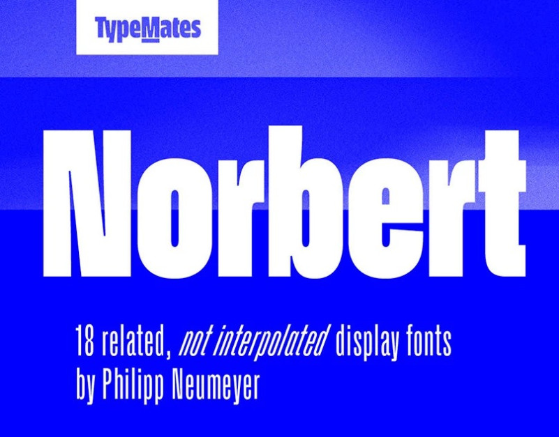
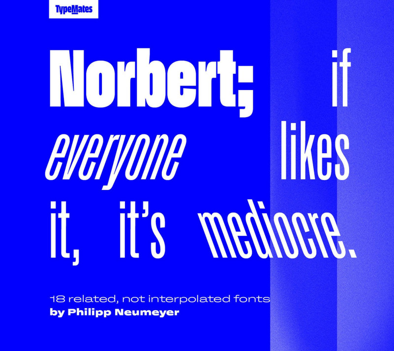
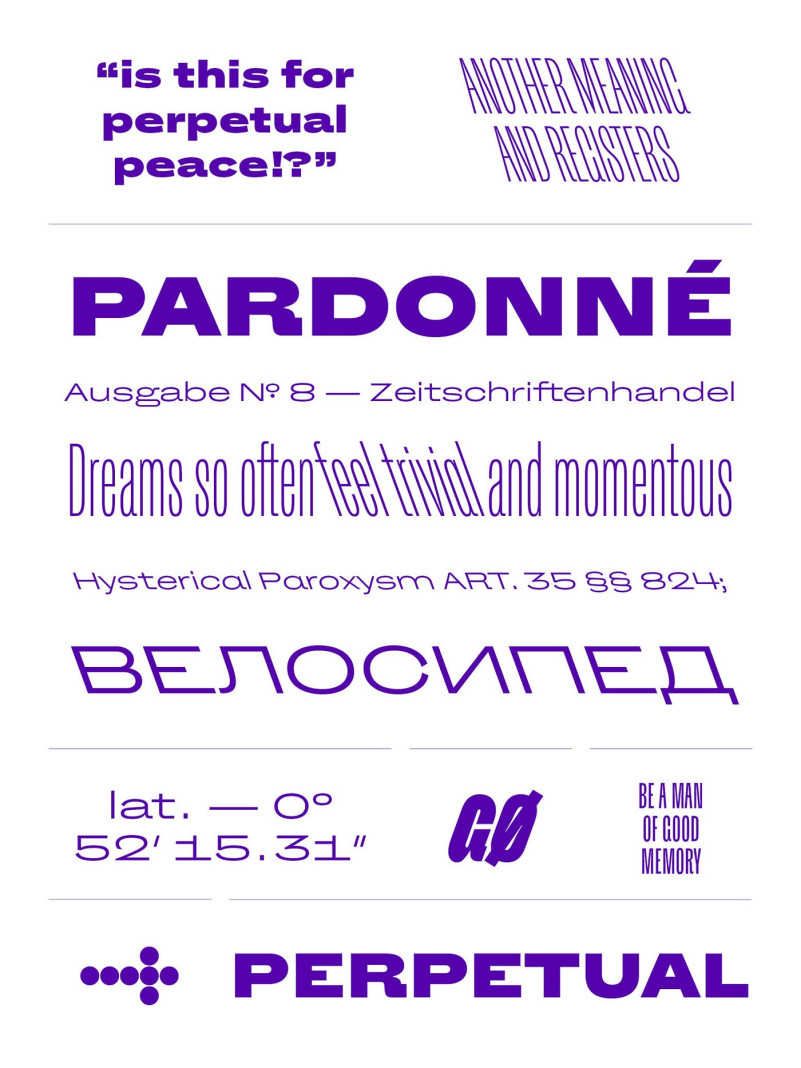
Norbert Sans Serif Font is a beautiful sans serif font inspired by motion and globalization. A collection of extremes, Norbert reflects on how the bundled-together styles of early hot metal type families were enriched by their contradictions and looks ahead. The result is an unaffected Grotesque and everything you never needed.
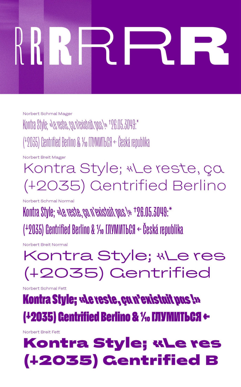
Harmonised without conformity, more familiar than family, Norbert’s three weights are in two widths: condensed (Schmal) and extended (Breit), each complemented by Kursiv and Kontra— backslanted—styles. Intentionally, Norbert has no regular width, variable font, or interpolated weights. Its character and versatility in identity and editorial work is a result of its styles being individually drawn, individually considered. It is what it is. Not a workhorse, but a typeface that can be delicate and rough for special occasions. As required, or not.
As with all TypeMates fonts, Norbert comes with extensive language support. Philipp was inspired by metal letters on a building in St Petersburg, so Norbert comes with Cyrillics proofed, scrutinised and tested by native experts. Philipp hopes you care about Norbert’s extensive range of arrows because he does.
Norbert Sans Serif Font is free for personal use. So, if you want to access more features and its full license contact TypeMatesdesigner
Comments