- Styles (1)
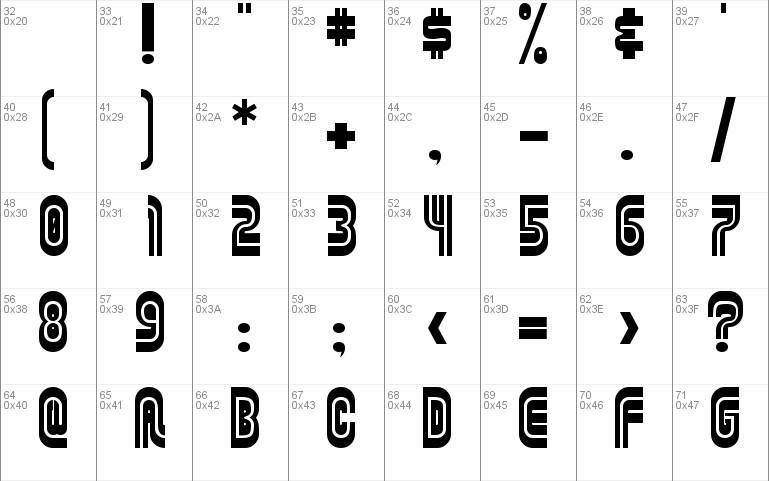
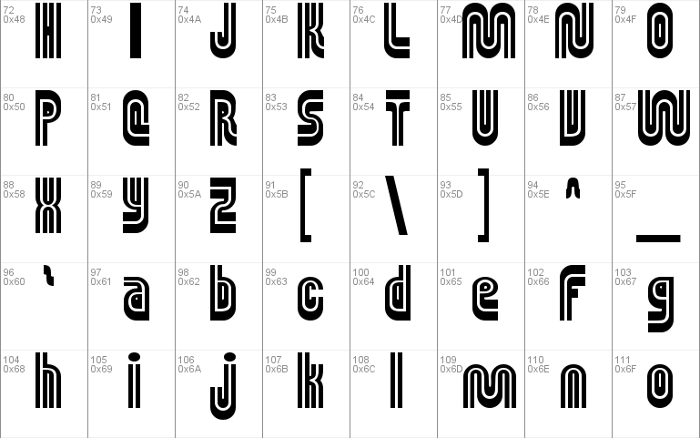
- Character Maps
- License


- Free for Personal Use
- Free for Commercial Use
- Modification Allowed
- Redistribution Allowed
Read more
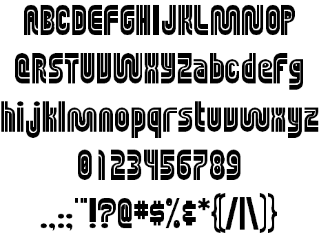
MUNIficent
The font based on the logo for the San Francisco Municipal Railway.
�1997 � 2000 by Down10/Jesse Burgheimer
Original Muni �Worm� design by Walter Landor, and property of the San Francisco Municipal Railway. All rights reserved. Used without permission.
Version 1.2
This font is FREE. Freeware. No quarter asked, no quarter given.
Please do not redistribute without expressly written consent of the creator (Down10 aka Jesse Burgheimer).
Changes in 1.2:
- Rebuilt font within Illustrator, with better alignment and curvature.
- Adjusted line height.
Rationale:
For those of you who�ve taken the bus in San Francisco, you know all about Muni. I don�t mean the cute cable cars rooming up hills that everyone seems to picture in this city� That would be too easy. I�m talking about the darker side of the Municipal Railway�everything else.
The service has been attacked again and again over its failure to meet national and local standards, and many SF citizens have been frustrated over the lack of quality in transportation that most of us have come to expect. The buses are unkempt and unclean, opperate on random time schedules, and the interior atmosphere is rather unpleasant at that. Ask any SF citizen about which two words describe the Muni, will likely say �crime and punishment� instead of �quality and comfort.�
Regardless, Muni has a neat logo on all the buses and stops, which I found to be most interesting. It was created by master graphic designer Walter Landor, which Muni had bought for $100,000. Dubbed the Muni �worm� by the locals, it looks like a cross between the logos of CNN and the Jeopardy! game show. I�m sure it was meant to give the sleek and fancy look to a healty bus system, but now it just looks more like an oblong 1970�s futuresque language. I love it, but I guess it�s become associated with the poor quality of the bus system.
Muni made an attempt to change the logo a few year ago, but it met with rather negative attention. I don�t see the current one disappearing anytime soon.
This is why I�ve created the first (I think) typeface based soley on Muni�s �worm� logo, which I have titled �MUNIficent.� It still has the curved techno look to it, yet with the same well-meaning 1970�s appeal. It wasn�t easy creating a logo out of four letters, though. This is the first font I�ve ever created, so cut me some slack. Macromedia Fontographer is not a simple program, but it was more than enough to whip out this font.
The best part about this font is that I�m not charging $45 for it. I�m not charging $25. Not even $5. It�s absolutely FREE. I hope you find that very munificent of me. My only request is that you write back to me through e-mail with some much needed feedback about it, and tell me if you plan on putting this font up on your web site.
Thanks for the download, and please�do the environment and the freeways a favor�take mass transit.
�Jesse D. Burgheimer \ Down10
[email protected]
http://www.down10.com/
Comments