- Styles (1)
- Character Maps
- License
Miltown


- Free for Personal Use
- Free for Commercial Use
- Modification Allowed
- Redistribution Allowed
Extended information
Font family: MiltownFont subfamily identification: RegularUnique identifier: Apostrophe('): Miltown BETA: 2000Full font name: MiltownVersion: Version 0.4; 2000Postscript font name: MiltownDesigner: Apostrophe (')Description:
Read more
Yet another showing of classic type demolished, this time sinking Times a bit further.
The idea for a second Miltown came from a designer friend of mine who tries his best to break out of the norm in everything he does. For as long as I've known him, he's been shedding light on things from angles which can in most cases qualify as an "unexplored perspective" as another friend of mine would label it. One of his funky habits is watching television and movies in black and white and only in black and white. He has his VCR set up to drain the colour from everything that plays through it.
One day last month, I was at his place and he was watching the Matrix movie. In black and white, of course. I took one look at the very familiar titling, and was very surprised to realize that it looked sharper, tighter and much better overall with a greyscale background. So I decided to try imposing the greyscaling on the background of the original Miltown. To do that, I simply drew a vertical rectangle in Illustrator and placed it randomly over each character. It looked good, and it did scream movie titling. Since the experiment was favourable, the technician in me decided to go the extra step on the font.
To make a long story short, here's what's new in Miltown II:
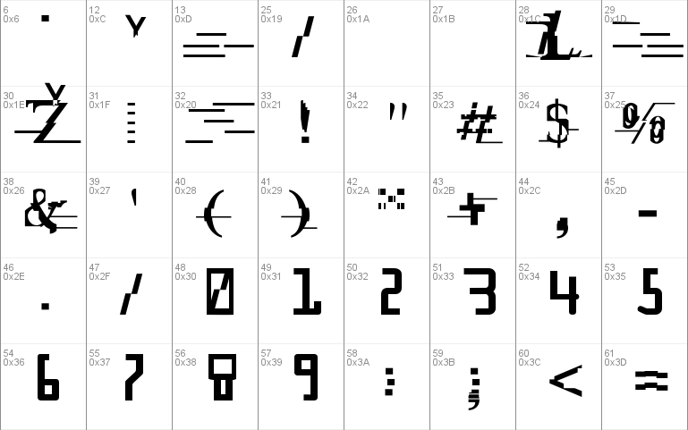
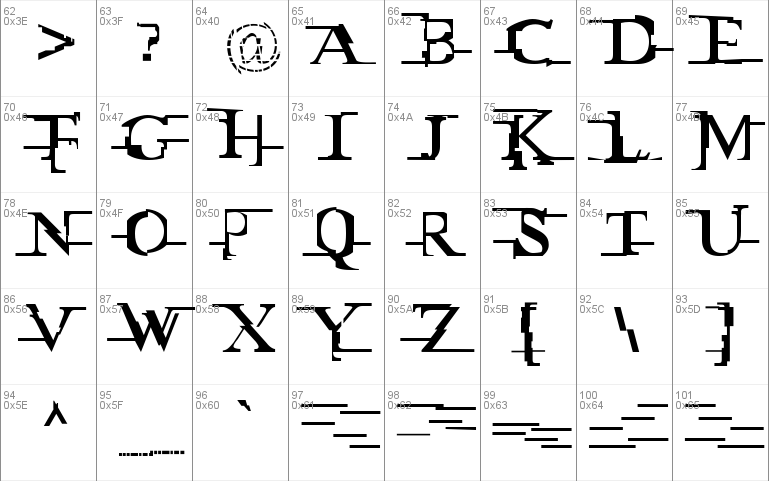
- The caps are the semi-knocked-out characters, while the lowercase letters are the same as the uppers in the original Miltown.
- The space stroke in this font will produce a blank 450 em wide space, as opposed to the variety of "fillers" that were in the original Miltown.
- Brand new numbers, as opposed to the OCR-like digits that were in Miltown.
- Complete character set. Although the original Miltown had many accented characters, it was nowhere near complete. This one is. It has all the monetary characters, for instance. The @ was remade to fit the style. And a bunch of other letters were either added or remade. If you liked and used the original Miltown, I suggest you take a closer look at this one to see where you can benefit more from its usage.
- Fitting and kerning were revised extensively. Although spacing the characters properly is nearly impossible in a font with a really random width and height structure such as this baby here, I tried my best to trap all the characters in their kerning. So EVERYTHING is kerned. Upper-upper, upper-lower, lower-lower, lower-upper, digits, accented-upper, accented-lower, lower-accented, upper-accented, etc. The result is 8838 kern pairs.
All in all I strongly recommend using this font instead of the original Miltown. Whatever you did with the original can be done with this font, except for the space fillers and the OCR-like numbers, which one can always use the original Miltown to produce. However, if you want to reproduce the spacing of the letters in the Matrix title, you should stick to the original Miltown. Miltown II, though it has a much better tightness to it, was not kerned to match the spacing of the movie title, but to actually look better in a demolition-man sort of way.
It's getting late. I'm out of here.
Don't drink and fly.
'
Miltown is based on the M, A, T, R, I, and X forms of The Matrix movie title. I tried to be as faithful as I could to those particular forms. I had no idea what the other forms in that particular alphabet would have looked like, so I used my imagination. Hope you like it and use it in good health.
Here are some helpful pointers regarding this font:
- The capital letters of this font are what actually constitute the alphabet, while the lower case characters are different variations of possible fillers or space alternates. A character table PDF should be enclosed with the font to explain this. Some JPEGs of very basic sample usage should also be included. For best showing, on screen and in print, I recommend that you use the font at 72 points and above.
- This font didn't take much to make. About 30 hours altogether. The demolition of Times New Roman, and of classic type in general, has seen many spins and ramifications in a large percentage of designs and publications that started in the late 1980s and is currently still happening. This is exactly what the designer of the Matrix titling did, and this is precisely what the Miltown font is: destruction of classic type. I'm not particularly fond of demolition jobs, but the object here was to replicate the Matrix's title. Let's just say that I winced a lot while making this thing.
- The reason I took on this project in the first place was mainly the enormous demand for "the Matrix font" on alt.binaries.fonts. If you see any movie/television/publication titles that you are particularly fond of and that doesn't already exist in the form of a font, feel free to contact me at [email protected]. I will try to accommodate.
- Miltown is the name of a tranquilizer/anti-depressant that was commonly prescribed by psychiatrists in the late 1960s and throughout the 1970s. The current day equivalent drugs have names like Prozac, Effexor, Zoloft, Paxil, Wellbutrin, Lithium, Valium, and so on. Miltown was one of the very first "mental health" drug approved by governments. Its side effects were numerous and warning labels about it were all over the place. For more information about Miltown, just type ["Miltown" AND "mental"] (without the brackets) in your favourite web search engine.
Surf's up...
'
Comments