

Download (zip 266.9 Kb)Add to favouritesReport this font
- Styles (7)
- Character Maps
- License
7 styles for
90 characters


- Free for Personal Use
- Free for Commercial Use
- Modification Allowed
- Redistribution Allowed
Read more
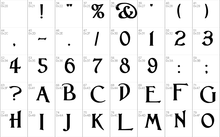
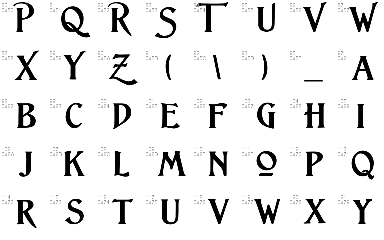
Lightfoot
After years of debating with myself whether the larger caps in a
small caps font should extend above or below the line - here's the ultimate
answer......some each way!
Seriously, to me the Lightfoot family suggests something of the charm of
turn of the century, Edwardian, signwriting. A fun family of seven faces
that manage to combine (relative) minimalism with period charm.
Paul Lloyd
http://moorstation.org/typoasis/designers/lloyd/index.htm
[email protected]


Comments