- Styles (1)
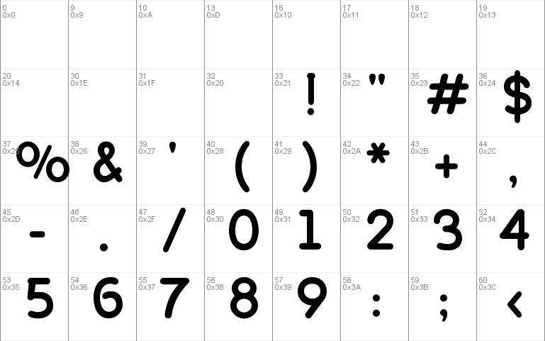
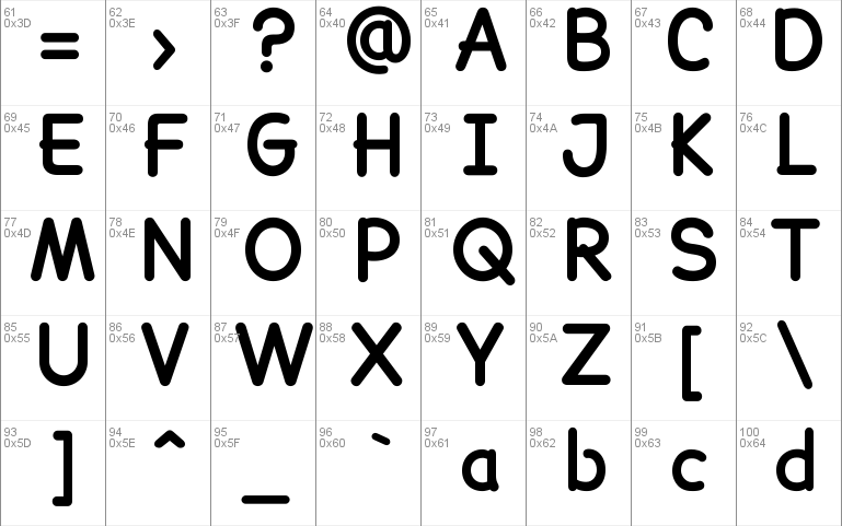
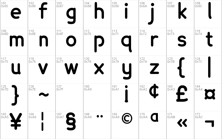
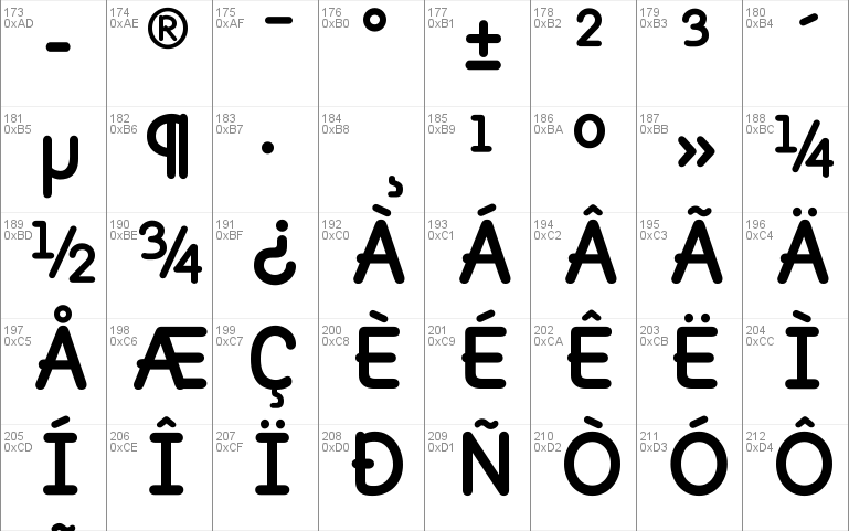
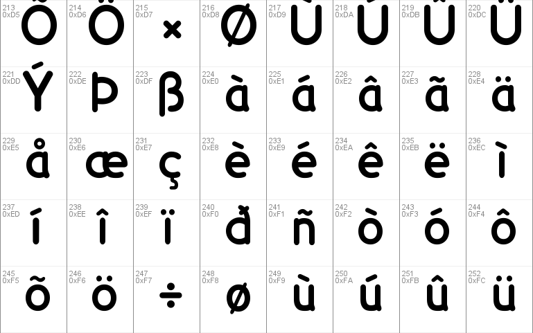
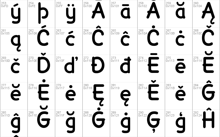
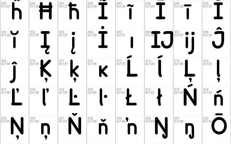
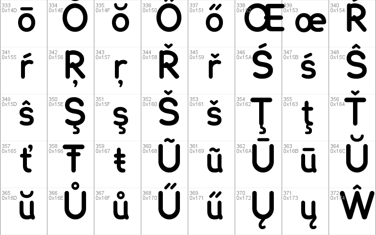
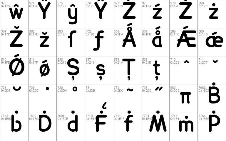
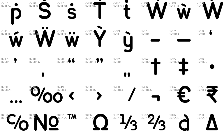
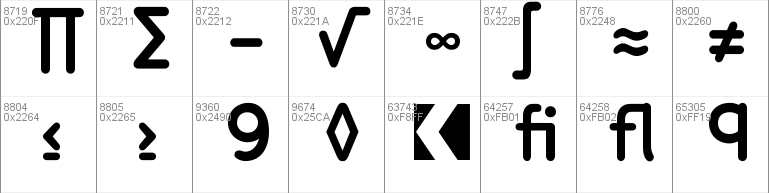
- Character Maps
- License
Lexie Readable


- Free for Personal Use
- Free for Commercial Use
- Modification Allowed
- Redistribution Allowed
Extended information
Font family: Lexie ReadableFont subfamily identification: BoldUnique identifier: pyrs: Lexie Readable Bold: 2015Full font name: Lexie Readable BoldVersion: Lexie Readable Bold (v 5.2) by Keith Bates
Read more
=== LEXIE READABLE ===
=== LEXIE READABLE ITALIC ===
=== LEXIE READABLE BOLD ===
=== LEXIE READABLE BOLD ITALIC ===
=== LEXIE READABLE HEAVY ===
=== LEXIE READABLE HEAVY OUTLINE ===
Keith Bates / K-Type © 2004, 2015 (version 5.2)
www.k-type.com - [email protected]
The Lexie Readable family (formerly Lexia Readable) is designed for maximum legibility. K-Type has tried to capture the clarity and accessibility of Comic Sans without the American comic book associations and whimsical, childlike quality which are culturally inappropriate for many uses and may seem patronizing.
Lexie Readable is an attempt to retain the strength, friendliness and legibility of Comic Sans, and even a slightly marker-drawn feel, whilst tidying up the comic book idiosyncrasies. It adds a hint of dignity, a sprinkling of refinement, and introduces elements of designer type to appeal to a contemporary audience.
Whilst Comic Sans has long been a preferred choice for infant typography from 'Baby on Board' stickers onward, its use risks undermining any serious message and appearing condescending to readers with greater visual maturity, issues that are particularly acute when applied to adolescent and adult literacy.
Typographical concerns from recent educational publications and discussions, and some highlighted by the British Dyslexia Association have been incorporated into the design of Lexie Readable - the simpler, handwritten forms of a and g, the non-symmetry of letters such as b and d, good sized descenders and ascenders, generous spacing and excellent screen clarity.
Many more accented characters have been added to each weight to complete the Latin Extended-A range. Several minor outline, spacing and kerning improvements have also been made.
The numeral 9 has been replaced by the more popular, diagonal leg alternative.
------------------------------------------------
== Licence Information ==
The Regular and Bold weights of Lexie Readable are available free for personal use; these two fonts can also be used free of charge, without a licence, by educational and charitable institutions.
Licences are required for italic and heavy weights of Lexie Readable. Licences are required for business use of the Lexie Readable family –
http://www.k-type.com/licences
------------------------------------------------
== Installing Fonts ==
Fonts are placed in your operating system's Fonts folder and will be made available to all the applications or programs you use.
= Windows =
Put the .ttf or .otf font file into C:\Windows\Fonts, or right-click on the font files > Install
= Mac =
Put the .ttf or .otf font file into /Library/Fonts
------------------------------------------------
Comments