
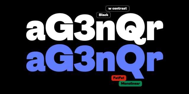
- Styles (3)
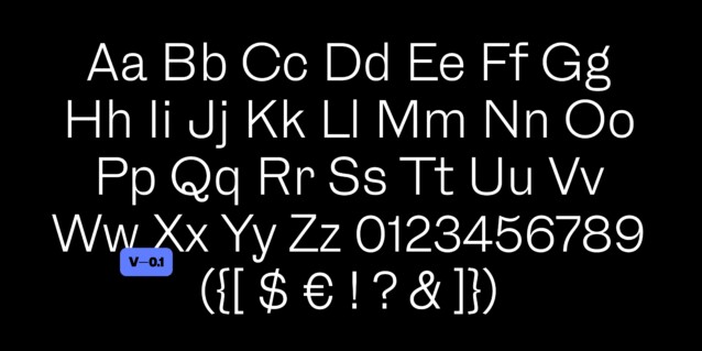
- Character Maps
- License


- Free for Personal Use
- Free for Commercial Use
- Modification Allowed
- Redistribution Allowed
Extended information
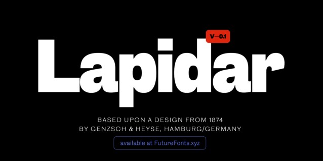
Lapidar Font is a variable geometric sans serif font family inspired by late 19th century metal type. Lapidar was first introduced in 1874/75 as an uppercase only typeface by Genzsch & Heyse from Hamburg/Germany, unfortunately without naming any of the designers. Around 1895 a set of lowercase letters was introduced. Even a very narrow design (under the same name but with very different design features) was marketed. Surprisingly all these styles had only one weight: the same Semilight/Regular weight.
While intending to keep the historic feel of the typeface it was apparent that some of the stranger idiosyncrasies of the historic model had to be ironed out: The very narrow »A« or »M« were widened to make them fit into the uppercase system more organically. Other elements such as the varying angles of the terminals (a, c, e, s, r…) were kept as inconsistent as in the original. The original design is also quite inconsistent across type sizes making it a challenge to decide which form to use in the revival. The introduction of a heavy weight is challenge in itself since it was a search for a bold design true to the existing lighter weight without a historic model.
Lapidar Font is free for personal use. So, if you want to access more features and its full license contact Character Type designer
Comments