
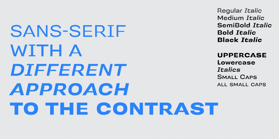
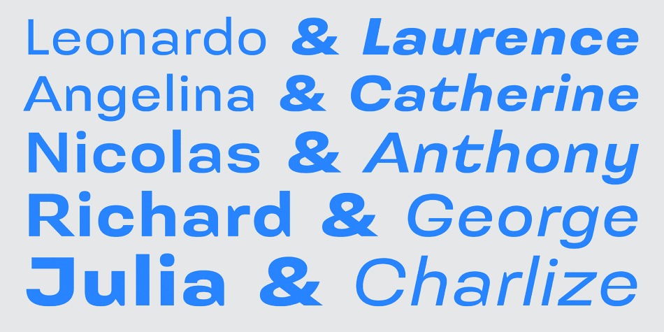

- Styles (6)
- Character Maps
- License


- Free for Personal Use
- Free for Commercial Use
- Modification Allowed
- Redistribution Allowed
Extended information
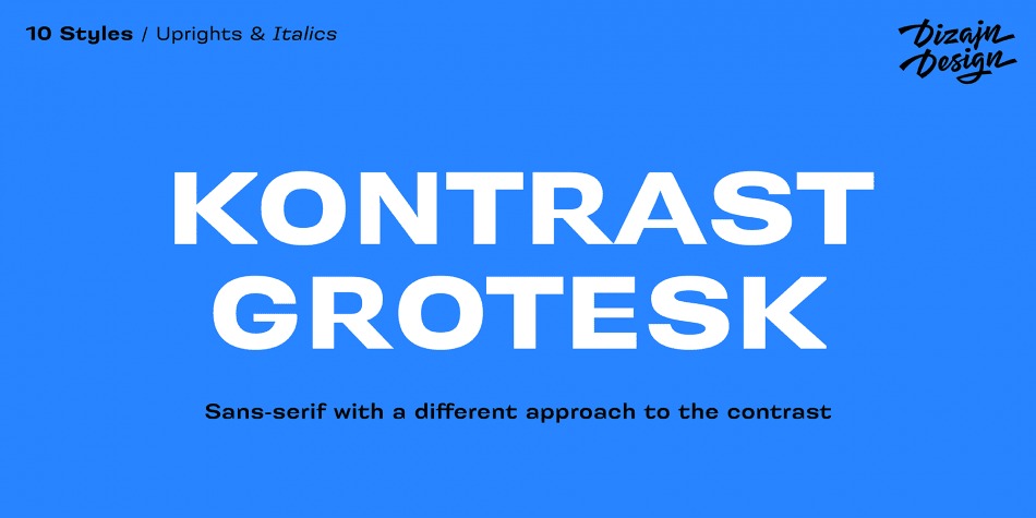
Kontrast Grotesk Sans Serif Font
This is a Swiss style modernist sans serif type family characterized by the play between elegant rounded shapes and sharp angular details. It was inspired by W. A. Dwiggins and his experiments with the stroke variations. Contrast in this typeface is created not only with the influence of the writing tool (the thickness of horizontal strokes in relation to vertical), but by setting the primary and secondary construction strokes of the characters (e.g. glyph “E”).
The grotesque types are usually with no or minimal contrast. Having the contrast has created a new and original look of this typeface without compromising the legibility. The fonts are designed for fluent reading on the screen. A little wider proportions are specially welcome with no need for saving a space as it is in printed media.
Kontrast Grotesk Sans Serif Font is free for personal use. So, if you want to access more features and its full license contact dizajndesigndesigner
Comments