
- Styles (1)
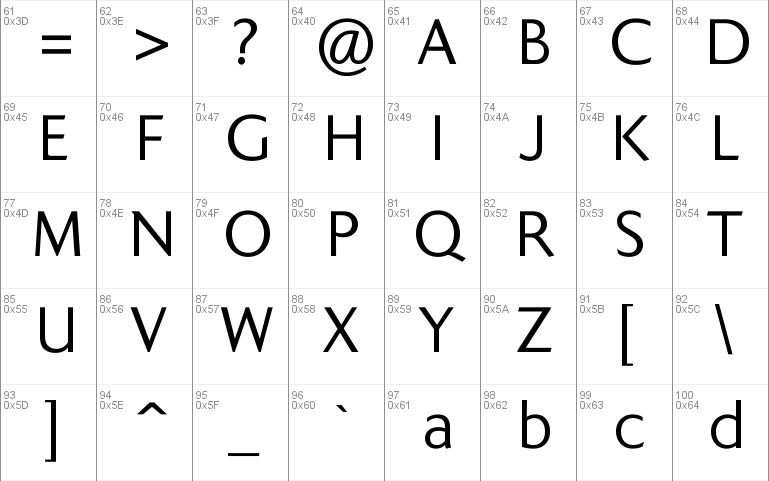
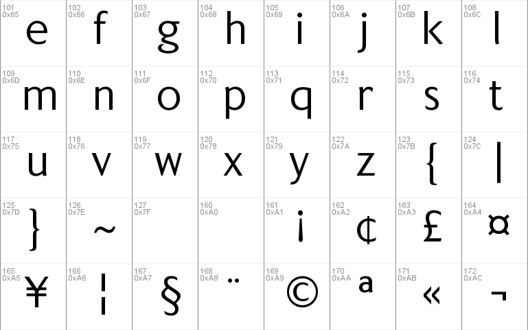
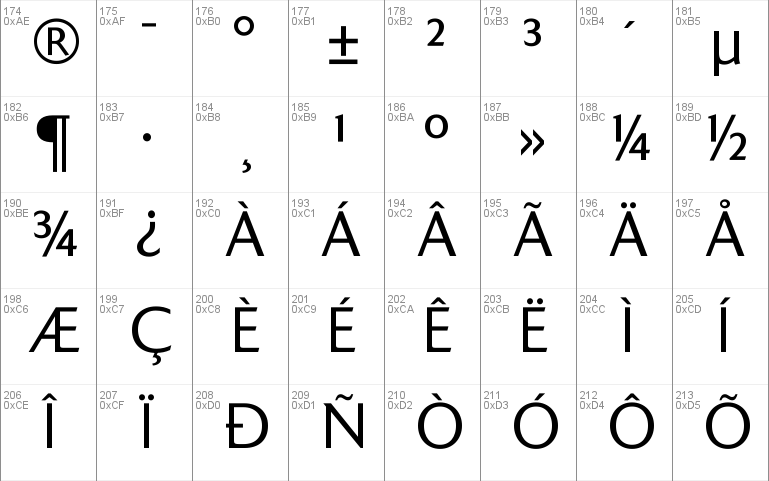
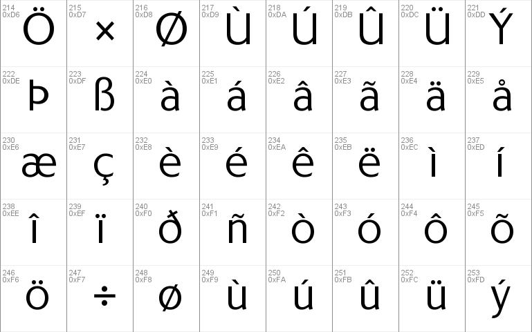
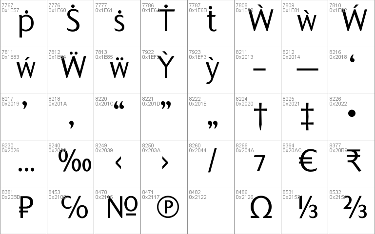
- Character Maps
- License


- Free for Personal Use
- Free for Commercial Use
- Modification Allowed
- Redistribution Allowed
Extended information
Many street nameplates in Britain use versions of Kindersley serif capitals designed by David Kindersley in the 1950s. K-Type Kindersley Sans is an unfussy alternative to the signage stalwart, perfectly suited to newer environments and more contemporary tastes.
Kindersley Sans is a humanist sans-serif that conserves the Gill-inspired character and some of the calligraphic qualities of Kindersley’s lettering, it retains the Roman proportions and its Britishness, but traditional prettiness and intricacy are discarded in favour of a clean modernity. For purposes where Transport (MOT) is considered too formal and Kindersley too old-fashioned, Kindersley Sans offers an open and amiable up-to-date alternative.
The typeface is comfortably spaced and carefully kerned to deliver beautiful results with ease, and although designed with nameplates in mind, it excels as an all-purpose text face in print and on screen.
The tail of the uppercase Q has minimal descent to avoid constriction.
Kindersley Sans includes a lowercase designed for signage with short descenders to prevent unsightly congestion. A generous x-height assists legibility, and characters are designed for easy reading and distinctiveness. The curved foot of the lowercase L distinguishes it from the uppercase i.
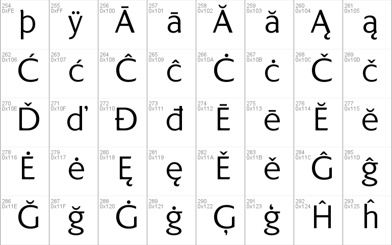
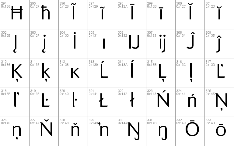
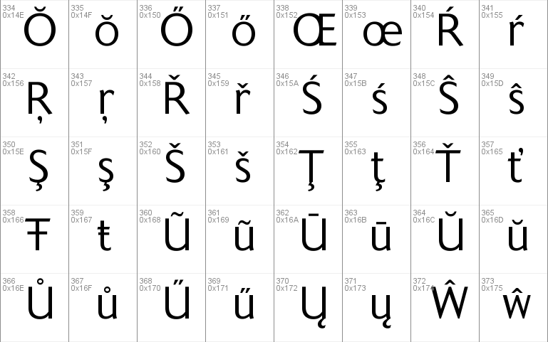
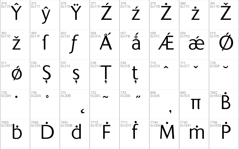
The six fonts contain a full complement of Latin Extended-A characters, Welsh diacritics and Irish dotted consonants, so European language nameplates need not be a source of frustration. The ascent and descent of accented characters has been kept to an acceptable minimum.
The licensed family includes all six fonts – regular, italic, bold, bold italic, medium and medium italic – and the regular weight can be downloaded Free for Personal Use.
Downloaded from https://www.1001freefonts.com/
Read more
=== KINDERSLEY SANS ===
=== KINDERSLEY SANS ITALIC ===
=== KINDERSLEY SANS BOLD ===
=== KINDERSLEY SANS BOLD ITALIC ===
=== KINDERSLEY SANS MEDIUM ===
=== KINDERSLEY SANS MEDIUM ITALIC ===
Keith Bates / K-Type © 2017 (version 1.1)
www.k-type.com - [email protected]
Many street nameplates in Britain use versions of Kindersley serif capitals designed by David Kindersley in the 1950s. K-Type Kindersley Sans is an unfussy alternative to the signage stalwart, perfectly suited to newer environments and more contemporary tastes.
Kindersley Sans is a humanist sans-serif that conserves the Gill-inspired character and some of the calligraphic qualities of Kindersley’s lettering, it retains the Roman proportions and its Britishness, but traditional prettiness and intricacy are discarded in favour of a clean modernity. For purposes where Transport (MOT) is considered too formal and Kindersley too old-fashioned, Kindersley Sans offers an open and amiable up-to-date alternative.
The typeface is comfortably spaced and carefully kerned to deliver beautiful results with ease, and although designed with nameplates in mind, it excels as an all-purpose text face in print and on screen.
The tail of the uppercase Q has minimal descent to avoid constriction.
Kindersley Sans includes a lowercase designed for signage with short descenders to prevent unsightly congestion. A generous x-height assists legibility, and characters are designed for easy reading and distinctiveness. The curved foot of the lowercase L distinguishes it from the uppercase i.
The six fonts contain a full complement of Latin Extended-A characters, Welsh diacritics and Irish dotted consonants, so European language nameplates need not be a source of frustration. The ascent and descent of accented characters has been kept to an acceptable minimum.
------------------------------------------------
== Licence Information ==
Licence URL: http://www.k-type.com/licences
------------------------------------------------
== Installing Fonts ==
Fonts are placed in your operating system's Fonts folder and will be made available to all the applications or programs you use.
= Windows =
Put the .ttf or .otf font file into C:\Windows\Fonts, or right-click on the font files > Install
= Mac =
Put the .ttf or .otf font file into /Library/Fonts
------------------------------------------------
Comments