
- Styles (4)
- Character Maps
- License


- Free for Personal Use
- Free for Commercial Use
Extended information
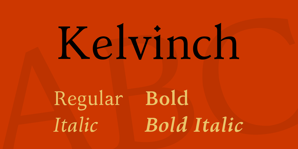
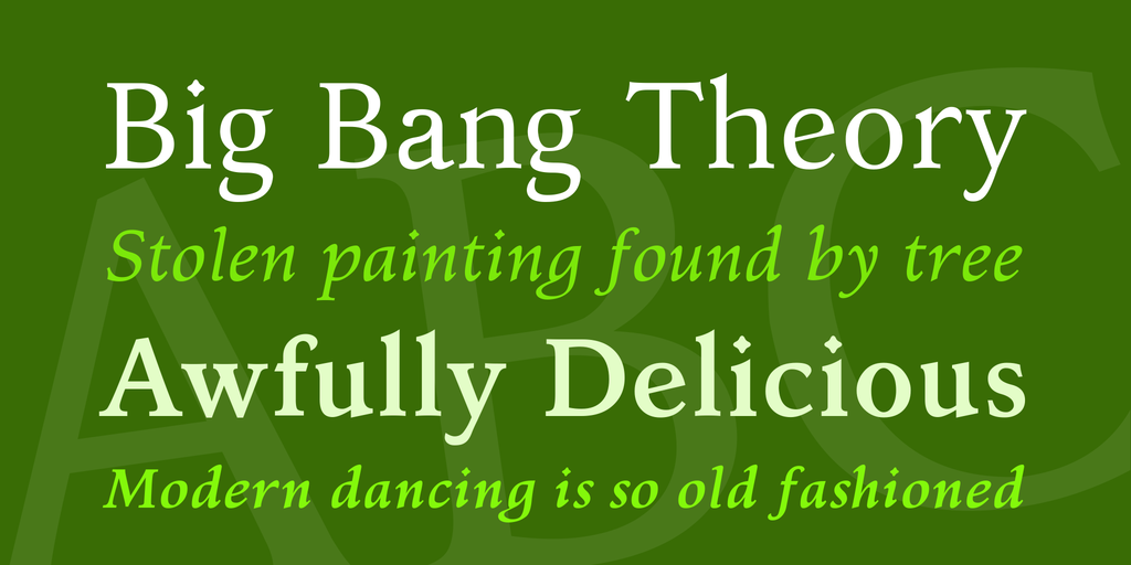
Although Kelvinch is meant for body text I have endeavoured to make the characters as aesthetically pleasing as possible without compromising its objective to be comfortable to read in long texts.
It comes in Regular, Italic, Bold and Bold Italic faces.
Kelvinch is a free font, free in the sense of free of restrictions and DRM but also free in the sense of cost.
Under the terms of the license you may use Kelvinch in any kind of publication, print or electronic, without fees or restrictions. You may modify the font for your own use. You may distribute your modified version in accordance with the terms of the SIL license.
You may use Kelvinch for any purpose including commercial usage. The only thing you may NOT do is sell the font on its own as a stand alone font.
Kelvinch is licensed under the SIL Open Font License: for the full text, go to scripts.sil.org/OFL.
It started out as my own personal font but somewhere along the way that changed and other people became interested in it and I took the decision to try to make it good enough that I wouldn't be embarrassed to know that other people were using it. I never once considered selling it.
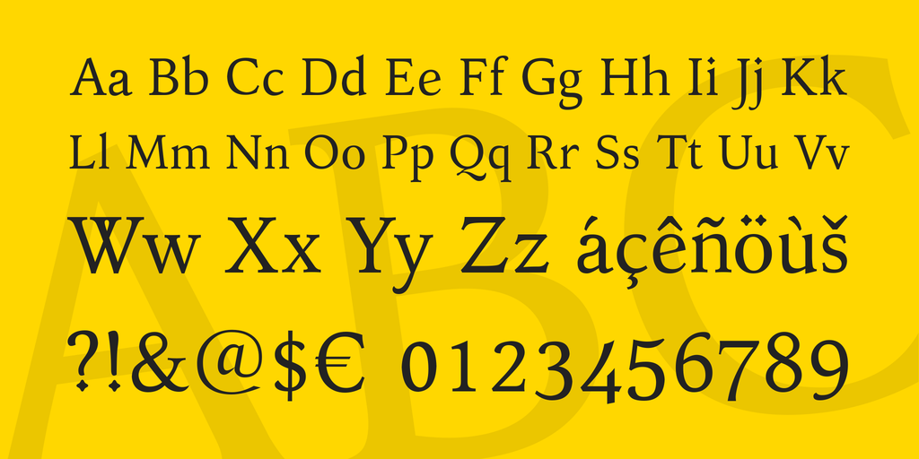
It covers many Unicode blocks including Greek & Coptic, Cyrillic, Georgian, Armenian, Mathematical Operators, Miscellaneous Symbols, Dingbats, Runes, Letterlike Symbols, Arrows and a comprehensive coverage of most of the Latin blocks.
It has taken over a year to develop.
Enjoy.
Update, 14th April 2016
Updated to version 3.1 - There was a fault in the kern tables in 3.0, some of the kern pairs for the Roman font didn't work. Also changed the position of many diacritic marks to improve the overall appearance of the font. Also changed the format of the download file from .7Z to .ZIP , although this is bigger it is also more compatible with computers which do not have 7zip installed.
Everything else is the same!
Update, 8th May 2016
And I thought this was finished, how wrong I was.
Based on the feedback I received I corrected some mistakes and changed a few things including the crossbar on the Upper Case 'A' which most people thought was a mistake. It's a pity, Kelvinch has lost some of it's character, but then character is not what you want in body text, it can become tiresome very quickly, oh well ...
Added some more Open Type features and re-kerned the whole thing.
Also changed the website address to the address of my blog, the free webhosting I tried wasn't very good and just seemed like they were trying to force people into getting their paid webhosting by offering very bad service to the free customers and making things very difficult for them. So kelvinch.uk never got up and running, sorry.
Hopefully this WILL be the last version.
11th May 2016
Minor update. I re-introduced the curved crossbar on the capital A as an open type stylistic alternative. The default is the straight crossbar.
Did the Historic Ligatures which I had always intended to do but in the midst of everything else it was forgotten until now. The characters were already there it was only the open type feature which needed adding.
Everything else is the same.
Hopefully THIS will be the final version.
Update 23 September 2016 - Version 3.3
Optimised all the glyphs, resulting in smaller files. Evened out and tweaked some of the kerning. Changed the ligatures to work better with Microsoft Word and added two characters new to the Unicode 9.0 standard.
Everything else is the same.
Update 10 January 2017 - Version 3.31
Sorted out three problems. Minor fixes. This is the final version!
Update 22 July 2017 - Version 3.4
Someone pointed out a serious bug in the font. This has now been corrected. Also the source files have been included in the .ZIP file. If you don't want to modify the font or use parts of the font for your own creation then just ignore the contents of the 'Source Code' folder. For normal use you only need the .OTF files.
Read more
FONTLOG
Kelvinch font family
====================
by Paul J. Miller (with help from others)
Status
------
Kelvinch is a free font, free in the sense of free of restrictions and DRM but also free in the sense of cost.
Under the terms of the license you may use Kelvinch in any kind of publication, print or electronic, without fees or restrictions. You may modify the font for your own use. You may distribute your modified version in accordance with the terms of the SIL license.
You may use Kelvinch for any purpose including commercial usage.
Kelvinch is licensed under the SIL Open Font License: for the full text, go to http://scripts.sil.org/OFL. It was also originally intended to be licensed under the GNU GPL (with the font exception). These two licenses are compatible with each other.
Without the font exception in GNU GPL you would be required to release any publications you write using Kelvinch into the public domain. With the font exception you can release any publications you produce under any license terms you want. You may use it for your latest book and sell the book either on paper or in electronic form without any restrictions or requirements.
The only thing you may NOT do is sell the font on its own as a stand alone font.
Kelvinch may not be the best choice of font for all occasions. If you are producing an electronic document for someone else and they don't have Kelvinch installed on their system the document won't be rendered correctly especially if you have used any of the characters from the Private Use Area. However you are free to give them a copy of Kelvinch so they can install it on their system. If you are going to do this it would be better to give them the .ZIP file you downloaded, but this is not a requirement because the .OTF files contain the license information within the relevant fields of the font file itself.
Kelvinch may be embedded in a .PDF file without any restrictions.
Another problem might arise if Kelvinch is used on a Website, Kelvinch has not been made into a WOFF project (this might change in the future, depending on demand) so if you embed Kelvinch into a website it is very likely that the computer viewing the website doesn't have Kelvinch installed and so the web page will be rendered incorrectly.
Compatability
-------------
If the application you are using doesn't support Unicode then you will only be able to use a subset of the first 256 characters of Kelvinch.
If the application you are using claims to support Unicode then it will certainly support 16 bit characters and probably support 32 bit characters as well. Newer applications are getting better at supporting Unicode but some applications still only support 16 bit characters. Fortunately most of Kelvinch has 16 bit encoding and the few characters that are 32 bit have been given aliases in the Private Use Area and so are still accessible.
If you are using Windows 7, make sure you have the Service Pack 1 installed. It fixes some problems with Unicode text rendering.
Many applications now have support for open type features, Kelvinch has a few open type features and will get more as I learn how to implement them.
Description
-----------
Kelvinch is the result of about one year of work in my spare time. Although Kelvinch is meant for body text I have endeavoured to make the characters as aesthetically pleasing as possible without compromising its objective to be comfortable to read in long texts.
It comes in Regular, Italic, Bold and Bold Italic faces.
Kelvinch started out as a font just for me, my very own personal font, I had been searching for a font which satisfied my own requirements for design and coverage for many years. Many fonts tick some of the boxes but none ticked all the boxes and so it was in January 2015 that I became aware of Font Forge (https://fontforge.github.io/en-US/) and started to create the font which I wanted. I have always been attracted to Baskerville style fonts and also venetian style fonts, Kelvinch contains features from both of these.
It started out as my own personal font but somewhere along the way that changed and other people became interested in it and I took the decision to try to make it good enough that I wouldn't be embarrassed to know that other people were using it. I never once considered selling it.
About five months into the development I bought a commercial font editor program, Font Creator (http://www.high-logic.com/). This was a good move, Font Creator has much more extensive facilities, editing characters is far easier in Font Creator than in Font Forge and there are many helpful people on the Font Creator forum. The development process became a lot quicker from that point on. You can do everything you need to do in Font Forge but it is a lot more work and a lot slower.
At first it was just intended to implement the basic A-Z, a-z, numbers and a few punctuation marks. But then there are the accented characters, I started adding extra characters so that my wife could type in her native language if she wanted to. Then I added more so that other people I know could type in their native languages but at this point I didn't know which ones would be most useful to people so basically I just kept adding characters until I had added all the charactes in a block. Then there were the Mathematical Operators which I would have found very useful when I was doing my degree. The font mandated by the university for writing papers and projects was 'Times New Roman' and that doesn't have a great coverage of the block $2200 to $22FF so I had to keep switching fonts.
I am one of those people whom make collections of things. And when I make a collection I always try to get the complete set, this is bed news when applied to font design because the complete set is enormous. But I have tried to include those characters which would give it maximum utility to the maximum number of people.
For example I have added Cyrillic, Georgian and Armenian. There are a lot of people in those countries and by adding these characters I have made the font useful to a great many more people. Cyrillic is well known and it was easy to get source material which portrays the Cyrillic character set.
Georgian was more difficult but source material is available if you know where to look and the internet is a great research tool. There are three alphabets in the Georgian language but the most commonly used is the Mkhedruli alphabet. There are many photographs taken by Russian tourists in Georgia and from the Black Sea coast which show small fragments of the alphabet as it is used in Georgia, ususlly in the background and sometimes out of focus. From these I was able to get a good idea of the alphabet and how it relates to the characters which appear in the Unicode standard. The Unicode standard portrays a good representation of the Mkhedruli alphabet. I got a good idea of the Asomtavruli alphabet by studying photographs of inscriptions carved in stone in the churches of Georgia, the Unicode standard portrays a good representation of the Asomtavruli alphabet.
The Nuskhuri alphabet was more difficult because it is not in common usage in Georgia at this time, nonetheless it does appear in the Unicode standard in the 'Georgian Suppliment' block ($2D00 to $2D2F), I found only a few pieces of source material for this but they were all consistent with each other and not consistent with the Unicode standard, the best one was several scanned pages from a school textbook, I have portrayed these characters as they appear in the source material but cleaned up and made consistent with the other characters of Kelvinch, the Unicode standard portrays a ver poor representation of the Nuskhuri alphabet.
As an update to the paragraphs above it has become apparent that the Nuskhuri alphabet and the Asomtavruli alphabet are not used in everyday life in Georgia, they use the Mkhedruli alphabet exclusively, the other two alphabets are leftovers from an earlier age, they are historic and their only current use is for liturgical purposes within the orthodox christian church. Maybe they should be removed from Kelvinch.
The Armenian alphabet was also difficult but again there was some source material available from an Iranian who has travelled in Armenia and posted his many photographs online, some of which contain background snippets of text in Armenian (but his website is in arabic and translation facilities on the internet are still somewhat lacking). From this material I came to the conclusion that the Unicode standard does not give a good representation of the Armenian alphabet as it is used in Armenia. But the characters were still recognisable. It is as if the Unicode Committee had taken a fancy oblique sans serif display font and included that in the Unicode standard as a representation of the basic latin alphabet. I have done the alphabet as I believe it to be used in Armenia, if you are Armenian and you think I have done it wrong then please get in touch and let me know.
I have added far more than I ever intended to do at the start. Was it worth it? I don't know, I think I will probably be happy no matter what the outcome, for all I know it might be a total flop and get a small hanfull of downloads, then it will just be my very own personal font and I will have no regrets, it will still have been worth it. However if someone else benefits from using this font then that will be so much better. I am in the fortunate position that I can give it away and I still have it.
If there is a demand for a specific character or characters then I will consider adding them, this does not mean that I will add every character that anyone asks for, but if there is a demand from several people then I will look into the practicality of adding them if I feel like it.
There is a lot which I did not add, you will find no Arabic, Hebrew, Japanese, Chinese or Korean. Some of these character sets are enormous and would be a lifetimes work to add, but for all of them I don't know what a true representation looks like and so I might end up making what I consider to be a subtle change to a character which might totally change the meaning to a native speaker, adding characters when you don't know what they should look like is a minefield. If anyone wants to extend Kelvinch with their own native character set then be my guest. You can even send me a copy and if I am satisfied that the added characters are authentic I will add your character set to the main Kelvinch.
There is no monetary reward but you will be named as a co-author.
Kelvinch is a Modified Version of Gentium Book Basic, although all the characters have been HEAVILY modified and do not resemble Gentium at this point, some of the punctuation and other symbols may still resemble the original Gentium.
The Panose numbers have been modified from Gentium, I believe them to be the correct numbers for Kelvinch but working out Panose numbers is quite difficult.
The Greek alphabet was ripped from Gentium Plus then heavily modified.
I added the mathematical symbols.
Many dingbats, geometric shapes and other symbols copied from the Pali font by Bhikkhu Persala.
These characters appear by kind permission of :-
Bhikkhu Pesala - http://www.softerviews.org/Fonts.html
many thanks to Bhikkhu Pesala.
_________________________________________________
This font was made in Sheffield, South Yorkshire!
¯¯¯¯¯¯¯¯¯¯¯¯¯¯¯¯¯¯¯¯¯¯¯¯¯¯¯¯¯¯¯¯¯¯¯¯¯¯¯¯¯¯¯¯¯¯¯¯¯
ChangeLog
---------
(This should list both major and minor changes, most recent first.)
22nd July 2017
Someone pointed out a fault in the open type features where adopting the Dutch locale disabeld all other open type features. This has been fixed for all four fonts. Also the source files will be included in the .ZIP file.
10 January 2017
Discovered some mistakes in Kelvinch and so corrected them. Updated version number to 3.31 as these were only minor changes.
Altered the Stylistic alternatives to actually work with Microsoft Word.
Corrected a mistake in the Cyrillic italic and bold italic alphabet where a character was not rendered properly, the diacritic mark was in the wrong place (my fault).
A few of the characters in the unicode block 'Miscellaneous Mathematical Symbols-A' were mapped to the wrong characters for the italic, bold and bold italic fonts. This has now been corrected (again, my fault).
20 to 22 September 2016
Altered the Arrows ($2190 to $21FF) to have bigger arrowheads and be more in keeping with the Kelvinch style.
Changed the version number to 3.3
13 &15 September 2016
Optimised all the glyphs, not very much work as Font Creator 10 now has an 'Optimise' command, much gain for little effort.
6 & 8 September 2016
Adjusted the ligatures so that the Qu combination is now a standard ligature and the ct & st ligatures are contextual.
Why do I want to change the font after all this time?
Well. I had some feedback from users and had some experience of using the font myself. Most people who use Kelvinch use it with Microsoft Word and the implementation of open type features within Microsoft Word is not very good. You cannot enable ligature sets individually, you can only have the combinations decided on by Microsoft. So the Qu, st and ct ligatures were discressionary ligatures, but you cannot switch these on without the historical ligatures in Microsoft Word. Microsoft make some stupid design decisions. Users probably don't want the historical ligatures on in a normal document.
There is another ligature set which can be switched on and off if the standard ligatures are being used and that is contextual ligatures. Contextual ligatures are meant to change the form of a letter if it appears in a specific context but I am not using them like that, I have not set a context so they will always apppear, I am not using them in the way they are meant to be used and I apologise for this but it does solve the problem and gives the user more control when using Kelvinch with Microsoft Word.
2 & 3 April 2016
Tested kelvinch on various applications. Tested the kerning using the 'Kern King' text formatted in 20 point Kelvinch, then Bold, Italic and Bold-Italic, then the same in 11 point. Made a few minor adjustments to the kerning. I should have used 'Kern King' to set the bearings after the Optical Metrics instead of various random word documents. Never mind I will know for next time.
Decided to license the font using only the SIL Open Font License, this is because the text in the license field of the font is the SIL License and it would be awkward to add the extra text and change everything now. The SIL License is equivalent to the GNU GPL anyway (except that is a little more concise) so there is little point in having both.
31 March 2016 & 1 April 2016
Finished culling the useless combinations in Bold, Italic and Bold-Italic. Noticed a few mistakes and anomolies, fixed them all. Finished about 1:30 am thus this font was completed on 1st April, an auspicious day to complete such a venture.
29 March 2016
Finished culling useless combinations in Bold-Italic. Corrected some mistakes in all four fonts. Re-genreated the superscript and subscript numbers 6, 8 and 9 which hadn't been updated when the numbers 6, 8 and 9 were edited in February. Altered the italic and bold italic oi ligature to more closely resemble the rest of the italic characters.
26 & 27 March 2016
Generated Auto Kerning several times with different parameters until I got a set which covered most combinations without generating too many pairs then set about culling the useless ones. Meanwhile tested the unkerned version on various applications.
24 March 2016
Added the petite caps open type feature to the fonts. Discovered and corrected several mistakes. Completed the fractions open type feature. Added the apple logo character ($F000) and had some fun with the italic variants. Tested the fonts in MS Word. Added the power connector symbols at $F8DE and $F8DF and added the USB symbol at $F8E0.
All appears to be well. I will upload the fonts to the High Logic Forum and see what mistakes they can find which I have missed.
22 March 2016
The Ligature combinations have now been completed. All that remains is to add open type features to give access to these ligatures and other features like small caps and fractions. I have already added some fractions to the Roman font following the instructions in Bhikkhu Persala's video tutorial. I need to add more then add them in the Italic, Bold and Bold-Italic fonts. I need to find out more about Open Type designer in Font Creator, unfortunately the documentation for Open Type Designer is introductory and not very comprehensive. I hope this changes in future.
21 March 2016
More testing done, another mistake found and fixed. Also evened out the weights of some of the small capitals.
19 & 20 March 2016
During testing several mistakes were found and corrected. I have noticed that after correcting the e and c lower case italics the lower case s now looks out of place so it has also been re-designed, that makes yet another complete re-design of the lower case italic character set. But I do think that they now look OK. Of course the reversed lower case s in Cyrillic also had to be re-designed because a simple reflected s made all the contrasts wrong. Oh well ...
Also re-designed the Upper and lower case Schwa characters, the Schwa is not just a lower case turned e, it is an important character in Cyrillic but has an even greater importance in the latin alphabet as used in some of the pan-turkik languages (Uyghur, Uzbek, Kazakh, Bashkir, Tartar and Azerbaijani) so it is only fair that I should lavish some attention on it. In particular the italic schwa which was challenging to get right. I think that the current one is now correct and fits with the rest of the italic characters.
15 & 17 March 2016
Re designed lower case e and c italics, these characters had been left mostly unchanged when many of the other lower case italics had been modified. The rest of the lower case italics have evolved into something better than they were when they started out. The starting point was just a slanted version of the normal characters (except for the f). The rest of the italic characters are now acceptable but for a long time I failed to see that they were diverging from the design of the e and the c. It's funny how you can fail to notice something which develops slowly, I had become accustomed to the appearance of the e and the c and failed to notice how different they were. Now I realise that they look as though they come from a different font. The re design makes them look a lot more like the rest of the lower case italic characters.
Of course this had consequences for the other related characters like the æ ligature and the œ ligature and also the characters :- ƈ ɕ ͻ.
5 to 13 March 2016
Went through many non latin characters setting up the bearings. Added the Power Symbols in the place they are likely to be added in the next iteration of the Unicode Standard. They were highlighted in red because they are not yet standard characters. The next iteration of Unicode comes out in June but at this rate Kelvinch will not be finished by June so there is no problem. If the Unicode committee put the power symbols somewhere else then I will just move them to the appropriate place.
3 March 2016
Corrected some spacing and bearings issues. Corrected the position of some diacritic marks.
1 March 2016
Tested Kelvinch on MS Word, Inkscape and Libre Office using long texts and the 'Kern King' text.
27 & 28 February 2016
Re- designed the numbers 6, 8 and 9 for all fonts, re-designed lower case italic 'g' and put the Runes back in. The italic g was challenging because I didn't know what end result I was aiming for, I started out with the idea of making it a script g without the closed bowl at the bottom but kept on extending the descender round in a spiral and then a loop until it eventually met with the upper bowl so it is now back as a two bowl g but the design is quite different from the upright font.
Added the euro currency symbol to all fonts just for completeness, it is never used.
I have decided that the second font (with added MUFI) will only be developed if Kelvinch becomes popular.
25 February 2016
I came to a decision today.
I was going to build the ultimate font.
One font to rule them all,
One font in which to find them,
One font to bring them all,
and in a ligature bind them.
But it doesn't work! It's too big.
That MUFI specification contains a terrible large count of characters. Let's not be hasty, barr rarr rhum ...
I think it more sensible to split Kelvinch into two fonts both identical except for the coverage.
Kelvinch will have Cyrillic, Georgian, Armenian, Miscellaneous symbols and a few other things but not the MUFI characters or the Runes.
The new font which has yet to be named will not have Cyrillic, Georgian, Armenian, Miscellaneous symbols and Geometric shapes but will contain MUFI, Ancient Symbols, Gothic and Alchemical Symbols. If Kelvinch is a flop then I will just add the runes back in and not develop the new font.
I made a copy of Kelvinch as it was at the beginning of the evening, then I deleted the Runes and the Ancient Symbols and all the MUFI characters in the Private Use Area. That means Kelvinch is largely finished apart from a bit of a tidy up and adding some kerning pairs.
23 February 2016
I stayed up editing glyphs until 2:30 am but all the glyphs from Unicode which I intended to add are all finished. The only characters left to add are the MUFI characters. The only problem is that there are an awful lot of MUFI characters. Is it worth adding them, I will have to think about that, they would only benefit a small number of people.
16 to 21 February 2016
Latin Extended - D block has now been cleaned up, so has the Alphabetic Presentation forms. Next task is the Ancient Symbols block. Tested Kelvinch on MS Word
13 & 14 February 2016
The Georgian Supplement block has been cleaned up and the Latin Extended - D block is now being cleaned up.
There is still a question which remains about the MUFI characters. I have been adding characters from the MUFI 3.0 specification but now a new specification has come out, MUFI 4.0 with many new characters. There are an awful lot of MUFI characters. If I decide to add them all then I can imagine that before I finish a MUFI 5.0 specification with even more characters might be released, I would be forever playning catchup.
I don't even know if anyone will use the MUFI characters, so I will stick with what I have for now and if there are any requests for Kelvinch to be MUFI compliant then I may add more characters in the future. If nobody notices their absence then they were obviously not needed.
11 February 2016
It has come to my attention that German character Double S ($DF) and German Sharp S ($1E9E) are not the same even though most fonts which implement Sharp S do it as a copy of Double S. Sharp S is actually the upper case rendition of Double S. Spent all evening making up a glyph for Sharp S in all four fonts. The letter double S is actually a ligature of long s (ſ $17F) and round s (normal s).
9 February 2016
Started cleaning up the Georgian Supplement block, this is slow because it was only really implemented on the Roman font, the italic fonts were just copied and made oblique and the bold font is just a straight copy. So I started making the Bold bold and the italics true italics.
6 & 7 February 2016
Cleanup operation now reached the end of the Miscelaneous Mathematical Symbols-B block which is only very sparsely populated. The Miscellaneous Symbols block and the Dingbats block were alread very good, I just went through inspecting them. I did make one change to the skidding car symbol ($26D0) which made it more like the English road sign (but only on two of the fonts) and altered the ferry symbol ($26F4).
4 February 2016
Finished the cleanup on the Letterlike Symbols. The following blocks were largely done and complete so there was not much to do. Mathematical Operators, Miscellaneous Technical, Number Forms and Arrows were trivial to do because the work had already been done so the cleanup has advanced to the end of the Miscellaneous Technical block.
2 February 2016
Started adding some of the MUFI characters from the private use area to the Roman font. Kelvinch will not be fully MUFI compliant, there are too many characters, I am only adding the stand alone characters, I am not adding those which can be made by a combination of a stand alone character and a combining diacritic. If there is more than one person who asks for these characters to be included then I will consider it. Cleanup has now reached $213A the sideways Q.
30 & 31 January 2016
Spent some time working through the Letterlike Symbols. Cleanup process has reached $211E the Prescription Take character which I think should be a 'P' & 'x' ligature rather than an 'R' with a stoke across it's leg.
28 January 2016
Finished off the currency symbols and started cleaning up the Letterlike Symbols ($2100 to $214F).
26 January 2016
The Superscripts and Subscripts section has already been cleaned up previously, examined it and corrected one mistake then went on to currency symbols, already added some unnecessary symbols for WGL4 so I added most of the others except for the Euro Currency symbol which was a mistake and which nobody uses, if you do need it then I will be happy to add it, just drop me an e-mail.
23 & 24 January 2016
The clean up operation has now reached the end of General Punctuation ($2000 to $206F) had some fun finding images of the Trionian Et ($204A) eventually decided to implement it as a 'z' character with the lower terminal turned into a hook, also re-designed the two characters 'Left Facing Black Bullet' and 'Right Facing Black Bullet' ($204C and $204D), I decided to have some fun with them, enjoy! :)
21 January 2016
Decided to add Box Drawing ($2500 to $257F) characters and the Block Elements ($2580 to $259F) characters partly to annoy someone called Tim but mostly because it makes Kelvinch compatible with Windows Glyph List 4 (https://en.wikipedia.org/wiki/Windows_Glyph_List_4). As these characters are not necessary for any other reason I will not fill the blocks but just implement the minimum necessary number of characters to achieve compliance. Also had to implement the Franc, Lira and Peseta characters for the same reason. Kelvinch now contains all the characters on WGL4 (and one or two other characters which aren't in WGL4 :) .
12 January 2016
Cleanup has now reached the end of the Latin Extended Additional ($1E00 to $1EFF). Began filling out the Technical Symbols block ($2300 to $23FA) but am not going to do the Dentistry symbols or the APL symbols.
9 January 2016
Re-designed the pointy hands ($261A to $261F). The clean-up operation has now reached the end of Georgian ($10FF).
6 January 2016
Re-designed Reference Mark ($203B) and Dotted Cross ($205C) to make them look more medieval, the cross was taken from the Celtic Rune character $16ED but made more curvy. The re-cycling symbols ($2673 to $2679) added lettering below each symbol to conform to current packaging standards.
5 january 2016
On a whim, re-designed the Ampersand ($26) for the italic fonts to resemble the Et ligature used in some fonts. Previously it was just an oblique copy of the upright ampersand.
4 January 2016
The cleanup has now reached the end of the Cyrillic character set $4FF
30 December 2015
Spent the last few days tidying up the Mathematical Operators section ($2200 to $22FF).
23 December 2015
Tidied up the Greek and Coptic characters ($370 to $3FF), added Coptic characters to all four fonts.
18 December 2015
Got some time off work over Christmas and the New Year, much to the disgust of my spouse I am spending the time working on the font all day and some evenings. This font has taken up too much of my time and already I just want it to be finished. I am starting to get fed up with font editing. But I have learned a lot about typography, character sets from around the world and even a little bit about history and culture this past year.
14 December 2015
Tidy up has reached the end of the Spacing Modifier Letters ($2FF)
5 December 2015
Tidy up process now at character lowercase qp digraph ($239).
29 November 2015
Tidy up process now at character lowercase kra ($138).
21 & 22 November 2015
Added more 'Letterlike Symbols' and 'Technical Symbols'
19 November 2015
Tidy up process now at character capital Eth ($D0).
17 November 2015
Added more math symbols.
14 & 15 November 2015
Added Number Forms ($2150 to $218F), surprisingly easily, they are almost all composites.
10 & 12 November 2015
Re-edited subscripts and superscripts across all four fonts so that they are all the same sizes and are all in the same positions. This makes it much simpler to implement fractions as composite glyphs.
7 November 2015
Tidy up process has reached lowercase z.
5 November 2015
Started adding Runic characters to Kelvinch to make it more MUFI (http://folk.uib.no/hnooh/mufi/) compatible.
3 November 2015
Started tidying up Glyphs starting from the beginning and removing any inconsistencies between the four fonts (Roman, Italic, Bold and Bold-Italic). Also tidying up and taking out un-necessary control points to simplify the glyphs. Composite glyphs will be much quicker and simpler to tidy up than simple glyphs. Also the Roman font has raced ahead of the other three, many of the higher numbered glyphs are only implemented in the Roman font. The cleanup process will make sure the glyphs are implemented consistently in all four fonts.
1 November 2015
Copied Cyrillic characters into the Italic font and made them oblique. Then started modifying them to be a true italic rather than just an oblique form of the Roman font.
31 October 2015
Finished adding Cyrillic, Georgian and Armenian alphabets to Kelvinch Roman, the ones in italic, bold and bold-italic are still blank.
8 October 2015
Started adding Cyrillic, Georgian and Armenian alphabets to Kelvinch. All the actual characters have been added but most of them are just blank glyphs at this stage.
6 October 2015
Uploaded the new version to the forum. But only the Roman version as the Bold, Italic and Bold-Italic versions have started to lag behind the Roman version.
27 September 2015
Copied (by copy and paste) the blocks 'Arrows' ($2190 to $21FF), 'Miscellaneous Technical' ($2300 to $23FF), 'Geometric Shapes' ($25A0 to $25FF), 'Miscellaneous Symbols' ($2600 to $26FF) and 'Dingbats ($2700 to $27BF) from Bhikkhu Pesala's Pali font. I asked his permission first and he pointed out that under the terms of the license I could do this without his permission but I thought that for such a major chunk of characters I should ask out of courtesy. If he had said no then I would have respected his wishes. These additions helped a lot.
22 September 2015
Re-designed Yogh characters to look like the characters in the Unicode standard. Previously they had been clones of the Ezh characters.
13 September 2015
Uploaded the new version to the forum.
5 to 12 September 2015
Made more corrections and changes based on feedback from the forum.
3 September 2015
Re-designed the ligatures and uploaded Kelvinch to the Font creator forum.
1 September 2015
Corrected some faults spotted by Bhikkhu Pesala and added some ligatures.
30 August 2015
Copied (by Copy and Paste) some of the example characters available in the example font which comes with Font Creator. These characters include the 'estimated' symbol and the sharp, flat and natural musical symbols from the Miscellaneous Symbols block.
22 August 2015
Added more Mathematical Operators.
15 & 16 August 2015
Re-designed lower case italics, still not satisfied with their appearance.
2 August to 13 August 2015
Adapted Greek characters from Gentium Plus to look more like the native Kelvinch characters.
2 August 2015
Copied (by copy and paste) Greek alphabet from Gentium Plus.
30 July 2015
Re-designed the capital Q character , the tail of the Q was never very good. Copied (by hand and eye) the tail of Bhikkhu Pesala's Q from his Balava font, very nice.
4 July 2015
Re-designed some italic lower case characters to improve their appearance.
From about mid June 2015 onwards Kelvinch was installed on my laptop computer and continually updated as new characters and features were added and was in daily use quite apart from being used for testing with various applications.
13 June 2015
Started adding more of the Mathematical Operators (block $2200 to $22FF).
6 June 2015
Continued to fill out the Latin Extended A and B blocks, Latin-1 Suppliment is now almost complete.
16 & 17 May 2015
Imported Kelvinch to Font Creator and changed version number to 1.0. Started adding information to meta data and re-formatted the SIL license which had its line breaks screwed up in the transfer. Started writing this Fontlog file. Very little to show for two days work, still getting to know Font Creator.
14 May 2015
Bought Font Creator and transferred development of Kelvinch to Font Creator.
April 2015
All the good names seem to be taken already, if you think of a name and do a Google search on "
March 2015
Added some Math Operators (block $2200 to $22FF) including some symbols copied and pasted from Gentium.
Re-designed lower case italics, the result still doesn't look correct when used in body text.
February 2015
Completed A-Z, a-z and the numbers. Copied (copy & pasted) a basic set of punctuation marks and other characters from Gentium. Started adding extra characters to fill out the font a little.
January 2015
Downloaded Font Forge and Gentium, it is more difficult to start with a blank canvas so copied a lot of letters numbers and punctuation from Gentium into my new font (by copy and paste). This has retrospectively been called version 0.0 it didn't really have and version number at the time.
Acknowledgements
----------------
(Here is where contributors can be acknowledged. If you make modifications be
sure to add your name (N), email (E), web-address (W) and description (D).
This list is sorted by last name in alphabetical order.)
N: Paul James Miller
E: [email protected]
W: kelvinch.uk
D: Original Designer and main contributor.
N: Bhikkhu Persala
E:
W: http://www.softerviews.org/Fonts.html
D: Contributed most of the Dingbats, Miscellaneuos Symbols, Geometric shapes and Arrows as well as a few other glyphs.
OFL FAQ - Frequently Asked Questions about the SIL Open Font License (OFL)
Version 1.1 - 1 February 2007
(See http://scripts.sil.org/OFL for updates)
1 ABOUT USING AND DISTRIBUTING FONTS LICENSED UNDER THE OFL
1.1 Can I use the fonts in any publication, even embedded in the file?
Yes. You may use them like most other fonts, but unlike some fonts you may include an embedded subset of the fonts in your document. Such use does not require you to include this license or other files (listed in OFL condition 2), nor does it require any type of acknowledgement within the publication. Some mention of the font name within the publication information (such as in a colophon) is usually appreciated. If you wish to include the complete font as a separate file, you should distribute the full font package, including all existing acknowledgements, and comply with the OFL conditions. Of course, referencing or embedding an OFL font in any document does not change the license of the document itself. The requirement for fonts to remain under the OFL does not apply to any document created using the fonts and their derivatives. Similarly, creating any kind of graphic using a font under OFL does not make the resulting artwork subject to the OFL.
1.2 Can I make web pages using these fonts?
Yes! Go ahead! Using CSS (Cascading Style Sheets) is recommended.
1.3 Can I make the fonts available to others from my web site?
Yes, as long as you meet the conditions of the license (do not sell by itself, include the necessary files, rename Modified Versions, do not abuse the Author(s)' name(s) and do not sublicense).
1.4 Can the fonts be included with Free/Libre and Open Source Software collections such as GNU/Linux and BSD distributions?
Yes! Fonts licensed under the OFL can be freely agreggated with software under FLOSS (Free/Libre and Open Source Software) licenses. Since fonts are much more useful aggregated to than merged with existing software, possible incompatibility with existing software licenses is not a problem. You can also repackage the fonts and the accompanying components in a .rpm or .deb package and include them in distro CD/DVDs and online repositories.
1.5 I want to distribute the fonts with my program. Does this mean my program also has to be free and open source software?
No. Only the portions based on the font software are required to be released under the OFL. The intent of the license is to allow aggregation or bundling with software under restricted licensing as well.
1.6 Can I include the fonts on a CD of freeware or commercial fonts?
Yes, as long some other font or software is also on the disk, so the OFL font is not sold by itself.
1.7 Can I sell a software package that includes these fonts?
Yes, you can do this with both the Original Version and a Modified Version. Examples of bundling made possible by the OFL would include: word processors, design and publishing applications, training and educational software, edutainment software, etc.
1.8 Why won't the OFL let me sell the fonts alone?
The intent is to keep people from making money by simply redistributing the fonts. The only people who ought to profit directly from the fonts should be the original authors, and those authors have kindly given up potential direct income to distribute their fonts under the OFL. Please honor and respect their contribution!
1.9 I've come across a font released under the OFL. How can I easily get more information about the Original Version? How can I know where it stands compared to the Original Version or other Modified Versions?
Consult the copyright statement in the license for ways to contact the original authors. Consult the FONTLOG for information on how the font differs from the Original Version, and get in touch with the various contributors via the information in the acknowledgment section. Please consider using the Original Versions of the fonts whenever possible.
1.10 What do you mean in condition 4? Can you provide examples of abusive promotion / endorsement / advertisement vs. normal acknowledgement?
The intent is that the goodwill and reputation of the author(s) should not be used in a way that makes it sound like the original author(s) endorse or approve of a specific Modified Version or software bundle. For example, it would not be right to advertise a word processor by naming the author(s) in a listing of software features, or to promote a Modified Version on a web site by saying "designed by ...". However, it would be appropriate to acknowledge the author(s) if your software package has a list of people who deserve thanks. We realize that this can seem to be a gray area, but the standard used to judge an acknowledgement is that if the acknowledgement benefits the author(s) it is allowed, but if it primarily benefits other parties, or could reflect poorly on the author(s), then it is not.
2 ABOUT MODIFYING OFL LICENSED FONTS
2.1 Can I change the fonts? Are there any limitations to what things I can and cannot change?
You are allowed to change anything, as long as such changes do not violate the terms of the license. In other words, you are not allowed to remove the copyright statement(s) from the font, but you could add additional information into it that covers your contribution.
2.2 I have a font that needs a few extra glyphs - can I take them from an OFL licensed font and copy them into mine?
Yes, but if you distribute that font to others it must be under the OFL, and include the information mentioned in condition 2 of the license.
2.3 Can I charge people for my additional work? In other words, if I add a bunch of special glyphs and/or OpenType/Graphite code, can I sell the enhanced font?
Not by itself. Derivative fonts must be released under the OFL and cannot be sold by themselves. It is permitted, however, to include them in a larger software package (such as text editors, office suites or operating systems), even if the larger package is sold. In that case, you are strongly encouraged, but not required, to also make that derived font easily and freely available outside of the larger package.
2.4 Can I pay someone to enhance the fonts for my use and distribution?
Yes. This is a good way to fund the further development of the fonts. Keep in mind, however, that if the font is distributed to others it must be under the OFL. You won't be able to recover your investment by exclusively selling the font, but you will be making a valuable contribution to the community. Please remember how you have benefitted from the contributions of others.
2.5 I need to make substantial revisions to the font to make it work with my program. It will be a lot of work, and a big investment, and I want to be sure that it can only be distributed with my program. Can I restrict its use?
No. If you redistribute a Modified Version of the font it must be under the OFL. You may not restrict it in any way. This is intended to ensure that all released improvements to the fonts become available to everyone. But you will likely get an edge over competitors by being the first to distribute a bundle with the enhancements. Again, please remember how you have benefitted from the contributions of others.
2.6 Do I have to make any derivative fonts (including source files, build scripts, documentation, etc.) publicly available?
No, but please do share your improvements with others. You may find that you receive more than what you gave in return.
2.7 Why can't I use the Reserved Font Name(s) in my derivative font names? I'd like people to know where the design came from.
The best way to acknowledge the source of the design is to thank the original authors and any other contributors in the files that are distributed with your revised font (although no acknowledgement is required). The FONTLOG is a natural place to do this. Reserved Font Name(s) ensure that the only fonts that have the original names are the unmodified Original Versions. This allows designers to maintain artistic integrity while allowing collaboration to happen. It eliminates potential confusion and name conflicts. When choosing a name be creative and avoid names that reuse almost all the same letters in the same order or sound like the original. Keep in mind that the Copyright Holder(s) can allow a specific trusted partner to use Reserved Font Name(s) through a separate written agreement.
2.8 What do you mean by "primary name as presented to the user"? Are you are referring to the font menu name?
Yes, the requirement to change the visible name used to differentiate the font from others applies to the font menu name and other mechanisms to specify a font in a document. It would be fine, for example, to keep a text reference to the original fonts in the description field, in your modified source file or in documentation provided alongside your derivative as long as no one could be confused that your modified source is the original. But you cannot use the Reserved Font Names in any way to identify the font to the user (unless the Copyright Holder(s) allow(s) it through a separate agreement, see section 2.7). Users who install derivatives ("Modified Versions") on their systems should not see any of the original names ("Reserved Font Names") in their font menus, for example. Again, this is to ensure that users are not confused and do not mistake a font for another and so expect features only another derivative or the Original Version can actually offer. Ultimately, creating name conflicts will cause many problems for the users as well as for the designer of both the Original and Modified versions, so please think ahead and find a good name for your own derivative. Font substitution systems like fontconfig, or application-level font fallback configuration within OpenOffice.org or Scribus, will also get very confused if the name of the font they are configured to substitute to actually refers to another physical font on the user's hard drive. It will help everyone if Original Versions and Modified Versions can easily be distinguished from one another and from other derivatives. The substitution mechanism itself is outside the scope of the license. Users can always manually change a font reference in a document or set up some kind of substitution at a higher level but at the lower level the fonts themselves have to respect the Reserved Font Name(s) requirement to prevent ambiguity. If a substitution is currently active the user should be aware of it.
2.9 Am I not allowed to use any part of the Reserved Font Names?
You may not use the words of the font names, but you would be allowed to use parts of words, as long as you do not use any word from the Reserved Font Names entirely. We do not recommend using parts of words because of potential confusion, but it is allowed. For example, if "Foobar" was a Reserved Font Name, you would be allowed to use "Foo" or "bar", although we would not recommend it. Such an unfortunate choice would confuse the users of your fonts as well as make it harder for other designers to contribute.
2.10 So what should I, as an author, identify as Reserved Font Names?
Original authors are encouraged to name their fonts using clear, distinct names, and only declare the unique parts of the name as Reserved Font Names. For example, the author of a font called "Foobar Sans" would declare "Foobar" as a Reserved Font Name, but not "Sans", as that is a common typographical term, and may be a useful word to use in a derivative font name. Reserved Font Names should also be single words. A font called "Flowing River" should have Reserved Font Names "Flowing" and "River", not "Flowing River".
2.11 Do I, as an author, have to identify and Reserved Font Names?
No, but we strongly encourage you to do so. This is to avoid confusion between your work and Modified versions. You may, however, give certain trusted parties the right to use any of your Reserved Font Names through separate written agreements. For example, even if "Foobar" is a RFN, you could write up an agreement to give company "XYZ" the right to distribute a modified version with a name that includes "Foobar". This allows for freedom without confusion.
2.12 Are any names (such as the main font name) reserved by default?
No. That is a change to the license as of version 1.1. If you want any names to be Reserved Font Names, they must be specified after the copyright statement.
2.13 What is this FONTLOG thing exactly?
It has three purposes: 1) to provide basic information on the font to users and other developers, 2) to document changes that have been made to the font or accompanying files, either by the original authors or others, and 3) to provide a place to acknowledge the authors and other contributors. Please use it! See below for details on how changes should be noted.
2.14 Am I required to update the FONTLOG?
No, but users, designers and other developers might get very frustrated at you if you don't! People need to know how derivative fonts differ from the originals, and how to take advantage of the changes, or build on them.
3 ABOUT THE FONTLOG
The FONTLOG can take a variety of formats, but should include these four sections:
3.1 FONTLOG for
This file provides detailed information on the
3.2 Basic Font Information
(Here is where you would describe the purpose and brief specifications for the font project, and where users can find more detailed documentation. It can also include references to how changes can be contributed back to the Original Version. You may also wish to include a short guide to the design, or a reference to such a document.)
3.3 ChangeLog
(This should list both major and minor changes, most recent first. Here are some examples:)
1 Feb 2005 (Jane Doe)
- Improved build script performance and verbosity
- Extended the smart code documentation
- Corrected minor typos in the documentation
- Fixed position of combining inverted breve below (U+032F)
- Added OpenType/Graphite smart code for Armenian
- Added Armenian glyphs (U+0531 -> U+0587)
- Released as "
1 Jan 2005 (Joe Smith)
- Initial release of font "
3.4 Acknowledgements
(Here is where contributors can be acknowledged.
If you make modifications be sure to add your name (N), email (E), web-address (W) and description (D). This list is sorted by last name in alphabetical order.)
N: Jane Doe
E: [email protected]
W: http://art.university.edu/projects/fonts
D: Contributor - Armenian glyphs and code
N: Fred Foobar
E: [email protected]
W: http://foobar.org
D: Contributor - misc Graphite fixes
N: Pat Johnson
E: [email protected]
W: http://pat.fontstudio.org
D: Designer - Greek & Cyrillic glyphs based on Roman design
N: Tom Parker
E: [email protected]
W: http://www.company.com/tom/projects/fonts
D: Engineer - original smart font code
N: Joe Smith
E: [email protected]
W: http://joe.fontstudio.org
D: Designer - original Roman glyphs
(Original authors can also include information here about their organization.)
4 ABOUT MAKING CONTRIBUTIONS
4.1 Why should I contribute my changes back to the original authors?
It would benefit many people if you contributed back to what you've received. Providing your contributions and improvements to the fonts and other components (data files, source code, build scripts, documentation, etc.) could be a tremendous help and would encourage others to contribute as well and 'give back', which means you will have an opportunity to benefit from other people's contributions as well. Sometimes maintaining your own separate version takes more effort than merging back with the original. Be aware that any contributions, however, must be either your own original creation or work that you own, and you may be asked to affirm that clearly when you contribute.
4.2 I've made some very nice improvements to the font, will you consider adopting them and putting them into future Original Versions?
Most authors would be very happy to receive such contributions. Keep in mind that it is unlikely that they would want to incorporate major changes that would require additional work on their end. Any contributions would likely need to be made for all the fonts in a family and match the overall design and style. Authors are encouraged to include a guide to the design with the fonts. It would also help to have contributions submitted as patches or clearly marked changes (the use of smart source revision control systems like subversion, svk or bzr is a good idea). Examples of useful contributions are bug fixes, additional glyphs, stylistic alternates (and the smart font code to access them) or improved hinting.
4.3 How can I financially support the development of OFL fonts?
It is likely that most authors of OFL fonts would accept financial contributions - contact them for instructions on how to do this. Such contributions would support future development. You can also pay for others to enhance the fonts and contribute the results back to the original authors for inclusion in the Original Version.
5 ABOUT THE LICENSE
5.1 I see that this is version 1.1 of the license. Will there be later changes?
Version 1.1 is the first minor revision of the OFL. We are confident that version 1.1 will meet most needs, but are open to future improvements. Any revisions would be for future font releases, and previously existing licenses would remain in effect. No retroactive changes are possible, although the Copyright Holder(s) can re-release the font under a revised OFL. All versions will be available on our web site: http://scripts.sil.org/OFL.
5.2 Can I use the SIL Open Font License for my own fonts?
Yes! We heartily encourage anyone to use the OFL to distribute their own original fonts. It is a carefully constructed license that allows great freedom along with enough artistic integrity protection for the work of the authors as well as clear rules for other contributors and those who redistribute the fonts. Some additional information about using the OFL is included at the end of this FAQ.
5.3 Does this license restrict the rights of the Copyright Holder(s)?
No. The Copyright Holder(s) still retains all the rights to their creation; they are only releasing a portion of it for use in a specific way. For example, the Copyright Holder(s) may choose to release a 'basic' version of their font under the OFL, but sell a restricted 'enhanced' version. Only the Copyright Holder(s) can do this.
5.4 Is the OFL a contract or a license?
The OFL is a license and not a contract and so does not require you to sign it to have legal validity. By using, modifying and redistributing components under the OFL you indicate that you accept the license.
5.5 How about translating the license and the FAQ into other languages?
SIL certainly recognises the need for people who are not familiar with English to be able to understand the OFL and this FAQ better in their own language. Making the license very clear and readable is a key goal of the OFL.
If you are an experienced translator, you are very welcome to help translating the OFL and its FAQ so that designers and users in your language community can understand the license better. But only the original English version of the license has legal value and has been approved by the community. Translations do not count as legal substitutes and should only serve as a way to explain the original license. SIL - as the author and steward of the license for the community at large - does not approve any translation of the OFL as legally valid because even small translations ambiguities could be abused and create problems.
We give permission to publish unofficial translations into other languages provided that they comply with the following guidelines:
- put the following disclaimer in both English and the target language stating clearly that the translation is unofficial:
"This is an unofficial translation of the SIL Open Font License into $language. It was not published by SIL International, and does not legally state the distribution terms for fonts that use the OFL. A release under the OFL is only valid when using the original English text.
However, we recognize that this unofficial translation will help users and designers not familiar with English to understand the SIL OFL better and make it easier to use and release font families under this collaborative font design model. We encourage designers who consider releasing their creation under the OFL to read the FAQ in their own language if it is available.
Please go to http://scripts.sil.org/OFL for the official version of the license and the accompanying FAQ."
"
- keep your unofficial translation current and update it at our request if needed, for example if there is any ambiguity which could lead to confusion.
If you start such a unofficial translation effort of the OFL and its accompanying FAQ please let us know, thank you.
6 ABOUT SIL INTERNATIONAL
6.1 Who is SIL International and what does it do?
SIL International is a worldwide faith-based education and development organization (NGO) that studies, documents, and assists in developing the world's lesser-known languages through literacy, linguistics, translation, and other academic disciplines. SIL makes its services available to all without regard to religious belief, political ideology, gender, race, or ethnic background. SIL's members and volunteers share a Christian commitment.
6.2 What does this have to do with font licensing?
The ability to read, write, type and publish in one's own language is one of the most critical needs for millions of people around the world. This requires fonts that are widely available and support lesser-known languages. SIL develops - and encourages others to develop - a complete stack of writing systems implementation components available under open licenses. This open stack includes input methods, smart fonts, smart rendering libraries and smart applications. There has been a need for a common open license that is specifically applicable to fonts and related software (a crucial component of this stack) so SIL developed the SIL Open Font License with the help of the FLOSS community.
6.3 How can I contact SIL?
Our main web site is: http://www.sil.org/
Our site about complex scripts is: http://scripts.sil.org/
Information about this license (including contact email information) is at: http://scripts.sil.org/OFL
7 ABOUT USING THE OFL FOR YOUR ORIGINAL FONTS
If you want to release your fonts under the OFL, you only need to do the following:
7.1 Put your copyright and reserved font names information in the beginning of the main OFL file.
7.2 Put your copyright and the OFL references in your various font files (such as in the copyright, license and description fields) and in your other components (build scripts, glyph databases, documentation, rendering samples, etc).
7.3 Write an initial FONTLOG for your font and include it in the release package.
7.4 Include the OFL in your release package.
7.5 We also highly recommend you include the relevant practical documentation on the license by putting the OFL-FAQ in your package.
That's all. If you have any more questions please get in touch with us.
Copyright (c) 2003-2008 SIL International (http://www.sil.org/),
with Reserved Font Names "Kelvinch" and "SIL".
This Font Software is licensed under the SIL Open Font License, Version 1.1.
This license is copied below, and is also available with a FAQ at:
http://scripts.sil.org/OFL
-----------------------------------------------------------
SIL OPEN FONT LICENSE Version 1.1 - 1 February 2007
-----------------------------------------------------------
PREAMBLE
The goals of the Open Font License (OFL) are to stimulate worldwide
development of collaborative font projects, to support the font creation
efforts of academic and linguistic communities, and to provide a free and
open framework in which fonts may be shared and improved in partnership
with others.
The OFL allows the licensed fonts to be used, studied, modified and
redistributed freely as long as they are not sold by themselves. The
fonts, including any derivative works, can be bundled, embedded,
redistributed and/or sold with any software provided that the font
names of derivative works are changed. The fonts and derivatives,
however, cannot be released under any other type of license. The
requirement for fonts to remain under this license does not apply
to any document created using the fonts or their derivatives.
DEFINITIONS
"Font Software" refers to the set of files released by the Copyright
Holder(s) under this license and clearly marked as such. This may
include source files, build scripts and documentation.
"Reserved Font Name" refers to any names specified as such after the
copyright statement(s).
"Original Version" refers to the collection of Font Software components as
distributed by the Copyright Holder(s).
"Modified Version" refers to any derivative made by adding to, deleting,
or substituting -- in part or in whole -- any of the components of the
Original Version, by changing formats or by porting the Font Software to a
new environment.
"Author" refers to any designer, engineer, programmer, technical
writer or other person who contributed to the Font Software.
PERMISSION & CONDITIONS
Permission is hereby granted, free of charge, to any person obtaining
a copy of the Font Software, to use, study, copy, merge, embed, modify,
redistribute, and sell modified and unmodified copies of the Font
Software, subject to the following conditions:
1) Neither the Font Software nor any of its individual components,
in Original or Modified Versions, may be sold by itself.
2) Original or Modified Versions of the Font Software may be bundled,
redistributed and/or sold with any software, provided that each copy
contains the above copyright notice and this license. These can be
included either as stand-alone text files, human-readable headers or
in the appropriate machine-readable metadata fields within text or
binary files as long as those fields can be easily viewed by the user.
3) No Modified Version of the Font Software may use the Reserved Font
Name(s) unless explicit written permission is granted by the corresponding
Copyright Holder. This restriction only applies to the primary font name as
presented to the users.
4) The name(s) of the Copyright Holder(s) or the Author(s) of the Font
Software shall not be used to promote, endorse or advertise any
Modified Version, except to acknowledge the contribution(s) of the
Copyright Holder(s) and the Author(s) or with their explicit written
permission.
5) The Font Software, modified or unmodified, in part or in whole,
must be distributed entirely under this license, and must not be
distributed under any other license. The requirement for fonts to
remain under this license does not apply to any document created
using the Font Software.
TERMINATION
This license becomes null and void if any of the above conditions are
not met.
DISCLAIMER
THE FONT SOFTWARE IS PROVIDED "AS IS", WITHOUT WARRANTY OF ANY KIND,
EXPRESS OR IMPLIED, INCLUDING BUT NOT LIMITED TO ANY WARRANTIES OF
MERCHANTABILITY, FITNESS FOR A PARTICULAR PURPOSE AND NONINFRINGEMENT
OF COPYRIGHT, PATENT, TRADEMARK, OR OTHER RIGHT. IN NO EVENT SHALL THE
COPYRIGHT HOLDER BE LIABLE FOR ANY CLAIM, DAMAGES OR OTHER LIABILITY,
INCLUDING ANY GENERAL, SPECIAL, INDIRECT, INCIDENTAL, OR CONSEQUENTIAL
DAMAGES, WHETHER IN AN ACTION OF CONTRACT, TORT OR OTHERWISE, ARISING
FROM, OUT OF THE USE OR INABILITY TO USE THE FONT SOFTWARE OR FROM
OTHER DEALINGS IN THE FONT SOFTWARE.
Comments