
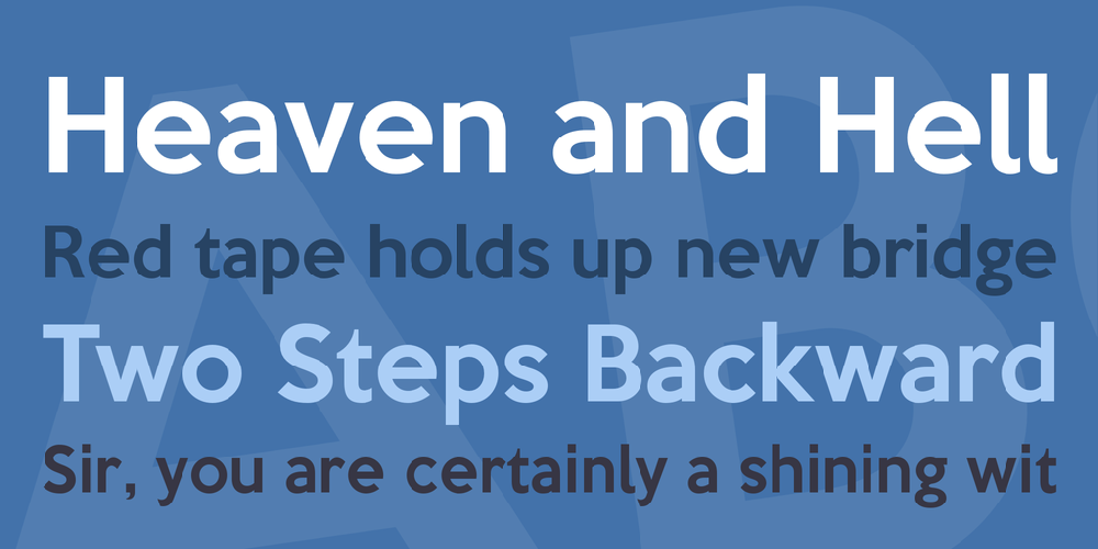
- Styles (1)
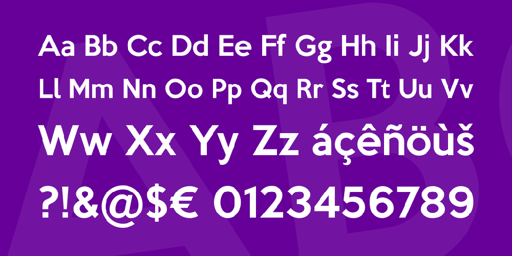
- Character Maps
- License


- Free for Personal Use
- Free for Commercial Use
- Modification Allowed
- Redistribution Allowed
Extended information
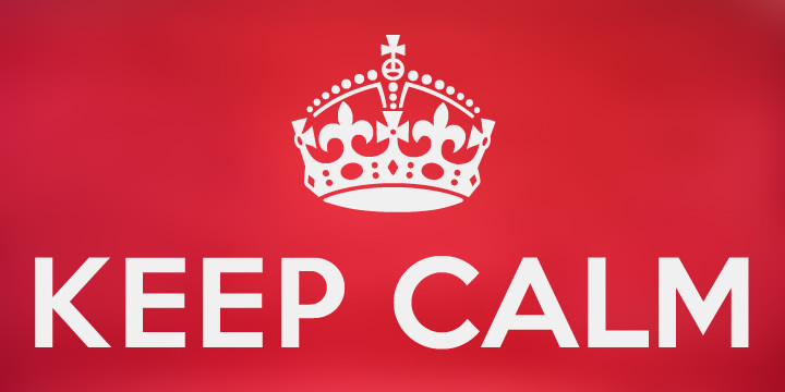
Keep Calm is a family of fonts developed from the now famous World War 2 poster that was designed in 1939 but never issued, then rediscovered in 2000. As well as the original Keep Calm font, the medium weight of the poster, new weights are now available – Keep Calm Book (regular weight), Heavy and Light – and each weight comes with a free italic. The family includes Central European and Western European accented characters including Welsh diacritics and Irish dotted consonants.
When I first saw the Keep Calm and Carry On poster, I wrongly assumed the letters to be Gill Sans. Although that influence is apparent, in the R particularly, the lettering was clearly hand-drawn by a talented designer who, if the M’s perfectly pointed vertex is anything to go by, was equally steeped in the signage of the London Underground. The most anomalous character, the C, resembles that found in the Gotham typeface, and given that Gotham’s vernacular sources included the handmade, ‘basic lettering’ of engineers, perhaps that shouldn't be surprising.
Developing the Keep Calm typeface is an exercise in extrapolation; an intriguing challenge to build a whole, high quality font family based on the twelve available uppercase letters of the Keep Calm poster, and on similar lettering from the other two posters in the original series. This has required the creation of complementary lowercases that are believably 1939; that maintain the influence of Gill and Johnston while also hinting at the functional imperative of a wartime drawing office. The draughtsman was balancing intuitive, human qualities, and the pure pleasure of drawing elegant contemporary letters, against an underlying geometry of ruled lines, perfect circles, 45° terminals, and a requirement for no-nonsense clarity.
Keep Calm Medium - version 1.3 (2015)
• Several minor outline improvements
Comments