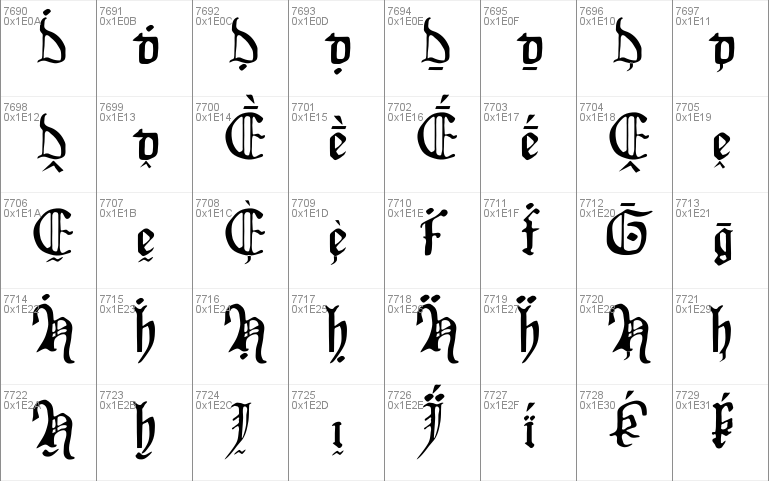
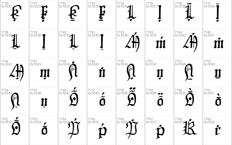
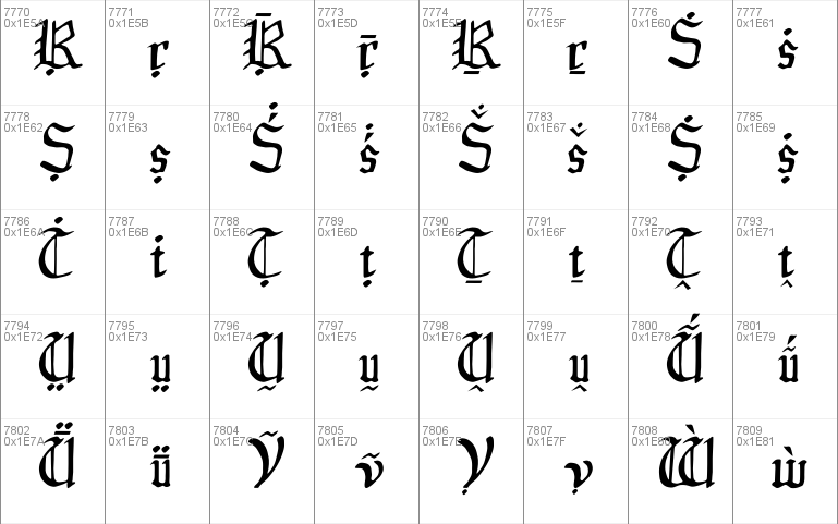
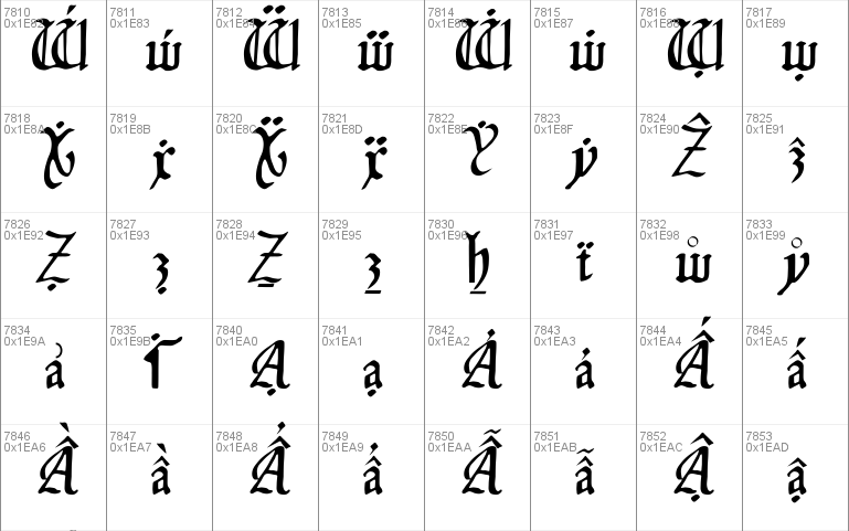
- Styles (1)
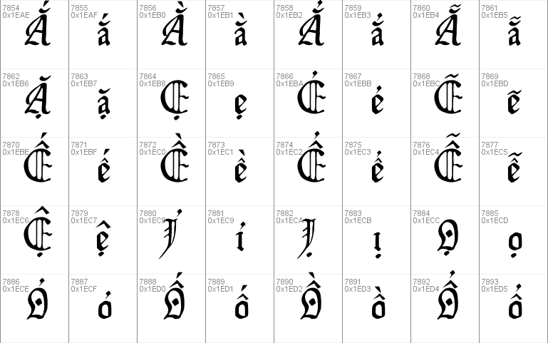
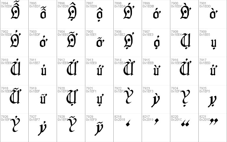
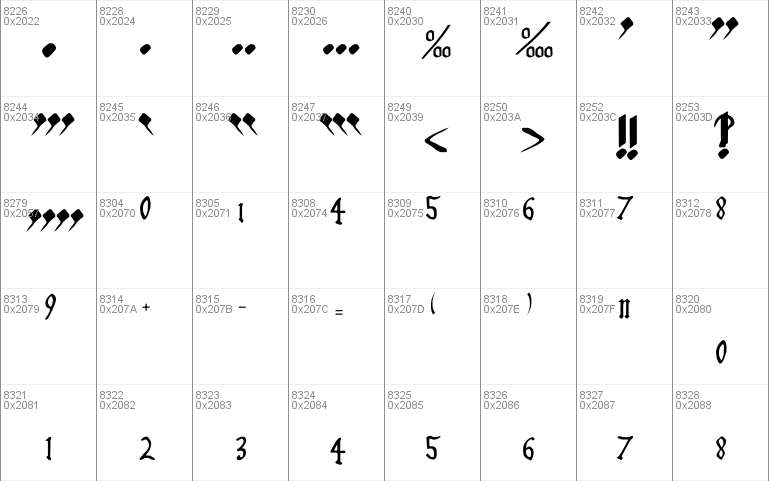
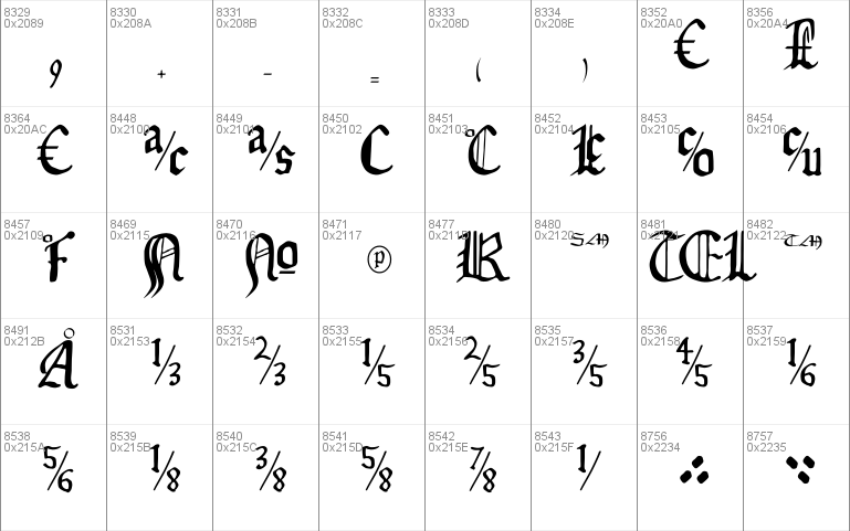
- Character Maps
- License


- Free for Personal Use
- Free for Commercial Use
- Modification Allowed
- Redistribution Allowed
Read more
Isabella, a font by John Stracke,
This font is called Isabella because it is based on the calligraphic
hand used in the Isabella Breviary, made around 1497, in Holland, for
Isabella of Castille, the first queen of united Spain.
It is released under the terms of the GNU General Public License
(GPL). You should have received a copy of the GPL along with this
program; it's in a file called COPYING. If not, write to the Free
Software Foundation, Inc., 59 Temple Place, Suite 330, Boston, MA
02111-1307 USA, or see
Where the GPL refers to "source code", I take that to refer to the
file called Isabella-first.sfd, which is a file for editing with
pfaedit (see
program. Pfaedit is not GPLed, but its license does seem to count as
free software (it's BSD-style, without the advertising clause). Thus,
according to the GPL, if you distribute this font, you must make
Isabella-first.sfd available to the recipient(s) under the terms
the GPL specifies for source availability.
At the time of this writing, Isabella-first.sfd is available on my
Website at
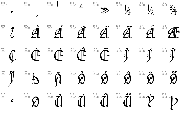
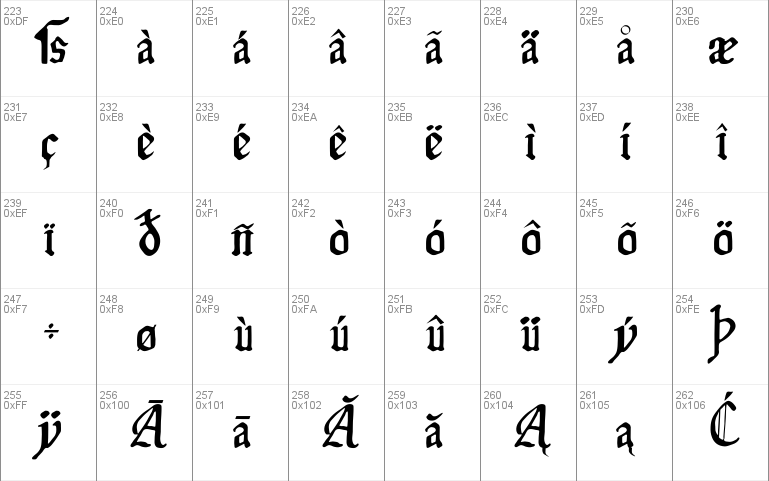
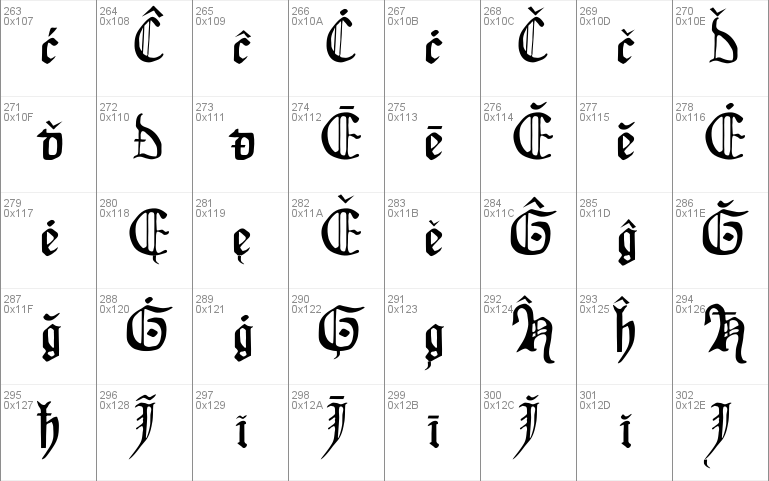
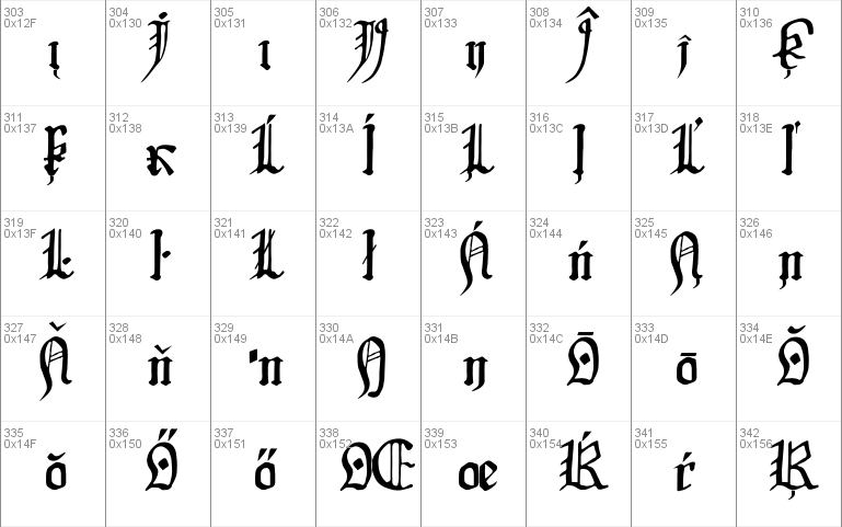
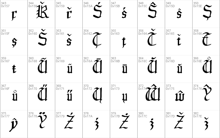
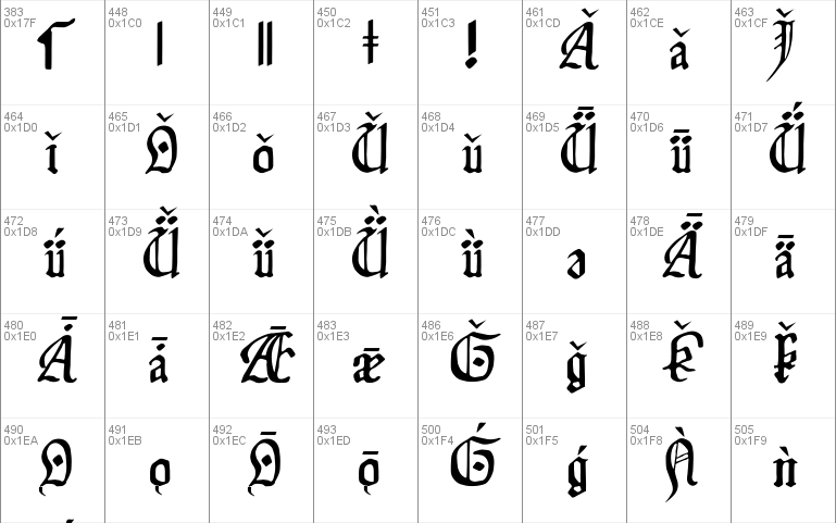
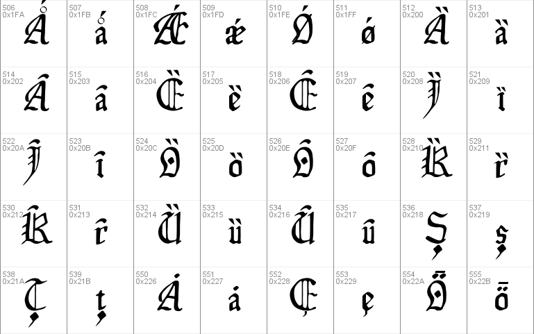
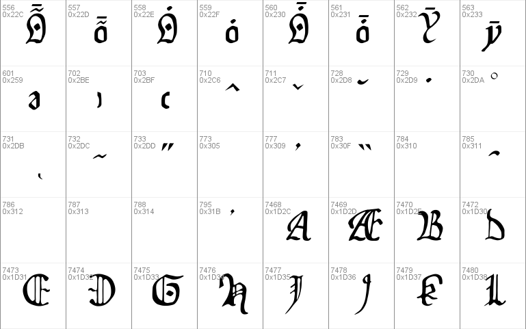
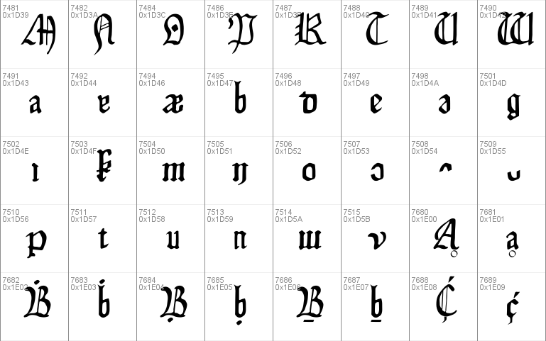
The font is, I think, complete for Latin-1 and Latin-2 (and maybe
others); it covers the first 384 characters of Unicode, not counting
control characters. It also has some other characters (e.g., the
quotation symbols used in Spanish), for a total of 342. If you find
that some character from your language is not quite right, please be
kind; the only languages I've known are Latin, English, Spanish, and
German, which means that most of the letters outside ASCII are new to
me. (Spanish uses tilde and acute accents on vowels; German uses
ess-zed. I had never heard of, say, ogonek, or accents on consonants,
before doing this font.) It has a Euro symbol.
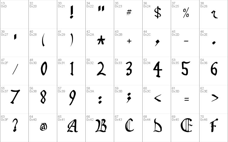
Naturally, the Isabella Breviary does not have an example of, say, @,
so I drew such characters as best I could. The primary design goal on
such characters was to look like something done with a calligraphic
pen; the secondary goal was to look like the other characters of the
font. So, for example, the copyright character ("c" in a circle) is
made by shrinking down the letter "c" and placing it inside a circle.
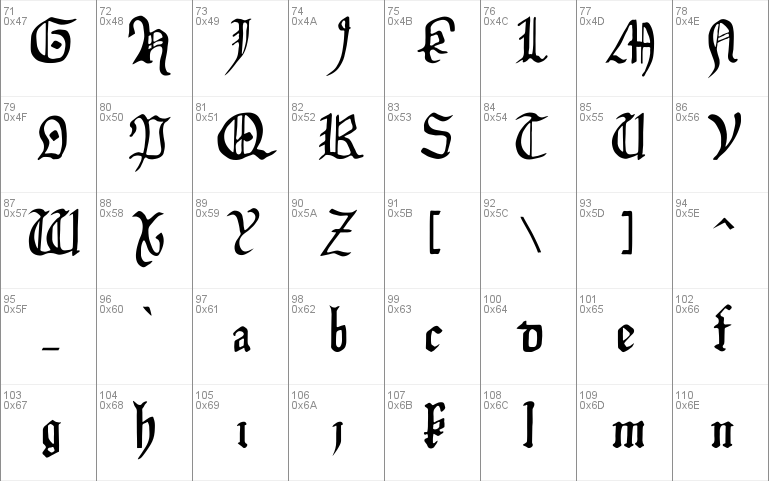
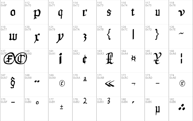
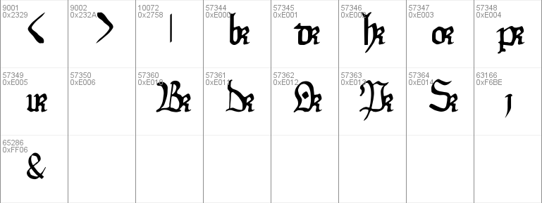
The original hand, like many medieval hands, has a half-r character,
used in ligatures for "or", "pr", "br", and "dr". I have not yet
figured out how to get pfaedit to produce ligatures; for now, the "or"
character is in the character position for Greek lowercase omega.
The alphabet wasn't quite the same in 1497. There were no "j" or "w";
I have added them. Unusually, the original hand *does* have a "v";
many medieval writers used "u" instead. In addition, there was a
"long s", which was used in the middle of words (for which reason it
is also called the "medial s", and the modern "s", used at the end of
words, is called the "terminal s"); I have provided one. The German
ess-zed (looks sort of like a Greek beta, but isn't) originated as a
ligature of the long "s" followed by the short "s", so, in this font,
I have represented ess-zed as the two "s"es together.
Bugs
Microsoft Word 2000 has trouble with the long "s"; it introduces a
line break before and after the "s".
The ampersand is perhaps too authentic; it's not really recognizable
to a modern eye. Feedback is welcomed:


Comments