

- Styles (1)
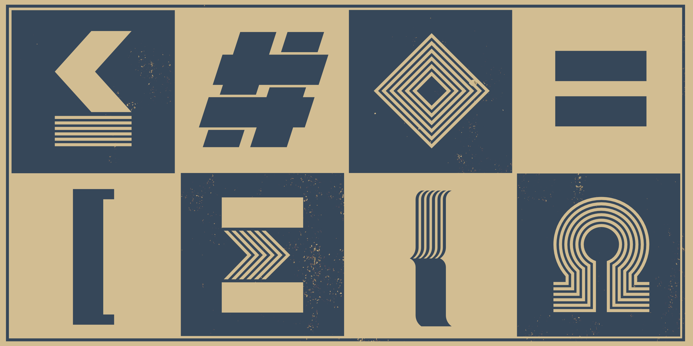
- Character Maps
- License


- Free for Personal Use
- Free for Commercial Use
- Modification Allowed
- Redistribution Allowed
Extended information
Designers Note
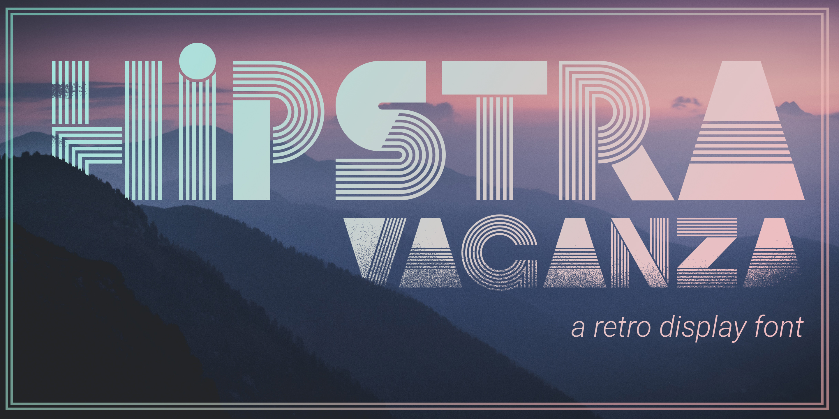
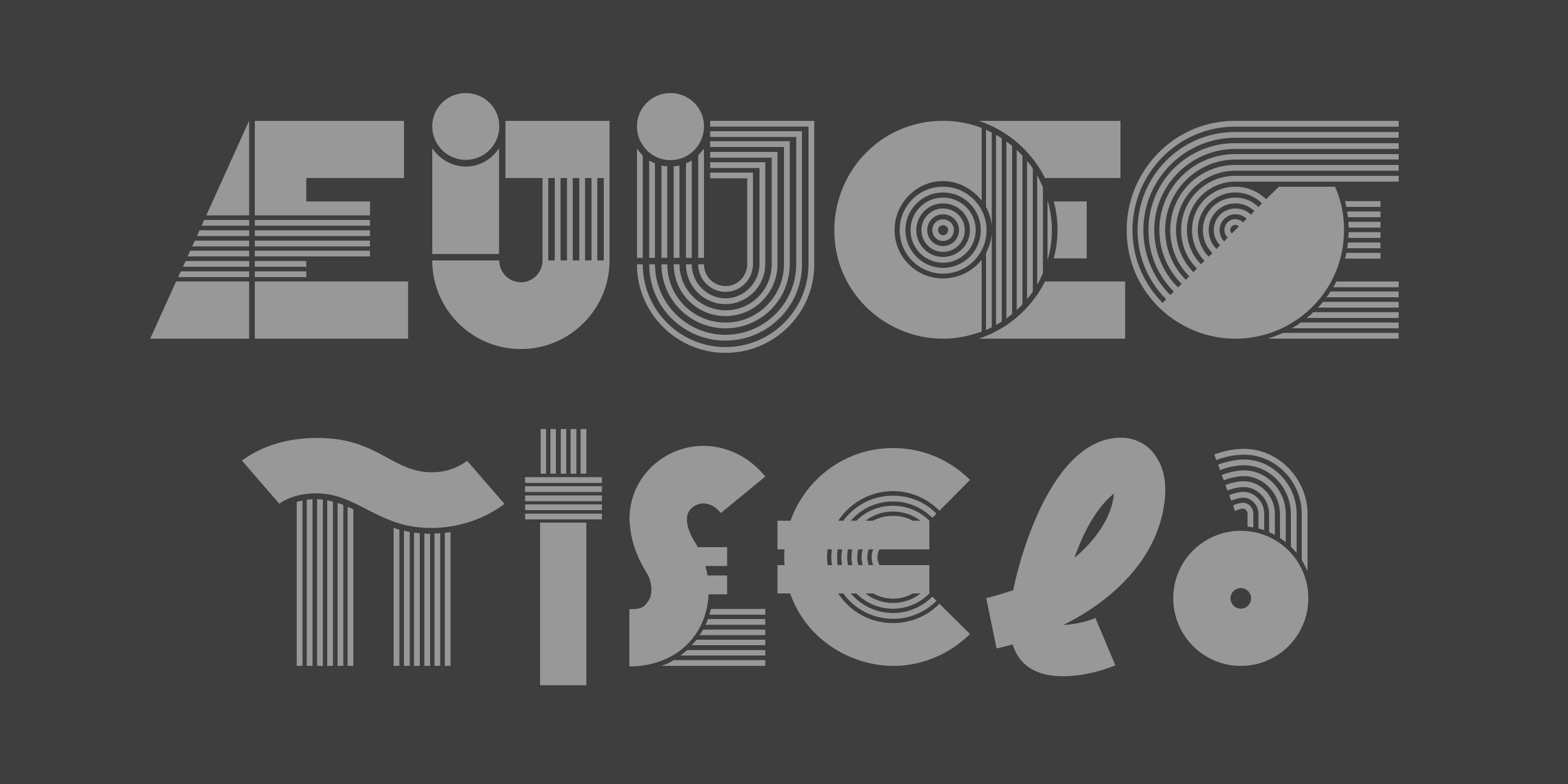
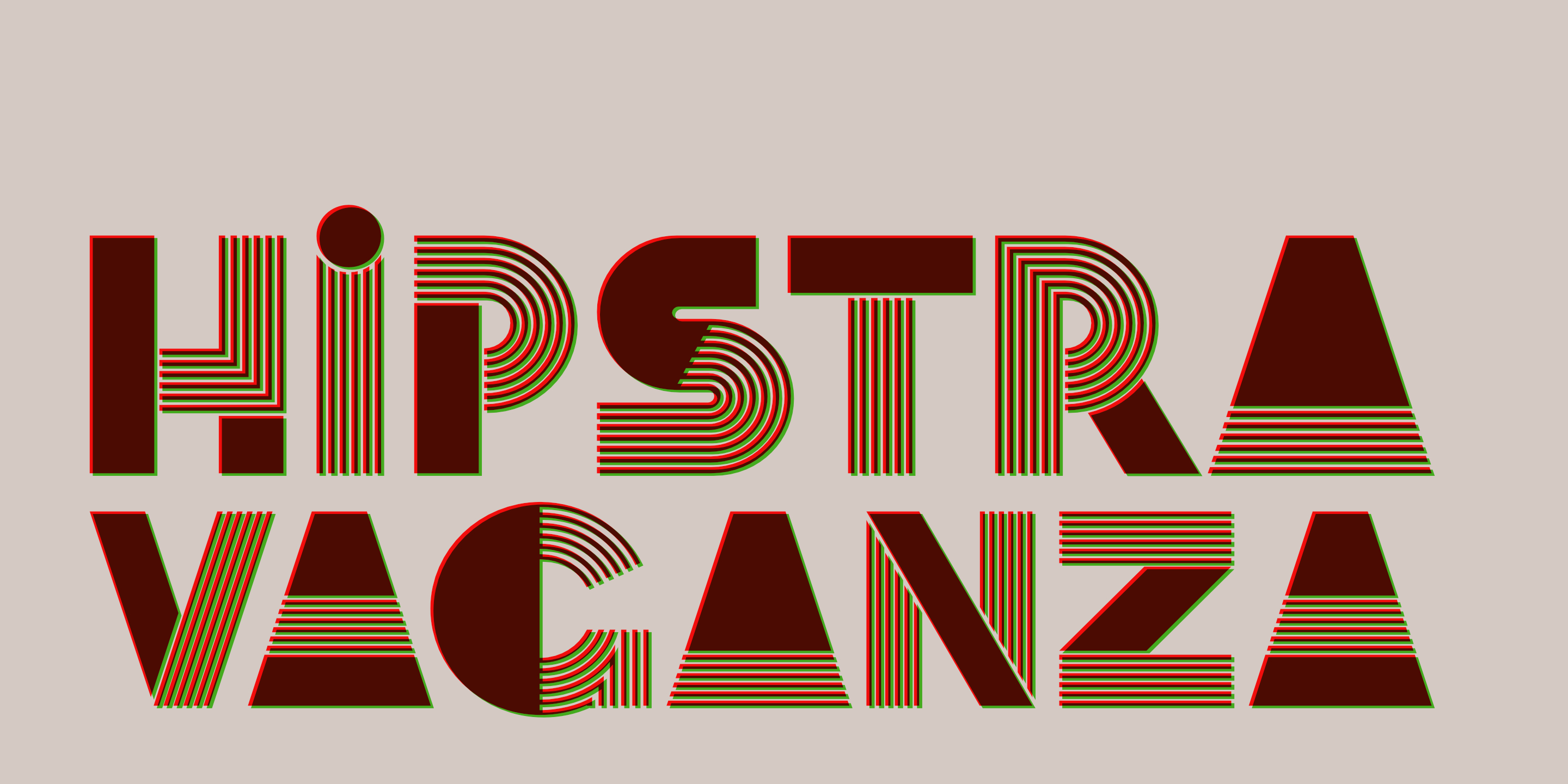
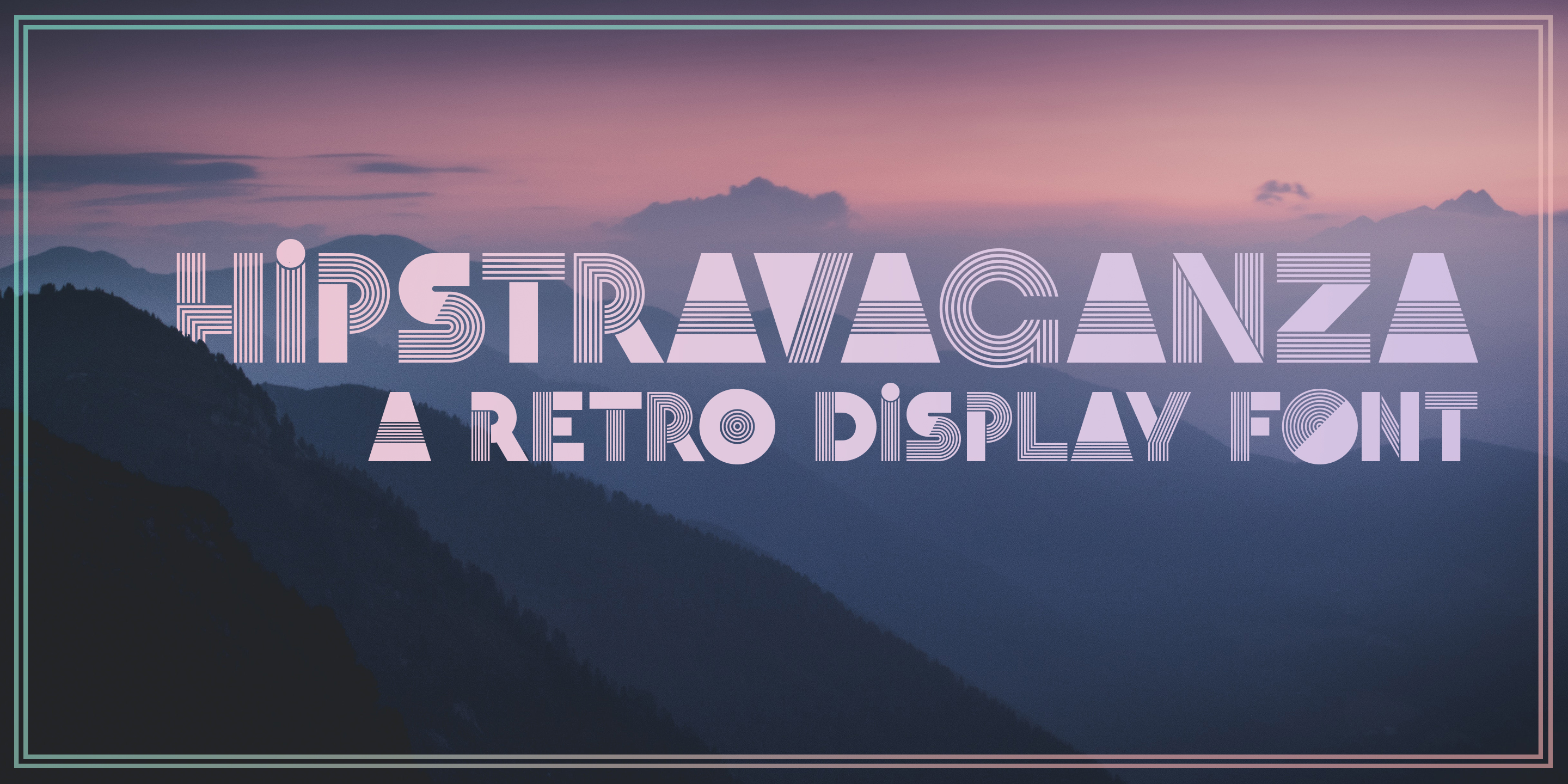
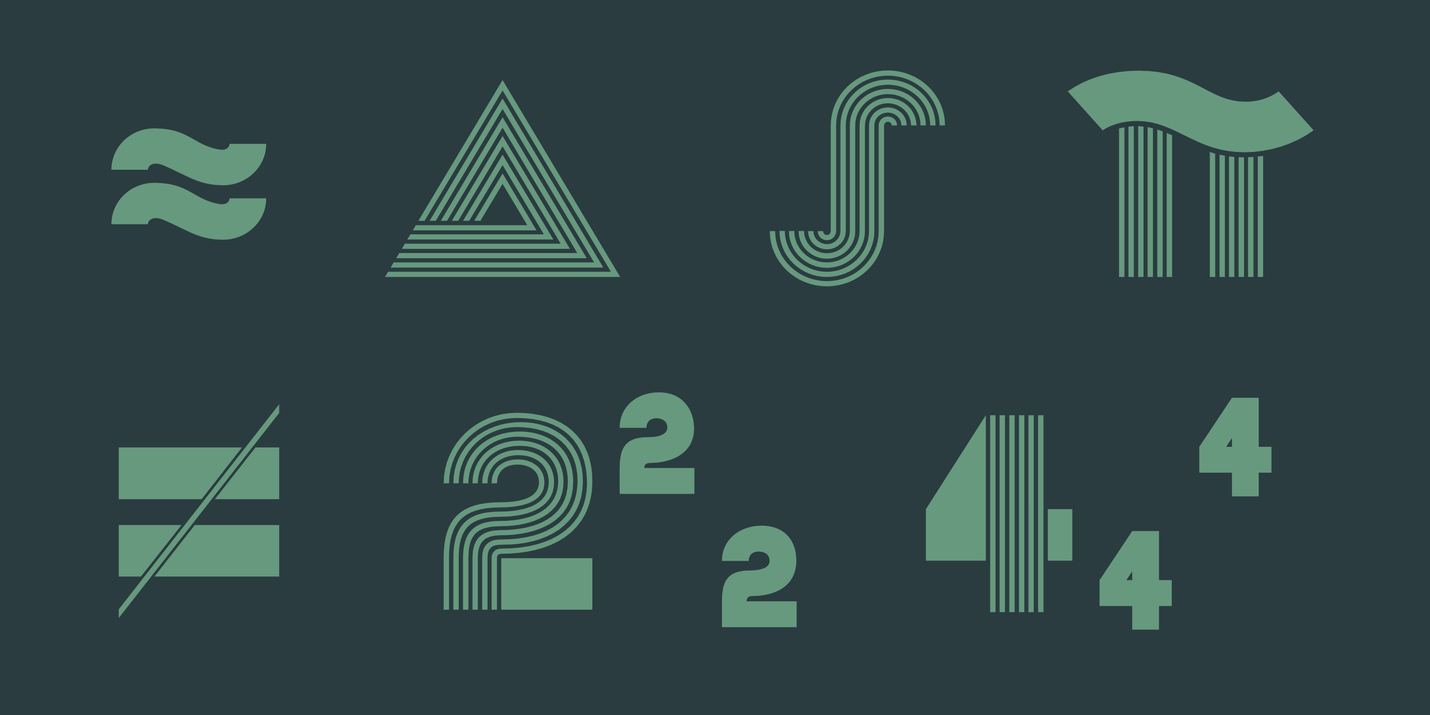
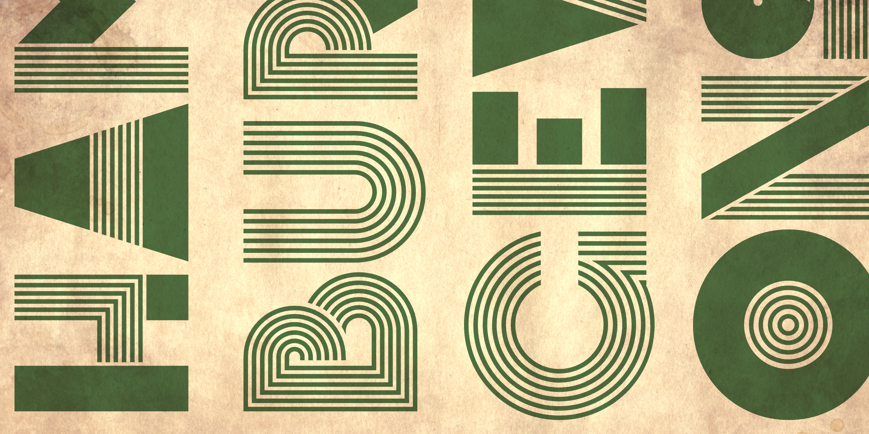
This one is all about a flashy retro style. I wanted to create something with a bit more ‘bang’. So I set out to make a mixture between blocks and parallel lines.
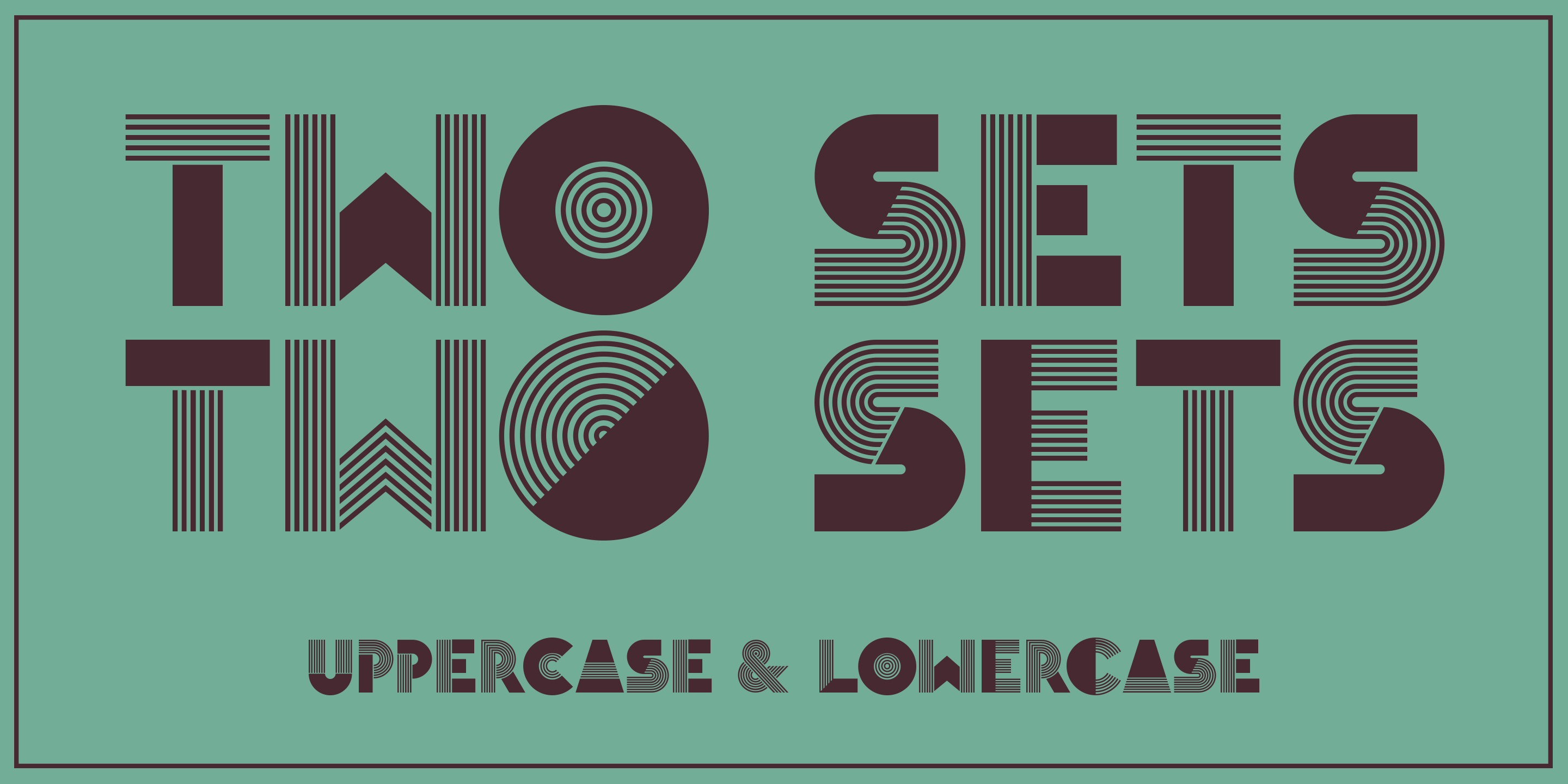
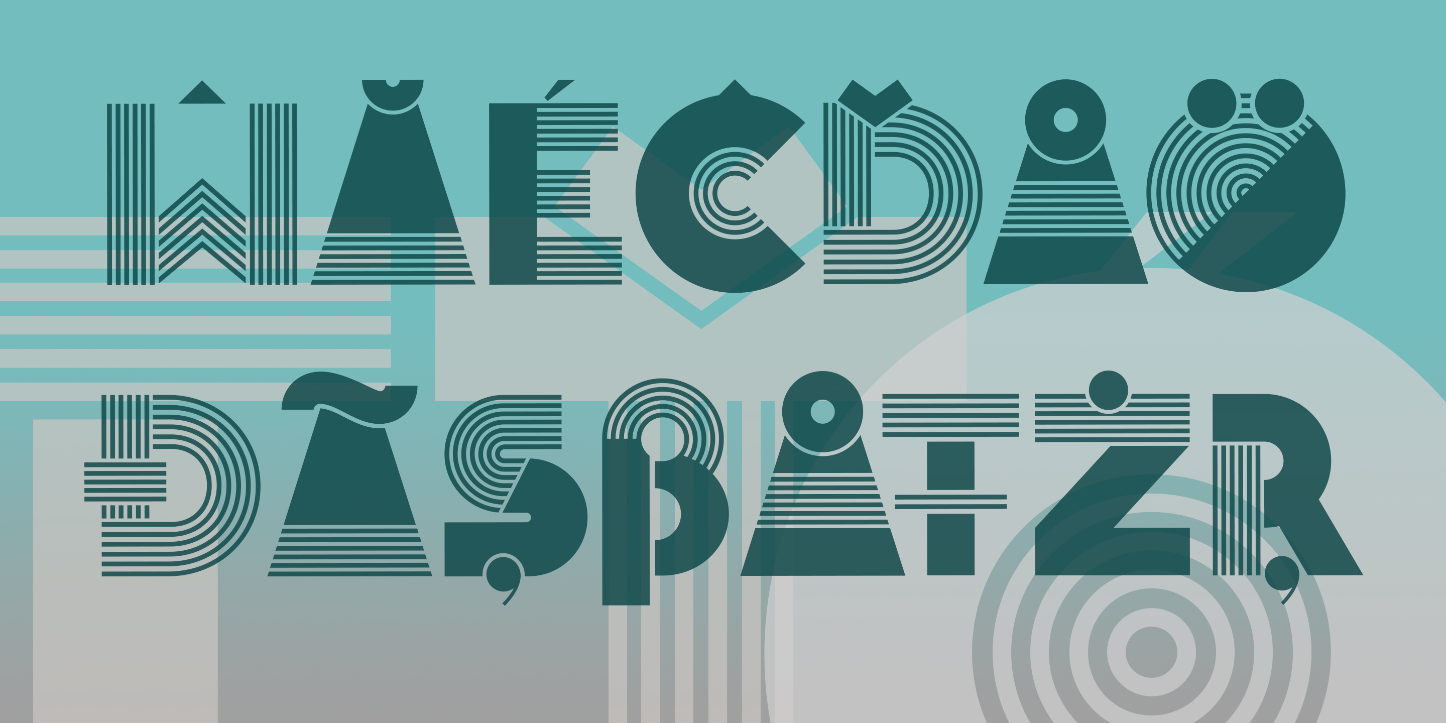
Because it is an all caps font, I decided to make the lowercase set into a second set of glyphs. They are similar to the caps, but with less blocks in the letters. I included all glyphs from LatPro, except for two ligatures.
It is pretty niche, and it works best as the centerpiece of a poster or as a foreground in front of photos. Due to it’s complex shapes, it’s a little difficult to pair up with too many other elements and fonts, but it’s certainly an eye catcher!
In very small it creates moire, but also if seen from afar, the parallel lines create a sort of illusion of partial transparency.
More link: http://www.fontspring.com/fonts/tudy1311/hipstravaganza?refby=tudy1311
Read more
THIS IS JUST A DEMO.
If you like it, and want to use it commercially, please buy it from http://www.fontspring.com/fonts/tudy1311/hipstravaganza?refby=tudy1311
--------------------
This one is all about a flashy retro style. I wanted to create something with a bit more ‘bang’. So I set out to make a mixture between blocks and parallel lines.
Because it is an all caps font, I decided to make the lowercase set into a second set of glyphs. They are similar to the caps, but with less blocks in the letters. I included all glyphs from LatPro, except for two ligatures.
It is pretty niche, and it works best as the centerpiece of a poster or as a foreground in front of photos. Due to it’s complex shapes, it’s a little difficult to pair up with too many other elements and fonts, but it’s certainly an eye catcher!
In very small it creates moire, but also if seen from afar, the parallel lines create a sort of illusion of partial transparency.
--------------------
My font shop: https://www.fontspring.com/foundry/tudy1311?refby=tudy1311
My homepage: https://tudorstype.com
Comments