- Styles (2)
- Character Maps
- License


- Free for Personal Use
- Free for Commercial Use
- Modification Allowed
- Redistribution Allowed
Extended information
FretQwik is combination alphanumeric text font, and guitar fret diagram builder. Half of the font consists of ordinary alphanumeric characters from a third-party public license font (see font internals for details). If you inspect FretQwik without using a character map, you won't see the frets. The other half of the font has component symbols that can be pieced together to build nearly any standard guitar chord (6-string guitar, or 4-string ukelele or lute).
Read more
README for FretQwik font
Since FretQwik has ordinary alphanumeric characters in the standard keyboard locations, you need a character map to see the fret capability.
FretQwikC (condensed) has the same characters as FretQwik, but the width of the fretboard is narrower. That is, the original FretQwik shows the fretboard as a square, but FretQwikC shows the fretboard as a non-square rectangle. The spacing of dots, bar, and spans has been scaled to match.
If you already have a fret diagram built with FretQwik, you will find that the same codes work with FretQwikC, and vice-versa. All that changes is the shape of the fretboard and associated items.
You can install both FretQwik and FretQwikC, if you wish. They will show as separate choices on your font menu. If you do no need to have both quare and rectangular fretboards, then you only need one font or the other.
***** Revision History
Version 4.00 October 2005. Changed the ASCII (non-fret) glyphs, so that they will print better in some applications.
Users who substitute version 4 for an earlier version may find that ordinary alphanumeric characters do not align with fret-related characters as before. Fretboards and components are unaffected. The benefits of the change outweigh the minor nuisance.
Version 3.00 January 2005. Added 4-string fretboards.
Version 2.40 January 27, 2004. Added small 0 at fret level and at nut level. Added fr. symbol at fret level. Added half-space. Added empty spaces to fill some unused code locations, so that the codepage looks like other fonts. Added FretQwikC.
Version 2.30 not publicly released.
Version 2.20 April 9, 2003. Very minor coding adjustment. Will not affect most users.
Version 2.10 August 29, 2002. Added mini-Roman numerals.
Version 1.00 July 2002 private release.
***** License
FretQwik font � Copyright 2002 by Robert Allgeyer.
Free public license. This font is offered AS-IS with NO WARRANTY EXPRESS OR IMPLIED, and no support. User accepts all risk of use.
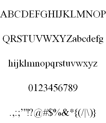
This font was derived (modified) by Robert Allgeyer using Bitstream Charter Type 1 font distributed under free
public license as part of Ghostscript. The following permission accompanies the distribution:
"� Copyright 1989-1992, Bitstream Inc., Cambridge, MA. You are hereby granted permission under all Bitstream proprietary rights to use, copy, modify, sublicense, sell, and redistribute the 4 Bitstream Charter (r) Type 1 outline fonts and the 4 Courier Type 1 outline fonts for any purpose and without restriction; provided, that this notice is left intact on all copies of such fonts and that Bitstream's trademark is acknowledged as shown below on all unmodified copies of the 4 Charter Type 1 fonts. BITSTREAM CHARTER is a registered trademark of Bitstream Inc."
***** Application
FretQwik is a Windows True Type font. It may also work in other operating systems that can use this format (perhaps Mac OS-X).
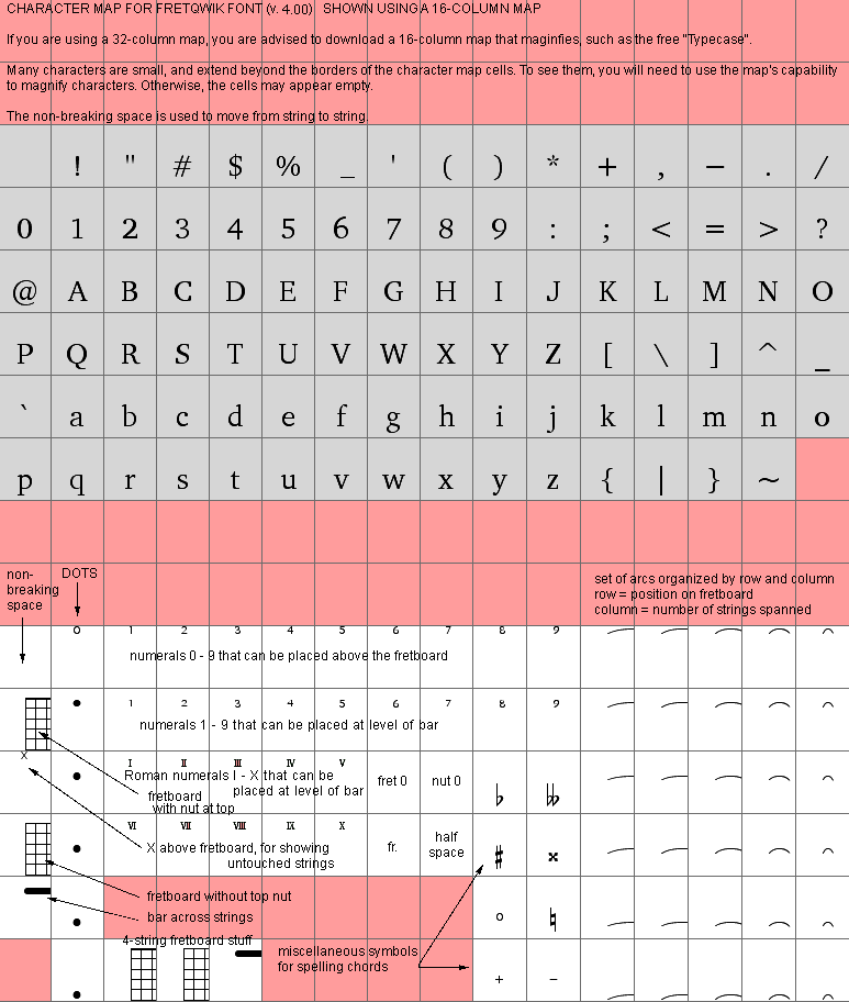
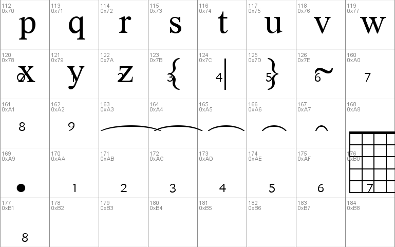
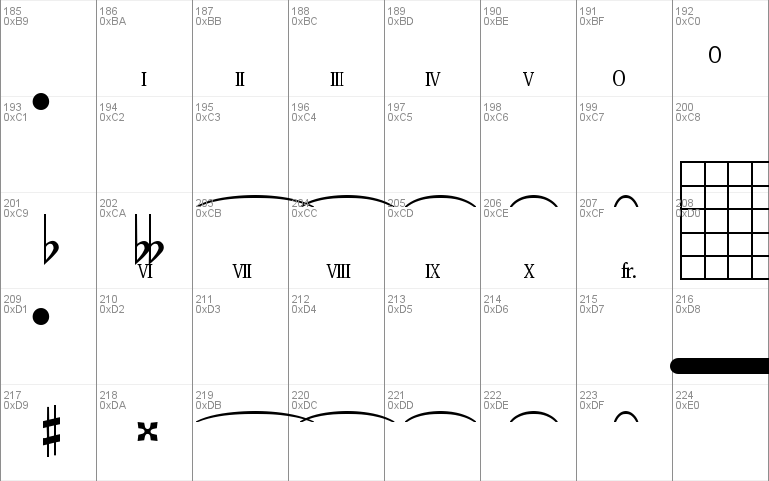
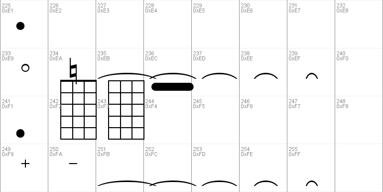
The ASCII character set of FretQwik is the same as for any text font. But the upper character set (decimal codes 160 through 255) contain a number of symbols that may be used to create guitar fingerboard diagrams. Enclosed with this distribution is a GIF image of some diagrams created using FretQwik. Here are the characters used to create those diagrams:
�� � � � � � �� � � � � � �� � � � � �� � � � б� � �� Ѥ � Ѥ
The above characters look like random gibberish, but if you install FretQwik in your system, they will look like fret diagrams in the FretQwik font. You may need to use a larger font size. If your fret diagrams are intended to be viewed on a computer screen rather than in print, it is best to use point size 24 or higher with FretQwik.
If you are using FretQwik in a document that you intend to distribute to others, it is best to either create a PDF file with the font embedded, or reduce your notation to a bitmap image (BMP, GIF, JPG, TIFF, PNG) and embed the image in your document. FretQwik will work in many applications. But some word processors and web browsers "intelligently" insert undesired white spaces that displace the fingering dots relative to the underlying fretboard. Unless you use PDF or bitmap images, someone else may not see your documents the same way as you created them, even if they have FretQwik installed.
On Windows 98 and XP, the NotePad text editor actually works better than one of my more sophisticated programs, when used with FretQwik. If I create the diagram in Notepad, then copy the screen image (Prt Sc) to the clipboard, I can paste the bitmap into a graphics editor and trim off the surroundings. Although MS Paint works for that purpose, the free "Irfan View" graphics editor does it much better.
FretQwik may also work in some music notation progams that have a built-in text editor. The FretQwik notation might look like ordinary text until you close the editor and return to the main music progam.
FretQwik also includes all the ordinary keyboard characters, plus accidentals needed to spell
chord names. The layout of symbols makes most sense when viewed with a 16-column character map. Some systems use a tiny32-column character map. You can download a free 16-column Windows character map called "Typecase" from www.simtel.net if you need one. Some of the symbols extend beyond the cell boundaries of a character map. You can view the symbols by magnifying the cells, or use the enclosed GIF image character map as a guide.
***** Selecting characters
Using a character map, look for the fret grid with nut (it is at code location decimal 0176). Above the
fret grid, at code 0160, is the non-breaking space. There is also a fret grid without nut.
In the column adjacent to the fret grid, there are dots representing finger positions. In the same row as
the non-breaking space there is an open circle positioned above the fret grid. Below it is a filled circle
at the first finger position, and so on down the column. For untouched strings, you may place an "x" above the
string.
Begin with a fret grid. Place a dot for the first string. Move to the next string using the non-breaking space.
Place a dot for the second string. Continue. You may omit a dot on any string, but you must use the non-breaking space to move from string to string. You may also place a numeral above the string.
You may also place arcs across the strings. An arc is placed at its leftmost point. Arcs in the same row
as the non-breaking space will be positioned above the fret grid. Moving down the rows, arcs move further down the fretboard. The width of arcs varies from the full width of the fretboard (in the column adjacent to the dots), down to merely spanning adjacent strings.
You may place a bar across the strings. It will be located at the first fret position. You may place a numeral
to the left or right of the fret grid, to label the bar. The numeral may be Arabic or Roman style. Use
one or two non-breaking spaces after the numeral, to prevent overlap with the following characters. [Note that
these numerals will be located at the level of the first fret position on the grid. There wasn't enough room in
the font to include every possible combination!]
There are also some other symbols useful for spelling the chord name.
If you use the ordinary alphanumeric characters, be aware that they were not drawn with computer screen resolution in mind. They may appear a bit rough on a screen, but will print well.
In version 2.40 added new characters. If you wish to use "fr." as part of the description for placing a fret bar, the combined symbol is available. Also added is a small "0" at nut level and at fret level, for describing fret positions greater than 9. If you need to use a two-digit fret number, there is a half-width space for moving the cursor a small amount. The new symbols are at codes 00C7, 00C8, 00D7, and 00D8.
Comments