- Styles (4)
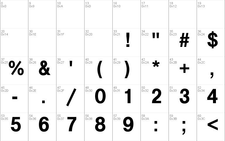
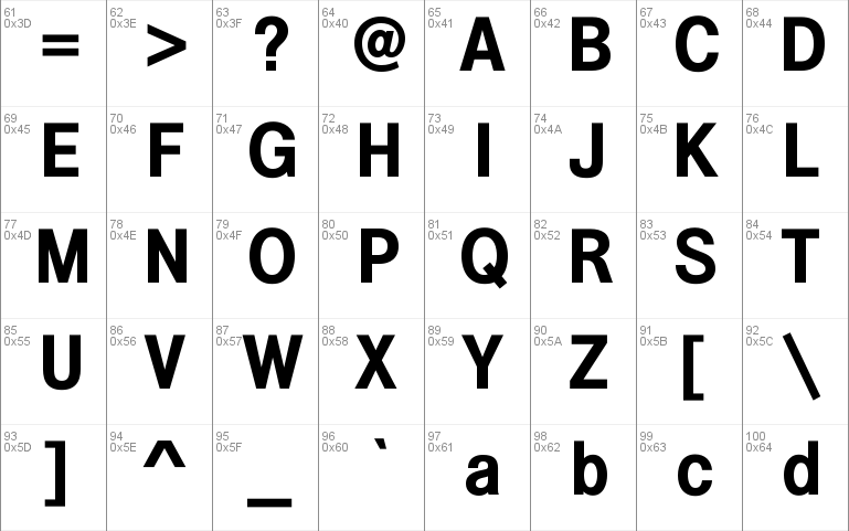
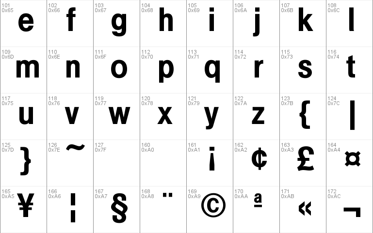
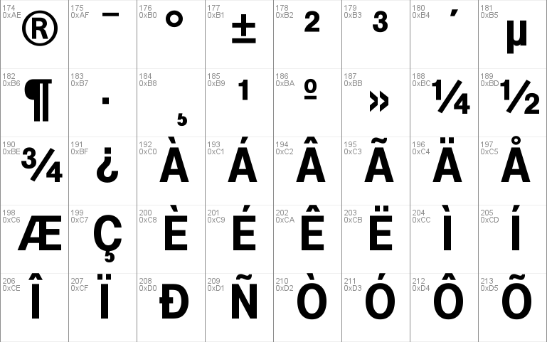
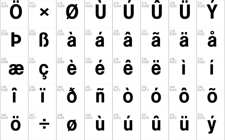
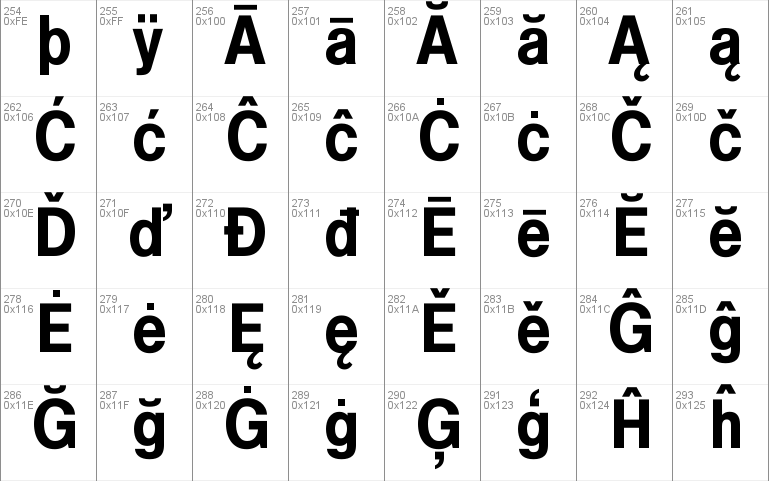
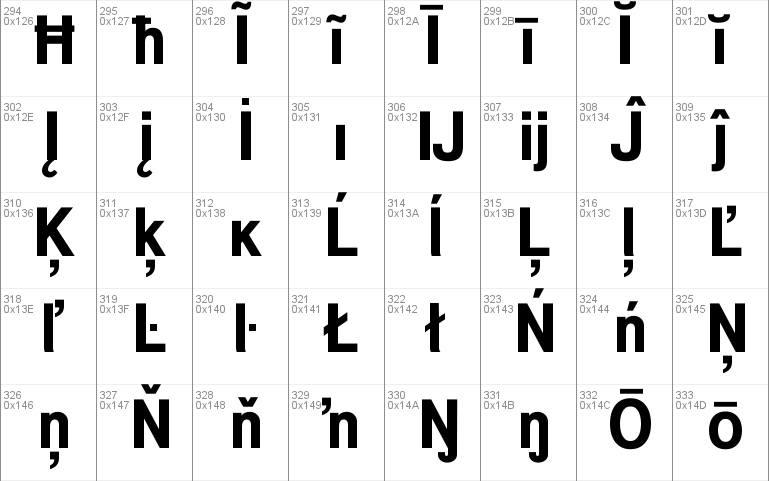
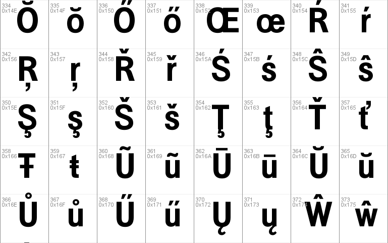
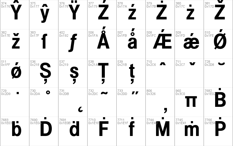
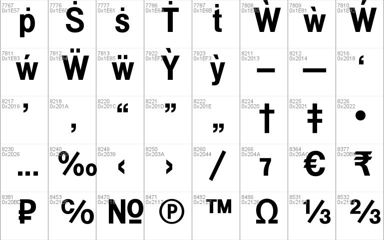
- Character Maps
- License


- Free for Personal Use
- Free for Commercial Use
- Modification Allowed
- Redistribution Allowed
Extended information
Example is a workhorse neo-grotesque, an alternative for those seeking an ageless sans but wishing to avoid the ordinary choices. The basic weights are clean, handsome and economically proportioned – characters are not as wide as Helvetica, though not condensed. Rounded characters are not as ‘squarified’.
Numerals are the same height as capitals, so titles and headlines line up efficiently. The lowercase L has a slightly curved foot which distinguishes it from the uppercase i and matches the vestigial tail of the a. The Italics feature a single-storey a and an f with descender hook, otherwise italic characters are optically corrected obliques. Example has a full complement of Latin Extended-A characters, Welsh diacritics and Irish dotted consonants.
The basic family (Regular, Italic, Bold and Bold Italic) can be downloaded free for personal use.
Downloaded from https://www.1001freefonts.com/
Read more
=== EXAMPLE ===
=== EXAMPLE ITALIC ===
=== EXAMPLE BOLD ===
=== EXAMPLE BOLD ITALIC ===
=== EXAMPLE BOLD GOLD ===
=== EXAMPLE BOLD HOLED ===
=== EXAMPLE BOLD OLD ===
=== EXAMPLE OLD ===
Keith Bates / K-Type © 2017 (version 1.1)
www.k-type.com - [email protected]
EXAMPLE is a workhorse neo-grotesque, an alternative for those seeking an ageless sans but wishing to avoid the ordinary choices.
Example is clean, handsome and economically proportioned - characters are not as wide as Helvetica, though not condensed. Rounded characters are not as ‘squarified’.
Numerals are the same height as capitals, so titles and headlines line up efficiently.
The l has a slightly curved foot which distinguishes it from the I and matches the vestigial tail of the a.
The Italics feature a single-storey a and an f with descender hook, otherwise italic characters are optically corrected obliques.
Example has a full complement of Latin Extended-A characters, Welsh diacritics and Irish dotted consonants.
The licensed family includes an additional four display fonts. Three are novelty variations of the Bold weight, designed for decorative and celebratory headings: ‘Bold Gold’ is an inline font that suggests shiny highlights, ‘Bold Holed’ replaces the inline with dots reminiscent of string lights or Aboriginal paintings, and ‘Bold Old’ has rough outlines giving an antique, weathered appearance. These three fonts share the spacing and kerning of Example Bold so can be overlapped for bicolor effects.
Also included is ‘Example Old’, a rough version of the regular weight with matching spacing and kerning.
------------------------------------------------
== Licence Information ==
Licence URL: http://www.k-type.com/licences
------------------------------------------------
== Installing Fonts ==
Fonts are placed in your operating system's Fonts folder and will be made available to all the applications or programs you use.
= Windows =
Put the .ttf or .otf font file into C:\Windows\Fonts, or right-click on the font files > Install
= Mac =
Put the .ttf or .otf font file into /Library/Fonts
------------------------------------------------
Comments