- Styles (4)
- Character Maps
- License


- Free for Personal Use
- Free for Commercial Use
- Modification Allowed
- Redistribution Allowed
Extended information
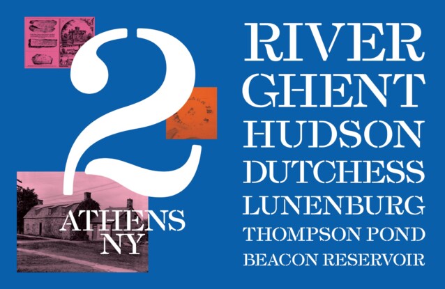
Esperanza Font Family is a unique serif font with a classic twist. The design was inspired by the lettering stamped into stoneware manufactured there throughout the 19th century at the Athens Pottery Works by Nathan Clark Senior and his partners and descendants. The type echoes the sturdy late transitional English types of William Martin and Richard Austin which would have been predominantly used in the former colony.
The tract of land called Caniskek was purchased from its Native American holders in 1665, and changed hands several times in the years which followed, eventually coming into the possession of Dutch blacksmith Jan van Loon, who built his house in 1706 and named the settlement Loonenburgh, often anglicized as “Lunenburg”. In 1794 a group of land speculators commissioned an urban plan from the French surveyor and architect Pierre Pharoux for a city to be named “Esperanza” located on the Hudson River at Loonenburg. This plan failed, but another was realised in 1805 and the Village of Athens was incorporated. The village was named after the seat of ancient Greece, in the super-hot classical revival toponymy trend of 1790-1850. Within two hundred miles of Athens you will find Rome, Troy, Utica, Syracuse, Ithaca, and Phoenicia, and you can drive to Cairo in 20 minutes.
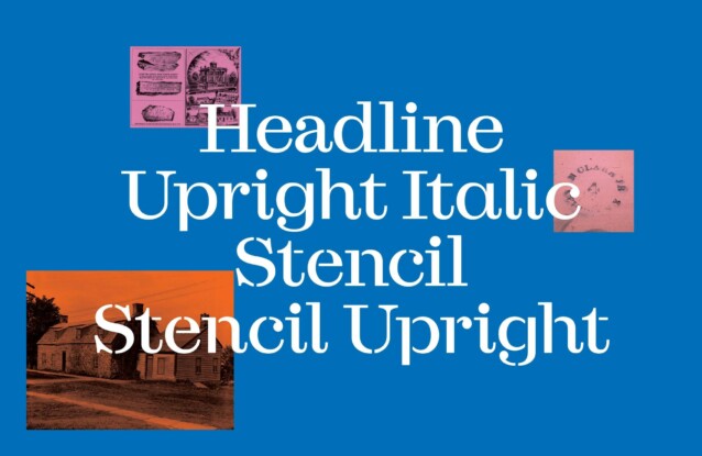
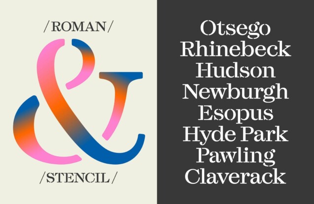
The original Esperanza types were caps-only in roman and a subtly-rounded stencil, designed to genuinely be useful for stencilling, and not merely as an affectation. Happy with how the type was working we added lowercase letters, and wondered what would happen if we used the traditional “tail” terminal of the ‘a’ in the ‘u’. Which led us down the path to create an entire “upright” lowercase; a non-italic doing italic things, inspired by Aldus Pius Manutius and William Addison Dwiggins in equal measure.
Esperanza Font is free for personal use. So, if you want to access more features and its full license contact Labor & Wait designer


Comments