- Styles (1)
- Character Maps
- License


- Free for Personal Use
- Free for Commercial Use
- Modification Allowed
- Redistribution Allowed
Extended information
Version 2.0: see below for explanation and new alterations.
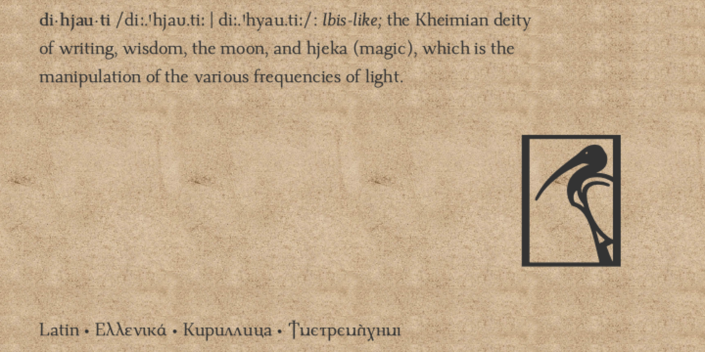
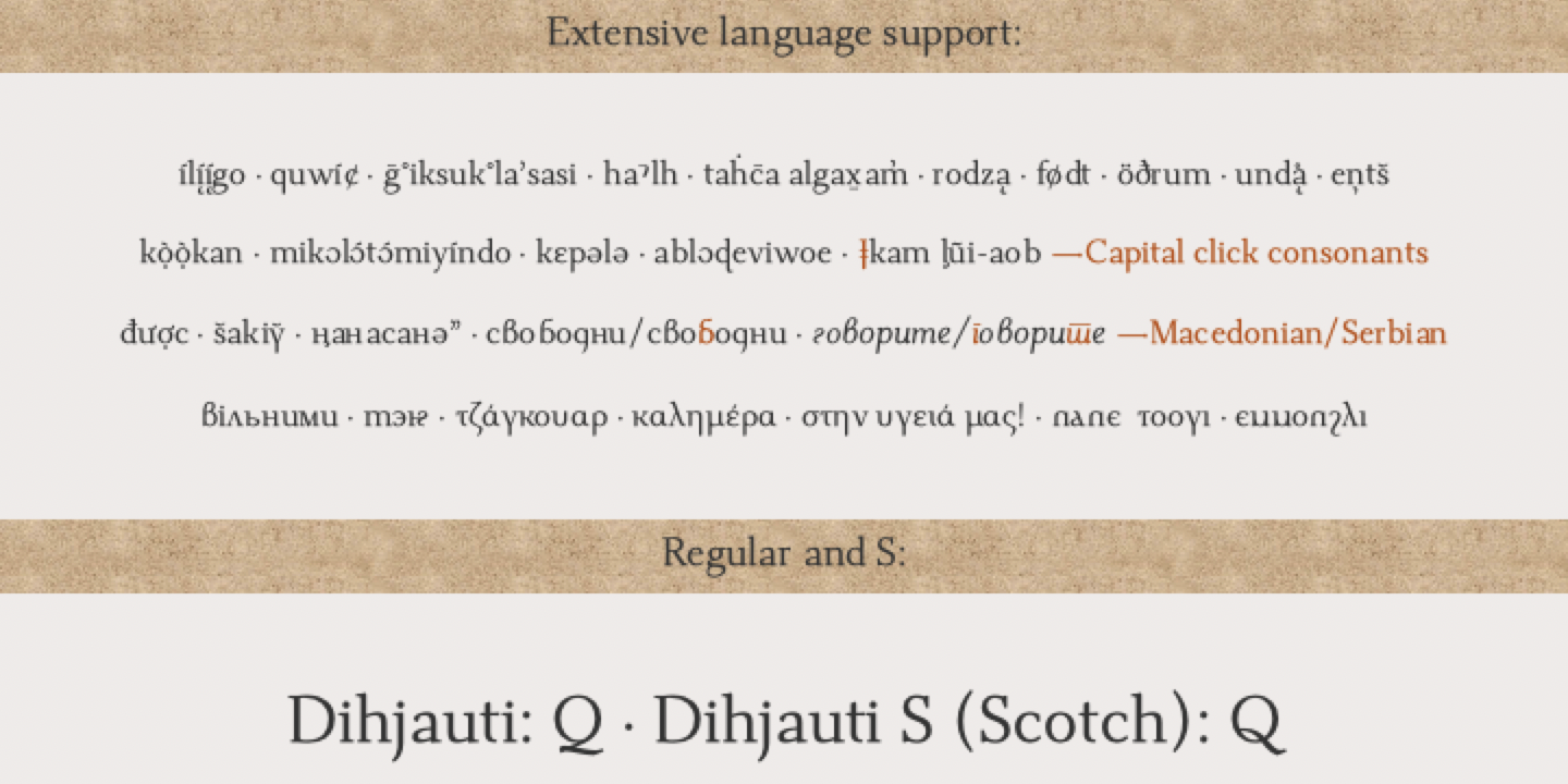
Dihjauti /di:.'hjau.ti: | dee.'hyow.tee/, is predominantly based off Dwiggin's Electra with shades of Baskerville, Fairfield, and Perpetua. It is modern and stately, and like its inspirers, it has broad counters and spacing, which temper it and give it warmth, making it comfortable and well-suited for longer texts. It is balanced in all aspects, from its punctuation to its reference marks and symbols. Its design takes into consideration all extra characters for languages that few fonts support, such as African and First Nation. These extra characters, such as Edh, Esh, Gamma, Ezh, Yogh, the pharyngeal fricatives, the click consonants (which have added capital versions), the glottal stops, et cetera, actually look like they belong, as opposed to being afterthoughts. The italic incorporates a touch of Arrighi. It includes all transcription systems relevant to the Latin, Cyrillic, and Greek alphabets, as well as standard Coptic, plus extra characters for Teuthonista and First Nation. It also includes, to list a few, Egyptian-styled pictographs (where applicable), APL, a plethora of mathematical symbols and arrows, and a number of alternatives in the PUA.
This is the updated and redrawn version of Dehuti/Dehjuti. After using the font on my kindle, I slowly began adjusting its design, spacing, and kerning, making it even more like Electra, but now with hints of Baskerville, as I realized that I wanted it to be more rounded. The italics, as a result, and which I had always had issues with design-wise, thus became Scotch-styled. Dihjauti S (Scotch) reflects that influence in the capital Q. This version (2.0) has some spacing fixes and redesigns to certain characters, those most notably being the asterisk and question marks, the italic a, e, and k, the combining hook and horn, all glyphs with flares, i.e., all combining glyphs (such as the macrons), Æ, E, F, f, g, t, et cetera, and the middle strokes/serifs of a, c, e, s, et cetera, which have become more Electra-esque. The Scotch-styled Q has been redesigned. Also, new characters have been added (SIL additions), while others have been moved.
Since Dihjauti is a Unicode font, I will update it on occasion, so check back for newer versions.
Notes: 1) The superscript characters, modifier letters, and the numerators, are all part of the superscript table. 2) The bold versions of the font have some alternative/reversed characters; I did this because there is no difference in the math or punctuation symbols, i.e., the bold versions are not actually bold (with exceptions), which gives the font a better harmony. 3) The font uses anchors, which means that it will not align properly for linguistic use, or otherwise, without opentype. 4) For those interested, Open or Libre Office can access all glyphs using: Insert > Special Character.
Read more
Dihjauti version 2.0.0
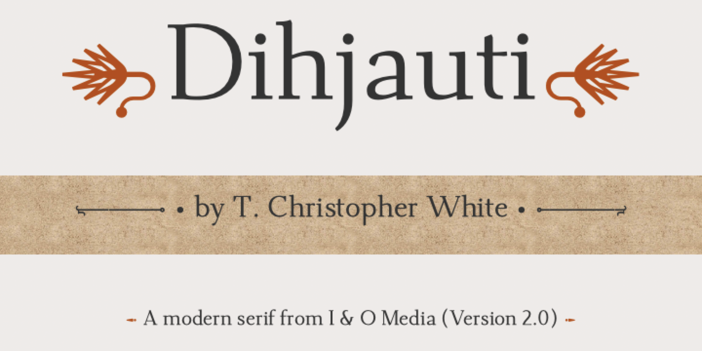
Author/designer: T. Christopher White (I & O Media)
You can contact me, if you have suggestions, find problems or know how to fix them, et cetera, at: [email protected]
Dihjauti /di:.'hjau.ti: | dee.'hyow.tee/, is predominantly based off Dwiggin's Electra with shades of Baskerville, Fairfield, and Perpetua. It is modern and stately, and like its inspirers, it has broad counters and spacing, which temper it and give it warmth, making it comfortable and well-suited for longer texts. It is balanced in all aspects, from its punctuation to its reference marks and symbols. Its design takes into consideration all extra characters for languages that few fonts support, such as African and First Nation. These extra characters, such as Edh, Esh, Gamma, Ezh, Yogh, the pharyngeal fricatives, the click consonants (which have added capital versions), the glottal stops, et cetera, actually look like they belong, as opposed to being afterthoughts. The italic incorporates a touch of Arrighi. It includes all transcription systems relevant to the Latin, Cyrillic, and Greek alphabets, as well as standard Coptic, plus extra characters for Teuthonista and First Nation. It also includes, to list a few, Egyptian-styled pictographs (where applicable), APL, a plethora of mathematical symbols and arrows, and a number of alternatives in the PUA.
This is the updated and redrawn version of Dehuti/Dehjuti. After using the font on my kindle, I slowly began adjusting its design, spacing, and kerning, making it even more like Electra, but now with hints of Baskerville, as I realized that I wanted it to be more rounded. The italics, as a result, and which I had always had issues with design-wise, thus became Scotch-styled. Dihjauti S (Scotch) reflects that influence in the capital Q. This version (2.0) has some spacing fixes and redesigns to certain characters, those most notably being the asterisk and question marks, the italic a, e, and k, the combining hook and horn, all glyphs with flares, i.e., all combining glyphs (such as the macrons), Æ, E, F, f, g, t, et cetera, and the middle strokes/serifs of a, c, e, s, et cetera, which have become more Electra-esque. The Scotch-styled Q has been redesigned. Also, new characters have been added (SIL additions), while others have been moved.
Notes: 1) The superscript characters, modifier letters, and the numerators, are all part of the superscript table. 2) The bold versions of the font have some alternative/reversed characters; I did this because there is no difference in the math or punctuation symbols, i.e., the bold versions are not actually bold (with exceptions), which gives the font a better harmony. 3) The font uses anchors, which means that it will not align properly for linguistic use, or otherwise, without opentype. 4) For those interested, Open or Libre Office can access all glyphs using: Insert > Special Character.
Dihjauti includes:
• Latin, Greek, Coptic, and Cyrillic
• Redesigned click consonants that have accompanying uppercase versions in the PUA
• Redesigned edh, Esh, Ezhes, and Yoghs
• Extended punctuation. For the uppercase middle dot, use (2E31). I placed the Teuthonista double bar on (2E3F). For those unfamiliar with the “reversed” question mark (2E2E), it is used for ironic or sarcastic statements. My design combines the two most popular forms for this glyph into one.
• All relevant (language specific) currency symbols, including the newest additions, such as bitcoin
• Fractions, as well as most math symbols, arrows (with horizontal extenders in the PUA), geometric shapes, and pictographs, with some alternative/reversed designs in the bold versions
• Latin superscript (includes modifier letters and numerators), subscript, and denominators, which are ordered as listed
• Old style numbers, which are followed by the tabular styles of both
• Redesigned short a (turned v), small capital r, and turned w and y, which better reflect their pronunciations; these characters are used predominantly with First Nation languages.
• Redesigned velar, palatal and retroflex characters; I included these if anyone may wish to use them, though they are, with a few exceptions, deprecated.
• Redesigned glottal stops. Their new design resembles curved 7s, which is preferred in the languages that use them. They are (0241 & 0242), and (A7CB & A7CC) for the voiced pharyngeal fricatives.
• IPA, NAPA, UPA, & Teuthonista (Combining Diacritical Marks Extended, Latin Extended-E, plus extras in the PUA [E6C4 – E6D5]); now with Latin Extended-F & -G, and Cyrillic Extended-D.
• SIL additions: 1) Modifier letter small capital barred u (F1CD); 2) Nine-step tone markers for African orthographies (F1F1 – F1F9); 3) Retroflex D with hook (F20D), counterpart to (1D91); 4) German dictionary small capital I + schwa and Latin upsilon + schwa (F258 & F259); 5) bilabial trilled b (F26D), with added capital (E0E7); 6) Capital small rams horn (F26E); and 7), Cyrillic capital and small Ghe with stroke and descender (F326 & F327).
• Small mathematical operators that correlate with vector or cross product (2A2F), plus fullwidth mathematical operators that correlate with multiplication X (2715). Now included are the remainder of the heavy versions accompanying the cross mark, or times (274C): plus, minus, division (2795 - 2797), and equals (1F7F0).
• Medieval, extra script, fraktur and double-struck letters, as well as raised MC, MD, MR, Wz, and more pictographs.
• A multitude of alternatives in the PUA, most with opentype extensions
These are my additions, which are mostly in the PUA:
• (20E7), the combining annuity symbol, is meant to attach to ‘a’, and be used with subscript letters.
• (221B), cube root, is a negative-spaced radical for use with superscript/modifier letters, numbers, et cetera. Type a letter/number, then 221B.
• Alternative forms for Product and Co-Product that harmonize with the standard Increment and Nabla. These are in the bold version, located on the square cap and cup.
• Concerning the enclosed alphanumerics: The bold version has Mayan numbers, which are: 1 – 5, plus 8 (space), and 11 – 15, plus 18 (space); these are the initial numbers. The secondary, or right half circles, are: 1 – 7, plus 10, and 11 – 17, plus 20, with 10 and 20 being zero. The 8/18 space is for writing larger numbers, e.g., twenty would be 1-8-10, or 11-18-20 for black. Twenty-two would be 1-8-2, et cetera.
• Alternative form for (2A00), or n-ary circled dot operator, which is in the bold version; this character is part of the set of enclosed black dots/circles that get progressively larger: 2299, 2A00, 29BF, 1F78A, 25C9. White circles: 229A, 29BE, 25CE.
• (A72E & A72F) can be used for whatever, such as an alternative for Latin letter Kra.
• Latin small letter um (A778) is designed to combine with either i, for German usage, or u, for Latin.
• (A79A & A79B, plus A79E): I placed new characters in these spots, normally used for Volapük. They are barred A & a, followed by capital UE.
• (A7A0 - A7A9) have been redesigned with a horizontal bar, to be used with other characters that have this feature.
• Latin Yeris (0184 & 0185), i.e., the Latin tone six letters. This letter, used with Janalif, is the equivalent of Latin letter dotless I.
• Triple diacritic marks, which anchor to the center character: circumflex (1AFC), inverted breve (1AFD), breve below (1AFE), tilde below (1AFF)
• Circled Logical And and Logical Or, which are in the bold version
• Mathematical exclamation mark (2757), i.e., the heavy exclamation mark
• Question, exclamation, interrobang, and reversed question marks with commas (E000-E003); type a comma followed by an exclamation mark, question mark, interrobang, or reversed question mark (2E2E).
• Bilabial trill B (E0E7), counterpart to the SIL addition (F2D6)
• Alternative B with hook (E0E9)
• Alternative stroked B/b (A796 & A797) — B with flourish
• Alternative Cyrillic be (E0F2)
• Additional barred digraphs for use with th (1D7A): (E117, E132, E570, E6A9)
• Alternative c with palatal hook (E118)
• Dl/dl for First Nation (A7CD & A7CE)
• Alternative D with hook (E124)
• Alternative F20D with hook (E125); retroflex D with hook
• Barred E/e (E164 & E1AB)
• Open E variant (E179); turned open E is (2108)
• Open e variant for Teuthonista (E1C0); turned open e is (0258)
• Alternative hooked g (E261) — linguistic use.
• Teuthonista g with stroked tail (E262)
• H with line below (E282), counterpart to (1E96)
• Alternative barred H (E285)
• Alternative H with hook (E286)
• Alternative Cyrillic shhas (E28F & E290)
• Slashed I/i (E293 & E2CA)
• Cyrillic short I/i with tail (E2C8 & E301)
• Long i (E2CB), counterpart to (A7FE)
• Teuthonista stroked i (E32B); combining stroked form
• Teuthonista stroked j (E365); combining stroked form
• Alternative K with hook (E36E)
• Alternative Welsh Ll/ll (E388 & E39A) — This form is the more common design.
• m and n with curled legs for Lithuanian (E3C4 & E3E5); these are alternatives of (AB3A & AB3B).
• Alternative retroflex N (E3EB)
• Alternative Eng (E3FF); (A790 & A791) are also alternative Engs, originally used with Janalif.
• Alternative Greek Omegas (E44A & E44B)
• Greek OU/ou ligature (E44C & E488)
• Teuthonista stroked o (E4A4); combining stroked from
• Alternative P/p with hook (E521 & E52C)
• Alternative Latin Q or Cyrillic Qa (E537)
• Retroflex R (E54E), counterpart to (027B)
• Alternative prescription take (E54F); this character is for Latin.
• Alternative small capital r (E55A); small Yr
• Alternative esh (E56E)
• T with diaeresis (E572), counterpart to (1E97)
• T/t with palatal hook (E575 & E582). This is an alternate for Saanich (Senchothen) J, and also a possible glyph for tsh/tch/ch/ et cetera.
• Tl/tl for First Nation (A7CF & 019B)
• Latin Thetas (A7DA & A7DB)
• Alternative Thorn (E57A); in my opinion, this form better harmonizes with the rest of the capitals.
• Alternative T with hook (E57B)
• Cyrillic Che/che with tail (E57C & E583)
• Capital U with curl (E5ED), counterpart to (AB52)
• Teuthonista stroked u (E606); combining stroked form
• Alternative V/v with hook (E641 & E64B)
• V with right hook (E642), counterpart to (2C71)
• W with ring above (E653), counterpart to (1E98)
• Y with ring above (E67A), counterpart to (1E99)
• Y/y with ogonek (E67D & E68C)
• Alternative turned H/h (E683 & E692); i.e., (A78D & 0265) or the equivalent of ÿ. I took the liberty of literally adding a tail to 'u', which is how the character evolved from Medieval Latin.
• Alternative Cyrillic Yu/yu (E684 & E693)
• z with palatal hook — for dialectological use (E6AA)
• Capital click consonants (E6AE – E6B2)
• Tonal glyphs (E6B8 – E6BF)
• Extra characters for Teuthonista (E6C4 – E6D5): superscript/modifier letter combining diaeresis (E6D1); combining dotless i (E6D2), small double parenthses (E6D4 & E6D5)
• Modifier letter Theta for First Nation languages (E733)
• Alternative drachma (E7B8), mil (E7B9), pfennig (E7BA), and Nordic sign (E7BB)
• Additional combining forms for Medieval Latin: (E7BC – for use with f and ſ); (E7BD – for use with i, k, u,..)
• Additional combing marks (E7C2 – E7C4): Saurashtra candrabindu (used in India), a combined haček and comma above for First Nation languages, and grave + acute.
• Alternative ampersands (E7C5 & E7C6)
• Alternative pilcrow/paragraph (E7C7)
• Additional characters for drafting (E7C8 - E7CB), which are in the regular version.
• Alternative house (E7CC); this style is a typical Egyptian house, i.e., this is an image, whereas the original is the hieroglyph.
• Alternative erase to the right for APL (E7CD)
• Mathematical double vertical bar (E7CE); regular version.
• Alternative “sun” — white sun with rays (263C), or compass (E7CF); the bold version has an alternative compass.
• Chinantec alternatives for spacing modifier letters (E7D0 – E7D3)
• Combining double breve, macron, tilde, inverted breve, circumflex, and ni for capitals (E7D4 – E7D9)
• Combining “def” and question mark for math (E7DB & E7DC); regular version.
• Alternative daggers for math (E7DD & E7DE); these characters correlate with (2BD2), which is the triple dagger, i.e., the "group mark".
• Combining overline for use with the long division glyph (E7DF)
• Reversed summations (E7E2 & E7E3); regular and bold versions.
• Alternative Gradient/Nabla (E7E4)
• Alternative/reversed radical (E7E5)
• Merged product and co-product (E7E6); type product, then co-product, i.e., (220F & 2210).
• Large combining glyphs (E7E7 – E7E9)
• (E7EF): Dihjau (ibis) icon; reversed in bold version
• Alternative circled equals (E7F3), is part of the group of circled symbols for licensing, the others being: (1F10D – 1F12C, 1F12F, and 1F16D – 1F16F).
• (E7F4): Restart button; an addition to the other power symbols (23FB – 23FE).
• (E7F5): eye of Rijaa (Sun) icon; the bold version is the reversed eye of Hjoru (sky) icon.
• (E7FA) is the inverse version of (1F5F9).
• Battery charging glyphs for use with 1F50B & 1FAAB (E800 – E806).
• Connecting arrow extensions, additions to (23AF), horizontal line extension, i.e., the connecting right pointing arrow extension. (E807 – E80B): open middle joiners; (E80C – E80F): additional arrow tails/starters; (E810): double right pointing arrow connector (double of 23AF); (E811 & E812): left pointing connectors; (E813 & E814): left-right joiners; (E815 & E816): centered extensions; (E817 – E81E): extra tails/starters. All of these can be used with the hyphen, en, and em dashes, or arrows, pictographs, et cetera, to create decorative elements.
• Extended Cyrillic vzmets & titlos (E84A – E84E). The triple titlo anchors to the center character.
• Alternative combining Cyrillic letters (E84F [regular version], E84F – E853 [Italic])
• (E85A – E881): decorative elements that can be used with the arrows, et cetera
• (E88A – E88D): decorative joiner elements (these are negative spaced on both ends)
• (E88E – E891): extra center decorative elements
• (E89A – E89D): decorative endings (right joins followed by left joins)
• Low tilde (EB67)
• Mayan tabular numbers (F2E0 – F2F3).
• Small and fullwidth forms: (FE55), the small colon, is for math; this character has no spacing, and is designed to be used with the hair space (200A). (FE57), the small exclamation mark, is an alternative for math/APL, as it is constructed with the apostrophe. (FE68), the small reverse solidus, is the counterpart to (2215), the division slash. (FF0F) is an alternative solidus operator for math, counterpart to (29F5), the reverse solidus operator. (FF5C) is an alternative bar for math.
• (1F5B3), or old personal computer, is a tablet.
• (1F701 - 1F704, & 1F747), part of a set with (2721) Star of David.
• (1F7F0), the heavy equals sign, accompanies (274C, and 2975 – 2797).
• (1FBBF), is the black version of (26CB).
Copyright (c) 19 June 2022, T. Christopher White ([email protected]),
with Reserved Font Name Dihjauti
This Font Software is licensed under the SIL Open Font License, Version 1.1.
This license is copied below, and is also available with a FAQ at:
http://scripts.sil.org/OFL
-----------------------------------------------------------
SIL OPEN FONT LICENSE Version 1.1 - 26 February 2007
-----------------------------------------------------------
PREAMBLE
The goals of the Open Font License (OFL) are to stimulate worldwide
development of collaborative font projects, to support the font creation
efforts of academic and linguistic communities, and to provide a free and
open framework in which fonts may be shared and improved in partnership
with others.
The OFL allows the licensed fonts to be used, studied, modified and
redistributed freely as long as they are not sold by themselves. The
fonts, including any derivative works, can be bundled, embedded,
redistributed and/or sold with any software provided that any reserved
names are not used by derivative works. The fonts and derivatives,
however, cannot be released under any other type of license. The
requirement for fonts to remain under this license does not apply
to any document created using the fonts or their derivatives.
DEFINITIONS
"Font Software" refers to the set of files released by the Copyright
Holder(s) under this license and clearly marked as such. This may
include source files, build scripts and documentation.
"Reserved Font Name" refers to any names specified as such after the
copyright statement(s).
"Original Version" refers to the collection of Font Software components as
distributed by the Copyright Holder(s).
"Modified Version" refers to any derivative made by adding to, deleting,
or substituting -- in part or in whole -- any of the components of the
Original Version, by changing formats or by porting the Font Software to a
new environment.
"Author" refers to any designer, engineer, programmer, technical
writer or other person who contributed to the Font Software.
PERMISSION & CONDITIONS
Permission is hereby granted, free of charge, to any person obtaining
a copy of the Font Software, to use, study, copy, merge, embed, modify,
redistribute, and sell modified and unmodified copies of the Font
Software, subject to the following conditions:
1) Neither the Font Software nor any of its individual components,
in Original or Modified Versions, may be sold by itself.
2) Original or Modified Versions of the Font Software may be bundled,
redistributed and/or sold with any software, provided that each copy
contains the above copyright notice and this license. These can be
included either as stand-alone text files, human-readable headers or
in the appropriate machine-readable metadata fields within text or
binary files as long as those fields can be easily viewed by the user.
3) No Modified Version of the Font Software may use the Reserved Font
Name(s) unless explicit written permission is granted by the corresponding
Copyright Holder. This restriction only applies to the primary font name as
presented to the users.
4) The name(s) of the Copyright Holder(s) or the Author(s) of the Font
Software shall not be used to promote, endorse or advertise any
Modified Version, except to acknowledge the contribution(s) of the
Copyright Holder(s) and the Author(s) or with their explicit written
permission.
5) The Font Software, modified or unmodified, in part or in whole,
must be distributed entirely under this license, and must not be
distributed under any other license. The requirement for fonts to
remain under this license does not apply to any document created
using the Font Software.
TERMINATION
This license becomes null and void if any of the above conditions are
not met.
DISCLAIMER
THE FONT SOFTWARE IS PROVIDED "AS IS", WITHOUT WARRANTY OF ANY KIND,
EXPRESS OR IMPLIED, INCLUDING BUT NOT LIMITED TO ANY WARRANTIES OF
MERCHANTABILITY, FITNESS FOR A PARTICULAR PURPOSE AND NONINFRINGEMENT
OF COPYRIGHT, PATENT, TRADEMARK, OR OTHER RIGHT. IN NO EVENT SHALL THE
COPYRIGHT HOLDER BE LIABLE FOR ANY CLAIM, DAMAGES OR OTHER LIABILITY,
INCLUDING ANY GENERAL, SPECIAL, INDIRECT, INCIDENTAL, OR CONSEQUENTIAL
DAMAGES, WHETHER IN AN ACTION OF CONTRACT, TORT OR OTHERWISE, ARISING
FROM, OUT OF THE USE OR INABILITY TO USE THE FONT SOFTWARE OR FROM
OTHER DEALINGS IN THE FONT SOFTWARE.
Comments