- Styles (2)
- Character Maps
- License


- Free for Personal Use
- Free for Commercial Use
- Modification Allowed
- Redistribution Allowed
Extended information
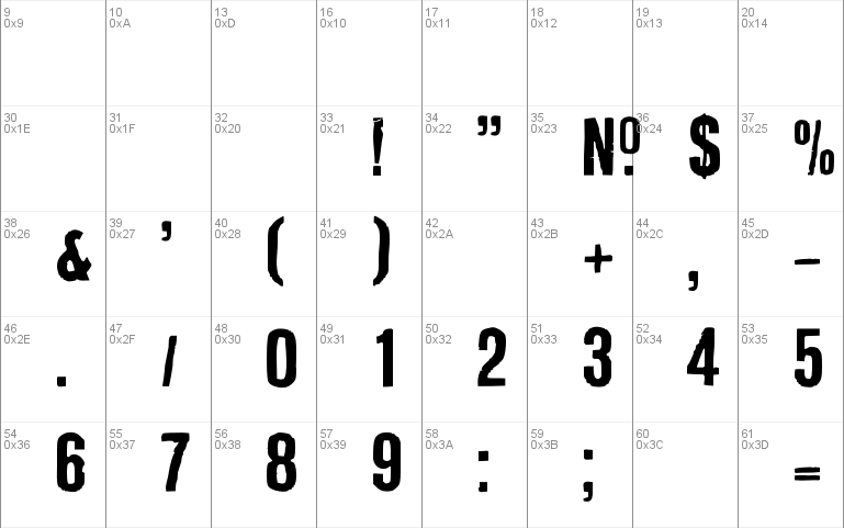
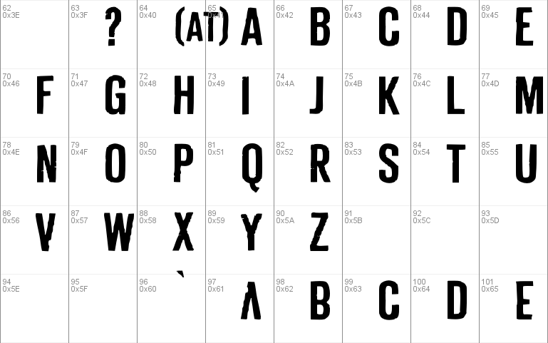
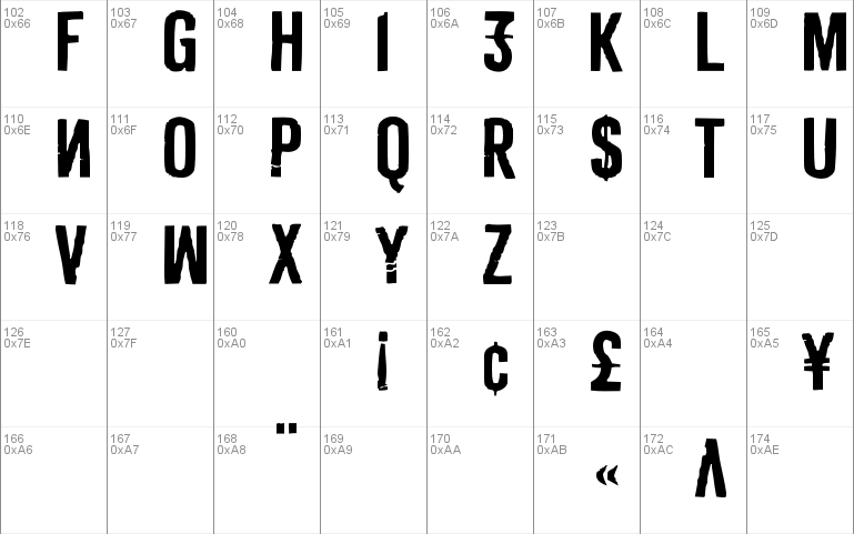
DERIVAT is based on rub-down lettering. Because single glyphs where soon missing on the sheet, people began altering other glyphs as a substitution for the missing glyphs. In the 80s this caused original aesthetics. Because it's an all caps font, DERIVAT uses this aesthetics by putting some altered uppercase glyphs in the lowercase slots. Additionally some glyphs in the lowercase slots where mirrored to add another disturbing effect.
After DERIVAT No1 was digitized the whole alphabet was scratched with a scalpel, then DERIVAT No2 was created with equal metrics to work as a layer font with DERIVAT No1. Together they can be colored different to get an even more eroded look.
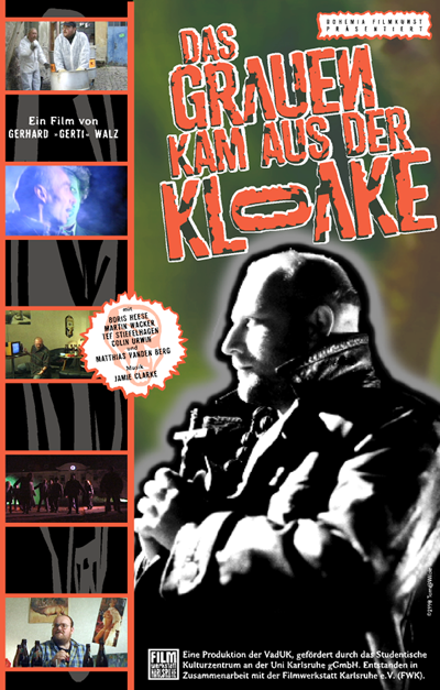
I used DERIVAT only once in 1998 for titling and packaging of a no budget Zombie film called "DAS GRAUEN KAM AUS DER KLOAKE" by Gerhard
Comments