

- Styles (1)
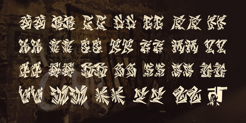
- Character Maps
- License


- Free for Personal Use
- Free for Commercial Use
- Modification Allowed
- Redistribution Allowed
Extended information
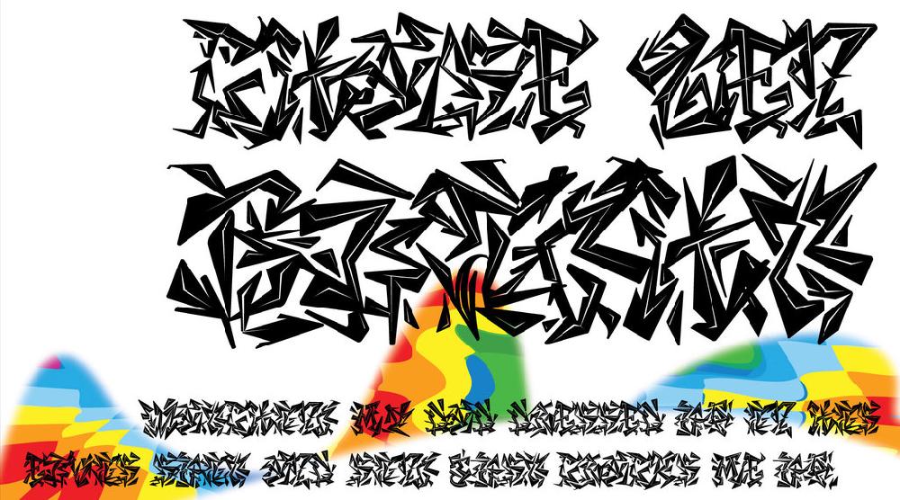
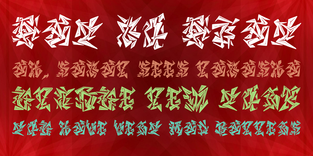
Let me say this. Most folks who use fonts, needed for their commercial projects. the basic rules of their fonts is legibility and style. Each industry need its own resource of font and to that end, this font can only offer a very very small niche. This is a graffiti font. that focus on style not legibility like most "real" graffiti fonts. so this leads to the question what happen when typeface is no longer a typeface but a pattern or illustration or texture? and how do you use this font?
First of all, I'm not the first to do this. Ever since there are typefaces, there are people experimenting with the boarder between texture and type or illustration and type. I'm no different. Second this font was design to be use as an texture with a graffiti look. another words dingbats in graffiti text that is not legibility. so if you need a background texture or a boarder that needs a feel of graffiti this may work. that is the intention for this font.
if you hate this style you will really hate the next one I'm working on now. it's totally illegible & it's call Chase Zen Megaton Fuq!


Comments