
Download (zip 4.0 Kb)DonateAdd to favouritesReport this font
- Styles (1)
- Character Maps
- License
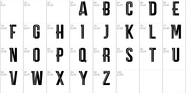
1 styles for

30 characters

- Free for Personal Use
- Free for Commercial Use
- Modification Allowed
- Redistribution Allowed
Extended information
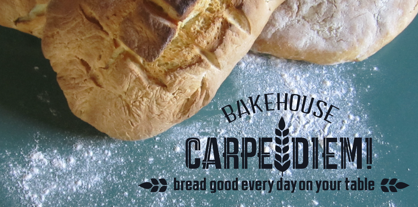
Carpe Diem it's a clear and modern Sans Serif with a geometric skeleton.
This kind of fonts was born in England during 1800s for the purpose of making
letters simple and with less frills.
Despite there are a lot of fonts with similar characteristics, Carpe Diem is trying to find
its niche in the anonimous fonts area, adding a personal interpretation to the same
simple font.
Definitely has a contemporary, familiar and 'perceptible' look.
CARPE DIEM MARK: transformed with help of simple lines, enriched, with a nice and
accurate graphic cut, readable, with a modern informal style. Suitable for a highly
young target, Carpe Diem Mark definitely gives a catchy visual impact.
Comments