
- Styles (16)
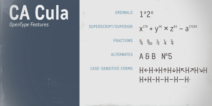
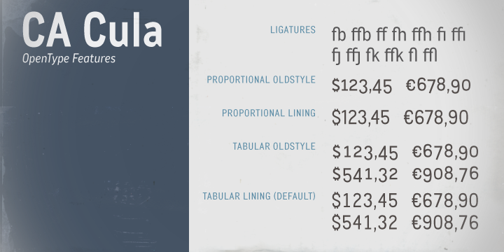
- Character Maps
- License


- Free for Personal Use
- Free for Commercial Use
- Modification Allowed
- Redistribution Allowed
Extended information
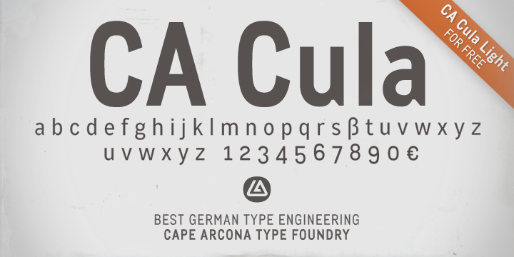
CA Cula Font Family
8 x TTF and OTF
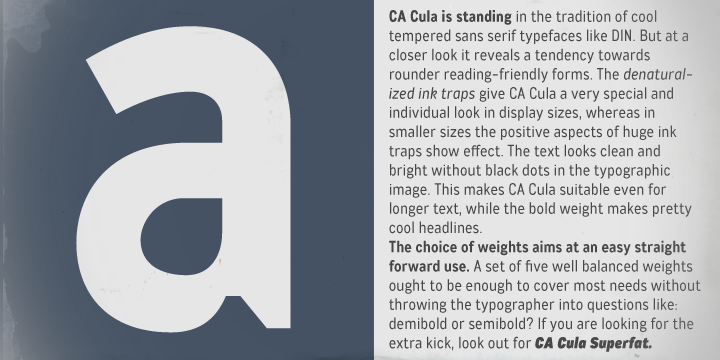
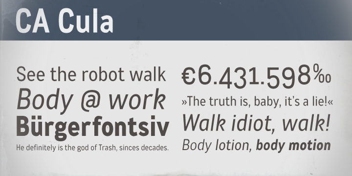
CA Cula is standing in the tradition of cool tempered sans serif typefaces like DIN. But at a closer look it reveals a tendency towards rounder reading-friendly forms.
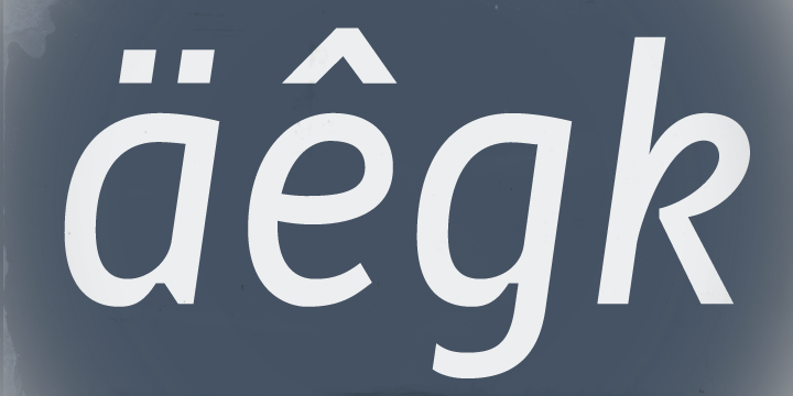
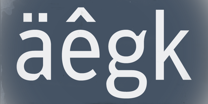
The denaturalized ink traps give CA Cula a very special and individual look in display sizes, whereas in smaller sizes the positive aspects of huge ink traps show effect. The text looks clean and bright without black dots in the typographic image. This makes CA Cula suitable even for longer text, while the bold weight makes pretty cool headlines.
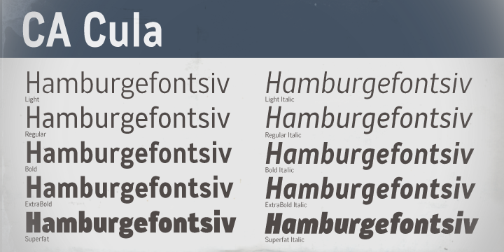
The choice of weights aims at an easy straight forward use. A set of five well balanced weights ought to be enough to cover most needs without throwing the typographer into questions like: demibold or semibold? If you are looking for the extra kick, look out for CA Cula Superfat.
Designers: Thomas Schostok
CA Cula Light
CA Cula Light Italic
CA Cula
CA Cula Italic
CA Cula Bold
CA Cula Bold Italic
CA Cula ExtraBold
CA Cula ExtraBold Italic
————————-
Comments