
- Styles (1)
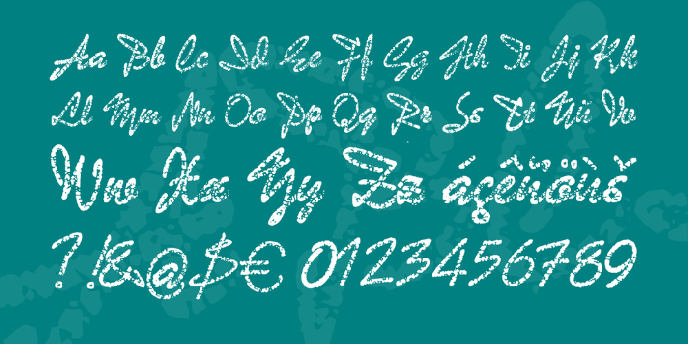
- Character Maps
- License


- Free for Personal Use
- Free for Commercial Use
- Modification Allowed
- Redistribution Allowed
Extended information
Translated from the original German description: I quite often visit the Typografie.info forum. There was a discussion about fonts that look like wrote with chalk. Finally, a forum member interjected that the typical chalk font is a font by name Dafa from the time the lead letters. Another forum member then asked if it now admit of this document, a digitized version, and as it turned out, there have been no. The font was designed by Carl (Carlos) Wilkow (even after Kandler Wilckow) designed in the 1940s and 1945 for the first time at the North German type foundry GmbH in Berlin (and loud Luc Devroye at John Wagner in Ingolstadt) for the first time cast, and achieved up in the 1960s in commercial printing great popularity, so it was available in almost every commercial web printing. However, the existing letters are often very crushed. High time for a digital rescue before the last casts land in the toy box.
This was the connection for me to strive for the digitization of this font. Other forums members have contributed for this purpose some pictures of that font to, among other things, a mapping from the known type specimen book "Kandler", all of which are significantly raise pictures showed that they were all printed by pretty worn letters. Nevertheless, I have tried to create these pictures once a reasonably usable character set. And even if I do not particularly love about Auto Trace Generated Funds, to say nice express, I created this font on the fly like that. This of course means that the individual forms are not particularly clean. Ok, this is only a first and actually respected as a temporary attempt to revive the font. And since I have this font so now once already produced, I want these also offer a freeware version here.
Nevertheless, this is obviously not the final goal. A printer in Berlin has offered me that I can make photos of his lead letters, or can be customize if I send someone with a camera at him over. This offer I will accept and I have already asked a friend from Berlin, whether he will take these pictures for me. If I have these photos once, I will firstly trace the contours of this font clean. This means that the first step is no chalk writing it only once arise, but a font with clean contours plotted and completely filled areas. This form was also released in 1968 as the lead Iowa scripts, and now already digitized, where unfortunately the nature of the writing has suffered somewhat. So I will do this closer to the original design.
In the second step, the granules of chalk handwriting image are then drawn for each letter accurately, right in the rounded forms of the original lead letters. As a final goal is to pour so families can enjoy again, in all sizes from 7 design means double (28 points) up to 8 Cicero font with its correspondingly finer structure. Just as in the quickly produced "Bad-Gong" there will again be some ligatures and alternates, which are automatically used by OpenType features. Because of the extremely high cost this clean Gong is then, however, no longer free font can be.
Comments