- Styles (1)
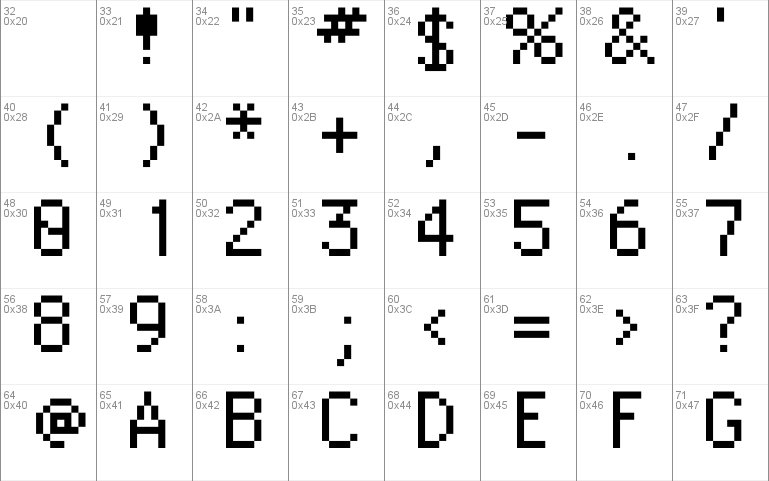
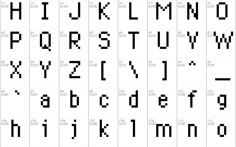
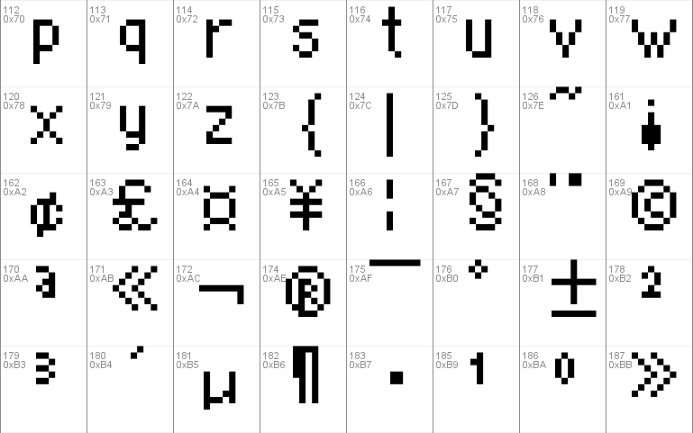
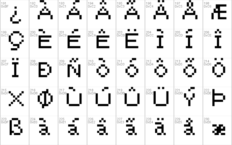
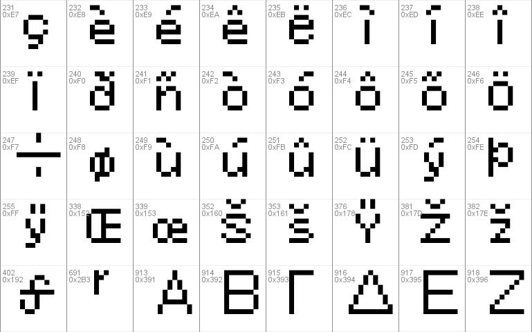
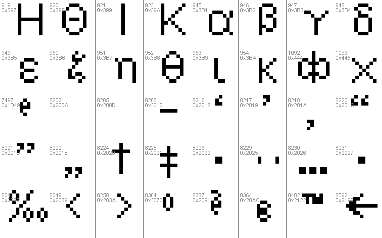
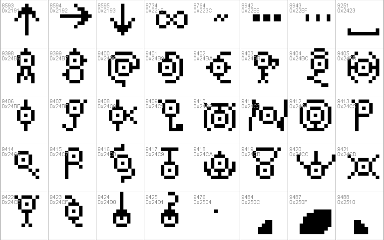
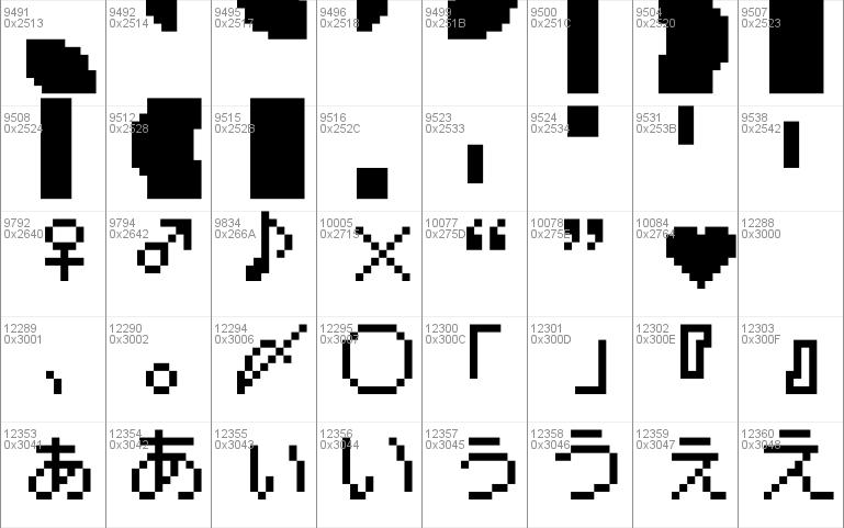
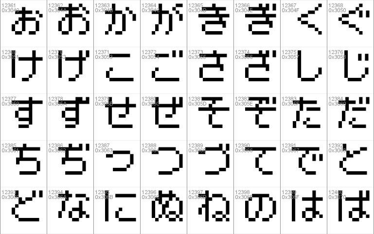
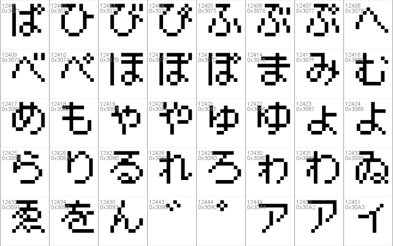
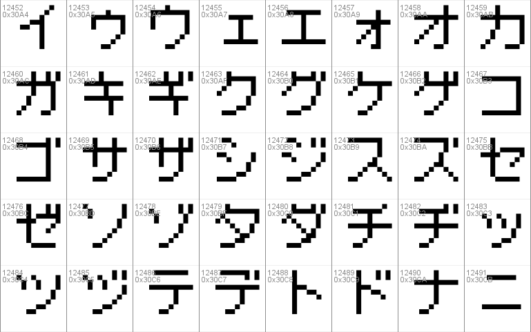
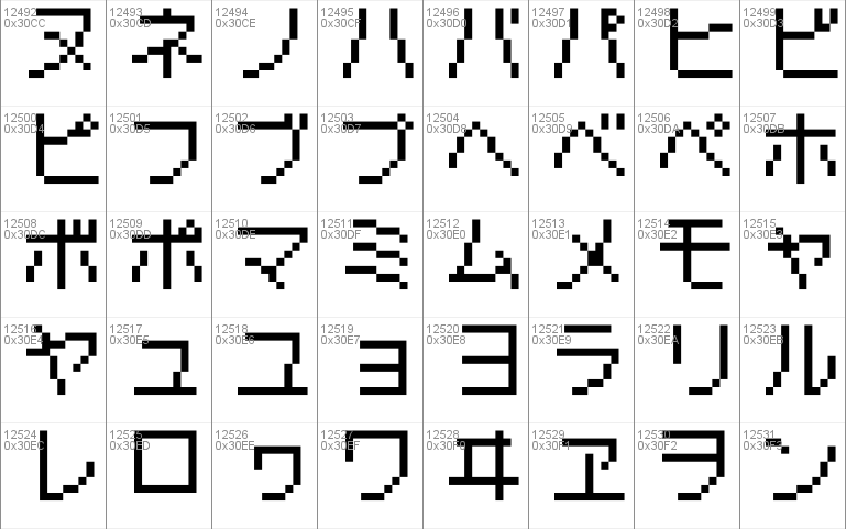
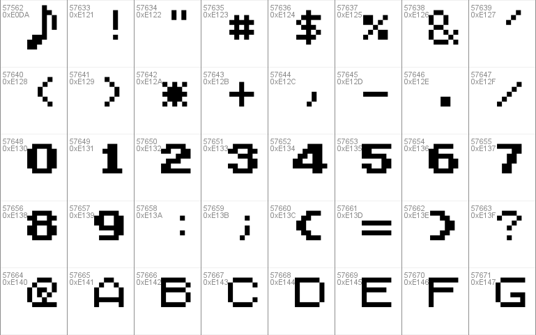
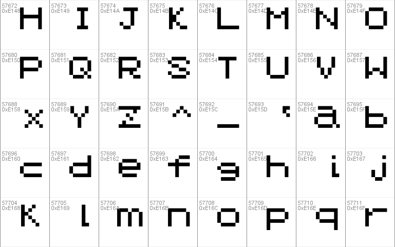
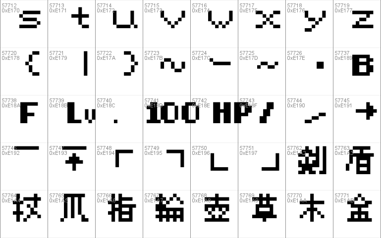
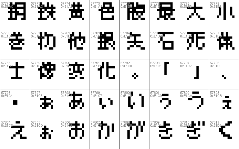
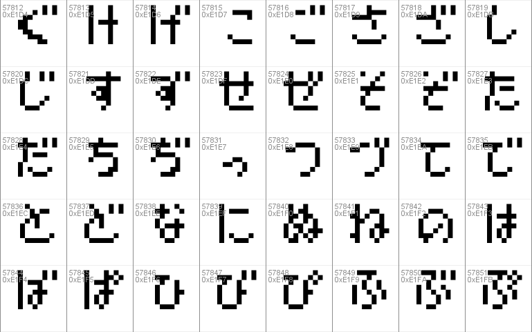
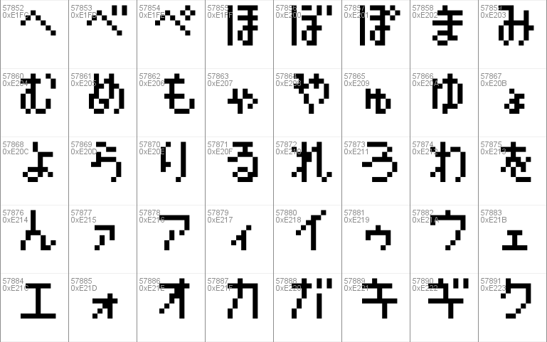
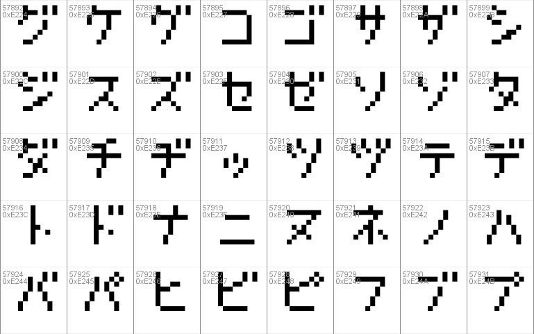
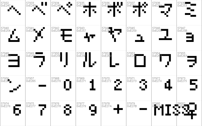
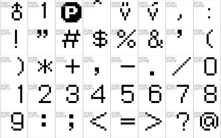
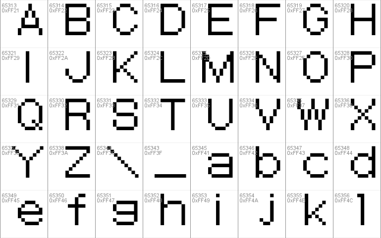
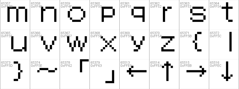
- Character Maps
- License


- Free for Personal Use
- Free for Commercial Use
- Modification Allowed
- Redistribution Allowed
Extended information
This is a port of the font in Pok
Read more
--------
Foreword
--------
If you notice any significant errors and wish to report them, the most likely places you are to reach me is on either reddit, or dafont, both under the username ShinxHijinx. This is the first font I've ever made, so I appreciate the feedback!
--------
-------
Credits
-------
-MandL27 for pointing out a handful of glyphs I missed, all sorts of various input, many offers of help, and continuously trying to keep me motivated so I didn't give up like I do on so many other projects of mine.
-The maintainers of Project Pokémon for information on control characters I was missing.
-David Fens, the author of the most well known/circulated Pokémon Mystery Dungeon font that motivated me to want to make this one to begin with.
-------
-------
Details
-------
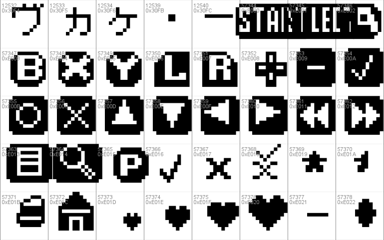
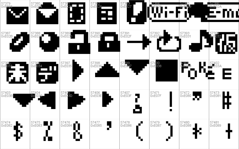
-Including things such as mirrors (for certain missing slashes or brackets mostly), icon recreations, compatibility glyphs, and extra glyphs with different spacing for varying purposes, this font in total has 1,064 glyphs. There are no glyphs in this font that are completely original, everything is directly from, or created from something in Explorers or Rescue Team.
-What is included: Basic Latin and numbers, punctuation, accented letters, fullwidth Latin and numbers, halfwidth Latin and numbers, Hiragana, Katakana, Japanese punctuation, limited Greek letters, Unowns, the HUD font (Numbers, Latin, limited punctuation, limited Kanji, Hiragana, Katakana), damage numbers, and as a bonus assorted menu elements, recreated icons, and recreated menu borders. Most of the extra stuff, or things that didn't have a good place ended up in the Private Use Area.
-What is NOT included: The entire Korean alphabet and any additional symbols in that version. Someone (who seems to wish to remain anonymous) clued me in that a Korean version of Time/Darkness exists (but not Sky oddly enough), and as much as I desired to add the Korean alphabet as well, in the interest of actually releasing this font and keeping what's left of my sanity I had to opt to skip over it, as I do not possess sufficient knowledge of Hangul to properly add it.
-Using the standard text box as a baseline, every glyph should have completely accurate spacing to how they are in Explorers (including vertically if the metrics are working as they should), with only two exceptions. First, the fullwidth "4" when accurate to the game is not monospaced like the rest of the fullwidth numbers, so I changed that as non-monospaced numbers are dumb. Second, the two single guillemets in-game are misaligned vertically when compared to each other by one pixel, so I raised the left one to make them aligned to match the double guillemets.
-There are some "duplicate" glyphs for varying reasons, such as that the game itself reuses them (for example some of the Greek letters being identical to the Fullwidth letters), they have different spacing, or they are variations of other glyphs. Here's the most noteworthy cases:
Comma: The main comma is used as normal, and the other for the decimal in money displays (U+FE50). Rescue Team does not do this, has no decimal for money displays, and only uses the normal one.
Colon: The main colon is used to designate a character speaking, and the other for general menu usage (U+FE55). Rescue Team only uses the menu colon.
Poké Coin: The International version (U+E015) has three more pixels worth of spacing than the Japanese version (U+E295)
Female/Male Symbol: The International versions are different to the Japanese versions (U+E292/U+E293).
"1": The "1" used in Rescue Team (U+E294) is shifted to the left by one pixel compared to in Explorers. If you want the "0" without the slash that's in Rescue Team, it looks exactly the same as the capital "O".
-As there is no support for combining characters, I included the resulting missing glyphs elsewhere (inverted breve: U+E2A8, umlaut v: U+E2A9, acute v: U+E2AA).
-The border glyphs were mostly added for decoration purposes, they unfortunately don't do a great job at matching up with the in-game menus due to the nature of them. Regardless, it's quite confusing to figure out how they fit together. In short, the Light Triple Dash (U+2504) is meant to be used for the straight separator line in menus, the Light Box Drawings (U+250C/2510/2514/2518/251C/2524/252C/2534) are for portrait borders, the Heavy Box Drawings (U+250F/2513/2517/251B/2523/252B/2533/253B) are for regular menu borders, and the Heavy Vertical-Light Horizontal Box Drawings (U+2520/2528/2542) are for dividing and attaching another menu box vertically. It's kind of a mess, sorry!
-If something doesn't seem to be lining up correctly horizontally for what you're doing for whatever reason, you might be able to use the Hair Space (U+200A) to suit your needs.
-Bitmaps are embedded for the first four integer sizes to prevent ClearType from getting its grubby paws on them and making it look poor. Although it will still scale to additional integer sizes properly regardless, they won't be protected from ClearType's nonsense.
-------
Comments