
- Styles (3)
- Character Maps
- License


- Free for Personal Use
- Free for Commercial Use
- Modification Allowed
- Redistribution Allowed
Extended information
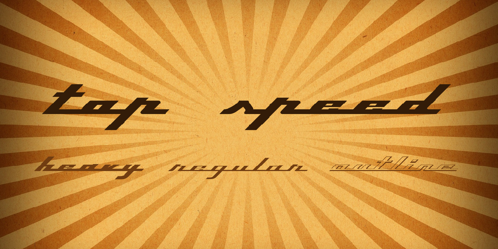
Top Speed Version 1.41Released as Shareware December 1997Copyright 1997 Jason VanderhillTop Speed is inspired by a certain metal badge seen on the flanks of the finest coachbuilt automobiles in the world. It is a complete alphabet, albeit all lower case at the moment, based on the letters p, i, n, f, a, and r.Top Speed Version 1.41 is currently available as shareware. For $10, you are entitled to a single-user licence for Top Speed Normal, Top Speed Outline, and Top Speed Heavy.Please send a cheque or money order to: Jason Vanderhill R.R. #1 Dorchester, ON N0L 1G4 canadaFeel free to email me at [email protected](Javascript must be enabled to view this email address)___________________________________...about Top Speed...___________________________________Top Speed is strictly a display typeface, and should be used for no more than one line--preferably only one or two words--at a time. The most distinctive feature of Top Speed is the fact that all the letterforms are connected to each other. To maintain this look, all the characters have tails. The forward-slash character (and underline character) can be inserted between words instead of using the space bar, maintaining the continuous baseline. The back-slash character is a somewhat shorter connector; the '|' key is a slightly longer connector. To begin your word or line of text, you should insert a small version of the baseline, which is the "<" character. This will start off your type with an appropriate "tail." To finish off your line of type, use the ">" character, as it will end your tail at the appropriate distance. These characters are more necessary in the Outline version of the font. Top Speed may require minor kerning adjustment with some characters. Because each letter must be placed EXACTLY next to the following letter, (Top Speed Normal and Heavy are slightly more forgiving) you might notice a sliver appear between an occasional pair of letters. There are no differences in the capital letters except for the letter F. The capital letter F does not continue along the baseline, but instead it can run into certain letters (typically, the a, o, or u) through it's horizontal crossed stroke. The Outline version of the capital F contains an extra bit of black. This fills up the "hole" left at the beginning of the next character. If the capital F is used to end a word or sentence using Top Speed Outline, that little speck will have to somehow be creatively covered up.Top Speed is my first computer designed typeface. It was created completely in CorelDraw 7. Since this was my first font, I did stumble through the whole process a bit, and as a result, it does contain the odd imperfection. For example, I am not sure how to get my apostrophes and quotation marks to work. Currently, the null character is inserted instead. In a way, it's a bit of a handmade product. I began the font in the spring, basically ignored it all summer, and then finished it in the fall. Mostly, it has been fun. I hope you enjoy it.___________________________________The typeface name 'Top Speed' has been registered at the Goudy International Typeface Center in Rochester, New York, 1997. This font may not be sold or modified without my consent. Top Speed may not be distributed without this text file (or embedded description).___________________________________===================================Thanks: Kikita Eric Wiley Fredi Valentini Laurence Penney J. Kimble Rigney Jim Marsteller Lightwings@aol Stu Henlis Vince Ondrade Derek Timmerman Jeff Harris Nicole Fritz===================================
Read more
___________________________Top Speed___________________________
Version 1.41 Released as Shareware December 1997
Copyright 1997 Jason Vanderhill
_______________________________________________________________
Top Speed is inspired by a certain metal badge seen on the
flanks of the finest coachbuilt automobiles in the world. It
is a complete alphabet, albeit all lower case at the moment,
based on the letters p, i, n, f, a, and r.
Top Speed Version 1.41 is currently available as shareware.
For $10, you are entitled to a single-user licence for
Top Speed Normal, Top Speed Outline, and Top Speed Heavy.
Please send a cheque or money order to:
Jason Vanderhill
R.R. #1 Dorchester, ON
N0L 1G4
canada
Feel free to email me at [email protected]
_______________________________________________________________
...about Top Speed...
_______________________________________________________________
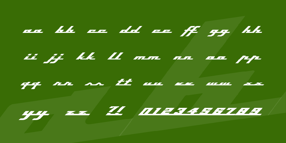
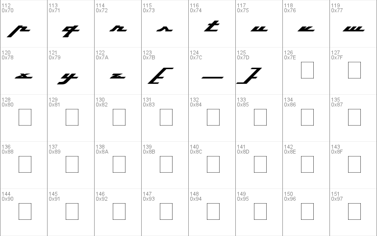
Top Speed is strictly a display typeface, and should be used
for no more than one line--preferably only one or two words--
at a time. The most distinctive feature of Top Speed is the
fact that all the letterforms are connected to each other.
To maintain this look, all the characters have tails. The
forward-slash character (and underline character) can be
inserted between words instead of using the space bar,
maintaining the continuous baseline. The back-slash character
is a somewhat shorter connector; the '|' key is a slightly
longer connector.
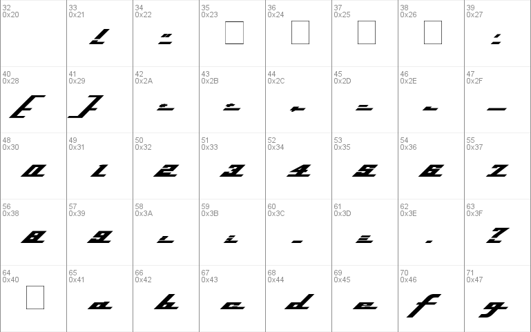
To begin your word or line of text, you should insert a small
version of the baseline, which is the "<" character. This will
start off your type with an appropriate "tail." To finish off
your line of type, use the ">" character, as it will end your
tail at the appropriate distance. These characters are more
necessary in the Outline version of the font.
Top Speed may require minor kerning adjustment with some
characters. Because each letter must be placed EXACTLY next
to the following letter, (Top Speed Normal and Heavy are
slightly more forgiving) you might notice a sliver appear
between an occasional pair of letters.
There are no differences in the capital letters except for the
letter F. The capital letter F does not continue along the
baseline, but instead it can run into certain letters
(typically, the a, o, or u) through it's horizontal crossed
stroke.
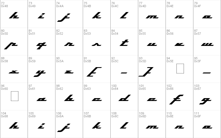
The Outline version of the capital F contains an extra bit of
black. This fills up the "hole" left at the beginning of the
next character. If the capital F is used to end a word or
sentence using Top Speed Outline, that little speck will have
to somehow be creatively covered up.
Top Speed is my first computer designed typeface. It was
created completely in CorelDraw 7. Since this was my first
font, I did stumble through the whole process a bit, and as
a result, it does contain the odd imperfection. For example,
I am not sure how to get my apostrophes and quotation marks
to work. Currently, the null character is inserted instead.
In a way, it's a bit of a handmade product. I began the
font in the spring, basically ignored it all summer, and
then finished it in the fall. Mostly, it has been fun.
I hope you enjoy it.
_______________________________________________________________
The typeface name 'Top Speed' has been registered at the Goudy
International Typeface Center in Rochester, New York, 1997.
This font may not be sold or modified without my consent.
Top Speed may not be distributed without this text file. The
contents of this file are also embedded inside the True Type
font file and can be viewed with font info extension softare.
_______________________________________________________________
===============================================================
Thanks: Kikita Eric Wiley Fredi Valentini Laurence Penney
J. Kimble Rigney Jim Marsteller Lightwings@aol Stu Henlis
Vince Ondrade Derek Timmerman Jeff Harris Nicole Fritz
===============================================================
Comments