- Styles (1)
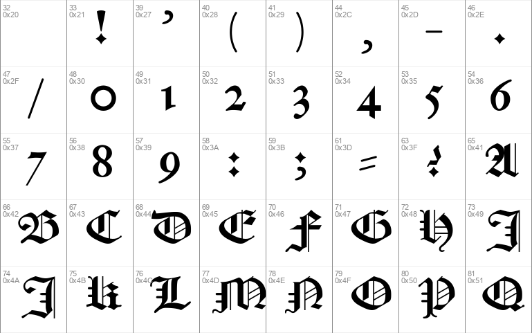
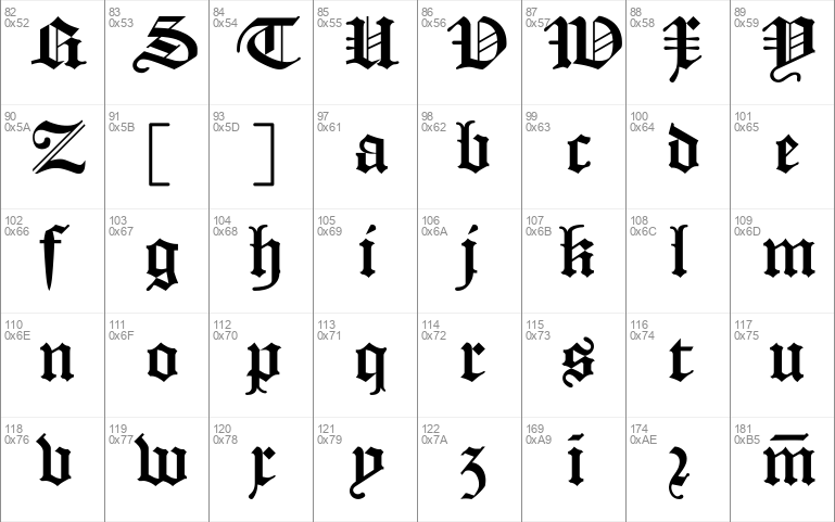
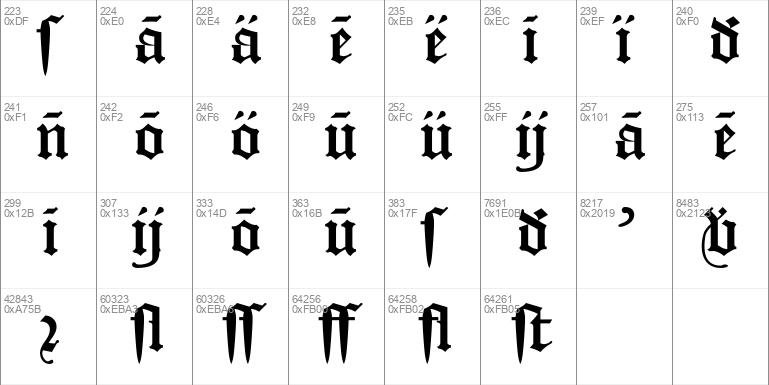
- Character Maps
- License


- Free for Personal Use
- Free for Commercial Use
- Modification Allowed
- Redistribution Allowed
Extended information
Not actually 'medieval'; Early Modern, rather.
Nederlands:
De schrik van menig student Nederlands! Textura Belgica is een traditiegetrouwe digitalisering van het Gotische lettertype zoals dat van de 16e tot in de 20e eeuw in het Nederlands taalgebied gebruikt werd.
Traditiegetrouw wil zeggen dat er in dit lettertype, anders dan in veel andere Gotische lettertypes die je online kunt vinden, volledige ondersteuning is voor de bijzondere tekens die je nodig hebt om naar hartelust je persoonlijke facsimiles maken!
Het lettertype is gedigitaliseerd aan de hand van een hoge-resolutie scan van een vel waarop alle letters staan, zoals gemaakt door de Gentse lettersnijder en -gieter Hendrick van den Keere. Naast dit vel, dat ik als basis heb gebruikt, heb ik gebruikt:
- scans van de Statenvertaling uit 1637 (https://www.bijbelsdigitaal.nl/view/?bible=sv1637);
- via Google Boeken 'Verbael van 't Verhandelde over de Gravamina, Kerckelijke swaricheden tot Rotterdam, Oudewater, etc.' (https://books.google.nl/books?id=zRZjAAAAcAAJ&printsec=frontcover&);
- mijn kleine priv
Read more
~ TEXTURA BELGICA ~ ?, ,
For English: see below
~~~~~~ NEDERLANDS ~~~~~~
== Over het lettertype ==
De schrik van menig student Nederlands! Textura Belgica is een traditiegetrouwe digitalisering van het Gotische lettertype zoals dat van de 16e tot in de 20e eeuw in het Nederlands taalgebied gebruikt werd.
Traditiegetrouw wil zeggen dat er in dit lettertype, anders dan in veel andere Gotische lettertypes die je online kunt vinden, volledige ondersteuning is voor de bijzondere tekens die je nodig hebt om naar hartelust je persoonlijke facsimiles maken!
Het lettertype is gedigitaliseerd aan de hand van een hoge-resolutie scan van een vel waarop alle letters staan, zoals gemaakt door de Gentse lettersnijder en -gieter Hendrick van den Keere. Naast dit vel, dat ik als basis heb gebruikt, heb ik gebruikt:
- scans van de Statenvertaling uit 1637 (https://www.bijbelsdigitaal.nl/view/?bible=sv1637);
- via Google Boeken 'Verbael van 't Verhandelde over de Gravamina, Kerckelijke swaricheden tot Rotterdam, Oudewater, etc.' (https://books.google.nl/books?id=zRZjAAAAcAAJ&printsec=frontcover&);
- mijn kleine privécollectie (twee bijbels, begin 19e en eind 18e eeuw, en een catechismus, tweede helft 18e eeuw).
Ik heb dit lettertype 'Textura Belgica' genoemd aangezien de term 'Belgica' in de tijd dat dit soort lettertype zijn 'gouden tijdperk' had nog als Latijnse benaming voor heel de Nederlanden gold (zo was de Latijnse naam van Nieuw-Nederland 'Nova Belgica').
== Installeren ==
is heel eenvoudig. Open het geleverde ttf-bestand en klik op 'Installeren'. Als je dit lettertype al eens eerder geïnstalleerd hebt, moet je nog een keer bevestigen dat je hem wilt overschrijven.
== Bijzondere tekens en ligaturen ==
Aangegeven toetscombinaties op basis van de toetsenbordopmaak 'Verenigde Staten (internationaal)'
Inbegrepen bijzondere tekens zijn:
Tekens: Te typen met:
lange s (ſ) <ſ>, <ß> (AltGr+s)
r-rotunda (ꝛ) <ꝛ>, <®> (AltGr+r)
Over deze tekens, voor de oningewijden:
De regels voor de lange s lijken te verschillen per land en per tijdvak. Het is makkelijker de gevallen te benoemen waarin de lange s níét gebruikt moet worden, ten faveure van de gewone 'ronde' s. Een concrete regel is dat de lange s nooit aan het einde van een woord komt: 'ſtaal' en 'plaats'. Een andere mogelijke regel is dat de lange s niet aan het einde van een lettergreep komt: 'lasſer'. Volgens een derde regel mag de laatste letter van een deelwoord van een samenstelling geen lange s zijn; hier kun je dus een verschil in betekenis zien: 'plaat-ſtaal' en 'plaats-taal'.
De regels voor de r-rotunda zijn daarentegen vrij eenvoudig. Dit is een puur esthetische vorm van de letter
Abbreviaturen: Te typen met: Afkorting voor (voorbeelden):
ā <ā>, <à> vā(n)
ē <ē>, <è> denkē(n)
ī <ī>, <ì> zī(n)
ō <ō>, <ò> zō(n)
ū <ū>, <ù> Jeſū(m)
ḋ <ḋ>, <ð> (AltGr+d) ḋ(aer)
n̄
m̄
℣ <℣>, <©> (AltGr+c)
Ligaturen:
Standaard, deze zijn automatisch actief
ff
fl
ſt
ſſ
ſl
'Historisch', deze moet apart worden ingeschakeld, maar is ook te typen met <ÿ>
ij
== Verdere opmerkingen over de tekens ==
De zogeheten Gotische komma, die wij eerder als een gewone schuine streep zien, staat in dit lettertype ook op de plek van de schuine streep. Op de plek van de komma staat gewoon een 'moderne' <,>; maar voor het meest authentieke resultaat zou je dus eigenlijk de schuine streep moeten gebruiken.
Dit lettertype heeft twee soorten koppeltekens, die onder <-> en <=> staan (en er ook zo uitzien, maar de tweede gekanteld). <-> wordt voornamelijk gebruikt voor het scheiden van woorden (zoals 'na-apen'), terwijl <=> vooral als woordafbrekingsteken aan het einde van de zin gebruikt wordt. Zoals altijd in oude drukken werden de 'regels' echter niet zo strikt nageleefd, dus je komt ook variatie in gebruik tegen.
~~~~~~ ENGLISH ~~~~~~
== About the font ==
The terror of many a student of Dutch Language and Culture! Textura Belgica is a true to tradition digitalisation of the blackletter type as it was used from the 16th into the 20th century in the Dutch language area.
With 'true to tradition' is meant that, in this font, differently from many other blackletter fonts you can find online, there is full support for the special characters you need to make your personal facsimiles!
This font had been digitalised using a high-resolution scan of a sheet with all letters, as made by type cutter and founder Hendrick van den Keere, from Gent in the 16th century. Beside this sheet, which I used as a base, I used:
- scans of the Dutch 'States Translation' of the Bible from 1637 (https://www.bijbelsdigitaal.nl/view/?bible=sv1637);
- via Google Books 'Verbael van 't Verhandelde over de Gravamina, Kerckelijke swaricheden tot Rotterdam, Oudewater, etc.' (https://books.google.nl/books?id=zRZjAAAAcAAJ&printsec=frontcover&);
- my own little private collection (two Bibles, early 19th and end 18th century, and a catechism, second half 18th century).
I have called this font 'Textura Belgica' as the term 'Belgica' during the 'golden age' of this type of font was used as the Latin name of all the Netherlands (equivalent in area with the modern Benelux). For example, the Latin name of the Dutch colony New Netherland was 'Nova Belgica'.
== Installation ==
is very simple. Open the ttf file and click 'install'. When you have installed the font previously, you will have to confirm that you want to overwrite it.
== Special characters and ligatures ==
Indicated key combinations are based on the layout 'United States (International)'
Included special characters are:
Characters: Can be typed using:
long s (ſ) <ſ>, <ß> (AltGr+s)
r rotunda (ꝛ) <ꝛ>, <®> (AltGr+r)
About these characters, for those who don't know:
The rules for using the long s seem to differ by country and time period. It's easier to note the cases in which it /shouldn't/ be used instead of the normal 'round' s. One concrete rule is that the long s is never used at the end of a word: 'ſteel', 'treats'. One other possible rule is that the long s isn't used at the end of a syllable: 'tosſer'. According to a third rule (relevant for languages with composite words written as one), the long s shouldn't be used as the final letter of a word within a composite word. Put simpler: 'graſshopper' would amount to 'grass-hopper' ('graſſ' isn't possible as 'ſ' can't be the final letter), whereas 'grasſhopper' would amount to 'gras-shopper'.
The rules for the r rotunda are comparatively simple. This is a purely aesthetical variant of the letter
Abbreviations: Can be typed using: Abbreviation for (examples):
ā <ā>, <à> vā(n) (of)
ē <ē>, <è> denkē(n) (to think)
ī <ī>, <ì> zī(n) (sense, purpose, sentence)
ō <ō>, <ò> zō(n) (sun)
ū <ū>, <ù> Jeſū(m) (Jesus [accusative])
ḋ <ḋ>, <ð> (AltGr+d) ḋ(aer) (there)
n̄
m̄
℣ <℣>, <©> (AltGr+c)
Ligatures:
Standard, these are automatically active
ff
fl
ſt
ſſ
ſl
'Historical', has to be seperately activated, but can also be typed using <ÿ>
ij
== Further comments on the characters ==
The so-called scratch comma, which we would currently see as a slash, also takes the place of the slash () in this font. Under the comma, I've put the 'modern' <,>; but for the most authentic results, you should really use the slash.
This font has two types of hyphens, under <-> and <=>. <-> is used mainly for the seperation of word-parts (as demonstrated in this very word), whereas <=> is mainly used to seperate words continuing on the next line. As always in old prints, the 'rules' were seen more as guidelines, so this difference wasn't maintained too strictly.
Comments