- Styles (3)
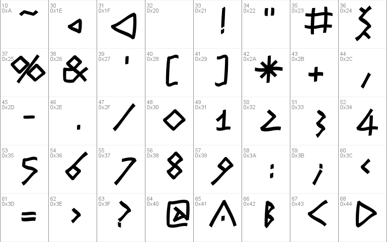
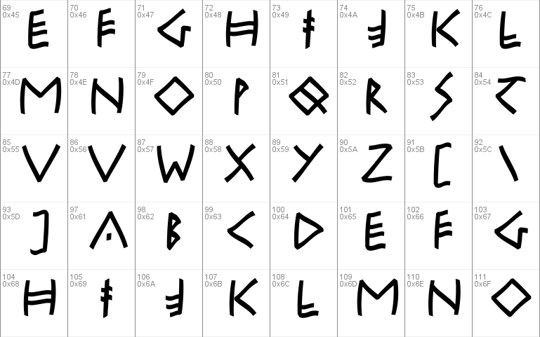
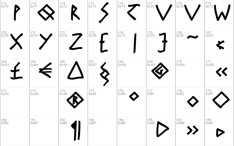
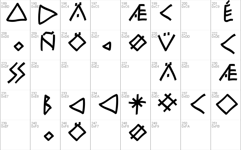
- Character Maps
- License


- Free for Personal Use
- Free for Commercial Use
- Modification Allowed
- Redistribution Allowed
Read more
RuniKlein Freeform
Die Herausforderung, alte Fonts heute lesbar zu machen, f�hrte zur
heutigen Fontfamilie: Runen f�r lateinisch Schreibende und Lesende.
Sie erinnern: W�hrend die R�mer ihre heute noch aktuelle Capitalis
Romana in die Marmorplatten mei�elten, sa�en die Nordeurop�er zwar
nicht mehr auf den B�umen, aber angeblich auf B�renfellen und tranken
massenhaft Met. Tats�chlich haben sie aber auch so etwas wie eine
eigene Schriftkultur gehabt, die aber - entgegen der r�mischen -
einfach unterging. Sie haben in der Geschichte eben auch ihre
Fingerprints hinterlassen.
Ich habe hier, �hnlich wie bei der "MyNippon", die Grundzeichen und
Zeichenformen unserer Vorfahren �bernommen und versucht, sie mit
unseren Texten in Lateinschrift lesbar zu machen. W�rde ich heute ein
Reiseplakat nach Skandinavien gestalten, dann vielleicht mit diesen
neuen Typen, deren Formen eigentlich schon vor 2000 Jahren
entstanden. - Wotan gr��t Wednesday (und Thor und den Donnerstag),
ich gr��e alle echten Typomaniacs: Ihr Manfred Klein ("ich bin ein
Berliner", da waren die R�mer wohl nie ... schade).
� Manfred Klein, all rights reserved, for privat use only; Okt-29-2001.
It's a challenge to make historical fonts legible. Today's font family,
consisting of runes for Latin writers and readers, is an attempt in this
direction. Recall that the Romans were already chiseling their Capitalis
Romana, which is still appropriate today, in marble plates, when the
Northern Europeans, barely down from their trees, were still running
around in bearskins and guzzling vast amounts of mead. But these northerners
had a typography of their own, which unlike the roman writing, got lost and
forgotten, except for a few historical clues.
Like in "My Nippon", I reworked the basic characters and symbols of our
ancestors and I tried to make them readable like in a Latin font. If I had
to design a poster for trips to Scandinavia today, I would probably choose this
new typeface with patterns that were conceived over 2000 years ago.
Wotan says hi to Wednesday, and Thor to Thursday.
And I say hi all true typomaniacs!
For you, from Manfred Klein ("Ich bin ein Berliner":
I am from Berlin. Too bad the Romans never made it there.)
� Manfred Klein, all rights reserved, for privat use only; Okt-29-2001.
Comments