


- Styles (6)
- Character Maps
- License


- Free for Personal Use
- Free for Commercial Use
- Modification Allowed
- Redistribution Allowed
Extended information
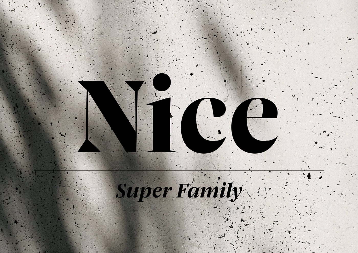
Nice Serif Font
This is a new serif typeface, inspired by the strong and spirited modern sports culture. Thanks to its four optical sizes, it covers a wide range in terms of design and legibility: from texts in very small sizes to large, expressive billboard grabbing titles. In contrast to many historically oriented serif fonts, it has a fresh look with a slightly nostalgic flair.
Drawing from its baroque ancestors, it takes only the most important essences: the expressiveness, the contrast between severity and warmth, the playfulness of the italics, the subtle quirkiness. By softening typical decorative elements such as sprawling curves, twisted drops or idiosyncratic serifs and carefully incorporating them into a modern framework, its designer Jan Fromm places its historical formal language in a contemporary context. Many peculiarities of the typefaces of that time compete with today’s reading habits. Therefore, oversized capitals, as in the case of a Baskerville, or the exuberant richness of form of a Fleischmann Italic were consciously avoided.
Nice is therefore not a revival. Instead, the attributes of classical baroque typefaces that still make sense today have been tailored to a refreshingly modern text font. Its availability as a variable font (which is included in the Superfamily package) makes its discreet historical borrowings almost completely unrecognizable.
In contrast to historically oriented text faces, which usually contain oldstyle numerals, Jan Fromm opted for proportional lining figures, as these work better in the large optical sizes of Headline and Poster. Many readers consider oldstyle figures to look too playful in such large and short use cases. In light of the superfamily’s syndetic variability, this decision has also been transferred to Nice Text and Nice Micro. To make lining figures suitable for this purpose, the numerals were made somewhat narrower. This way, they fit perfectly in continuous texts and convince in responsive environments.
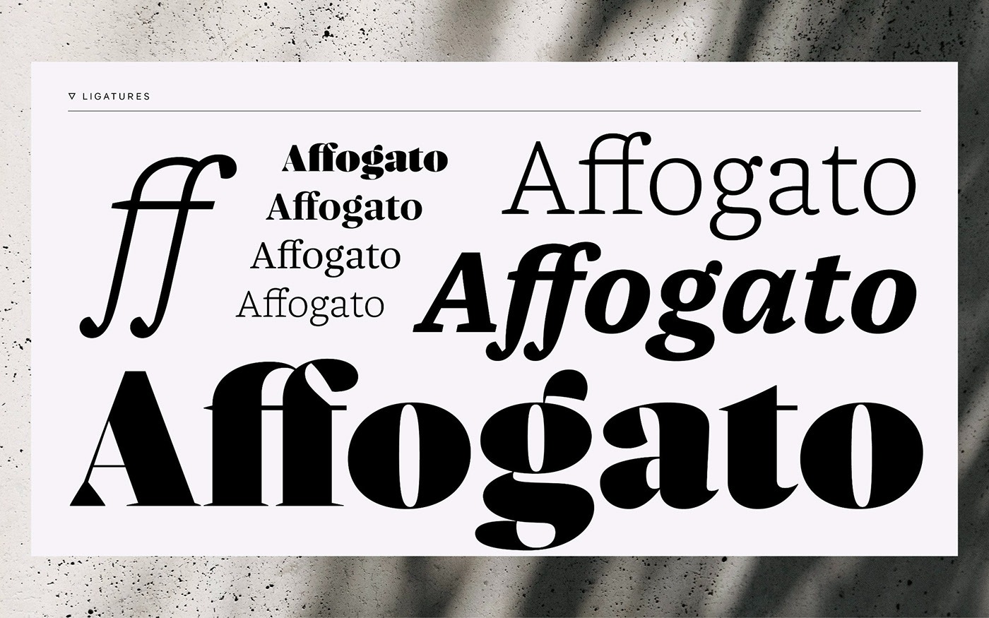
Alongside the different types of numerals, the family members Poster, Headline, Text and Micro and the multiple and varied weights (from ExtraLight to Black), Nice is equipped with a rich typographic repertoire of small caps, arrows and symbols. Whether used in editorial design, fashion, branding or packaging – Nice always cuts a fine figure.
The designer himself recommends using Micro for font sizes from about 6 to 9pt, Text from about 9 to 16pt, Headline up to about 48pt and Poster for larger applications. But, of course, that is just a suggestion …
The versatility and expressive nature of Nice will be further expanded with the planned addition of more widths (Condensed and Extended), as well as language extensions such as Cyrillic, Greek and Vietnamese. Corresponding styles such as Sans, Mono and perhaps even Slab, Semi Sans or even Script are also conceivable. After all, these genres also deserve a ‘nice’ clarity, liveliness and legibility.
Comments